Colour!

Last weekend I had a new group of Creative Surface Design students in the studio which was wonderful as we spend the first weekend of this course focusing on colour. Colour blending, colour exchanges, colour families ….. I love it!
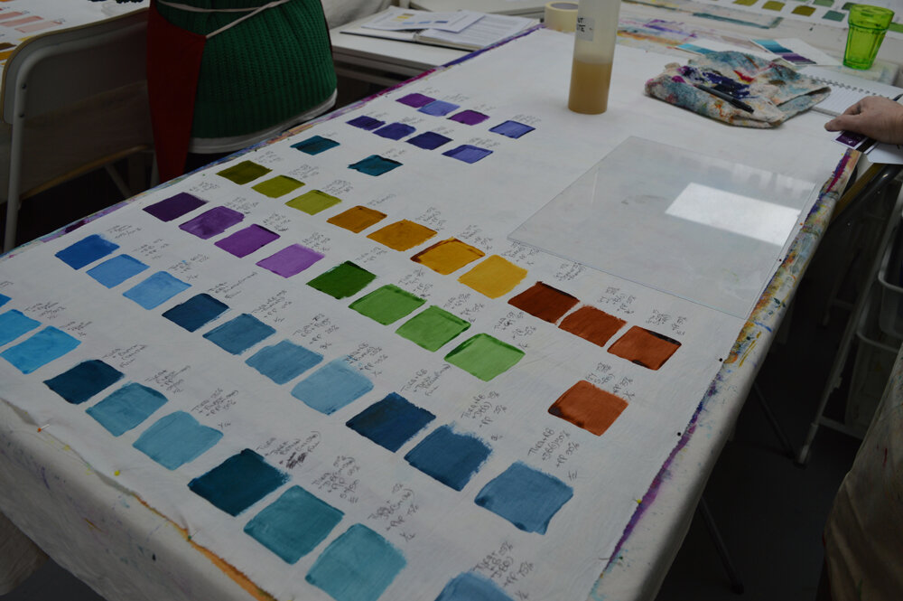
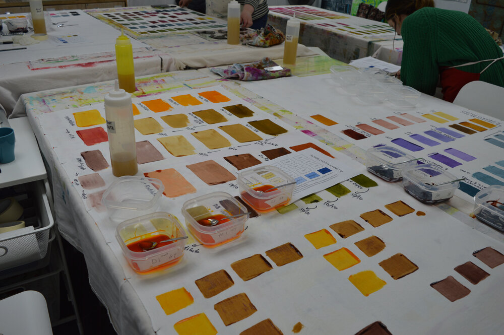
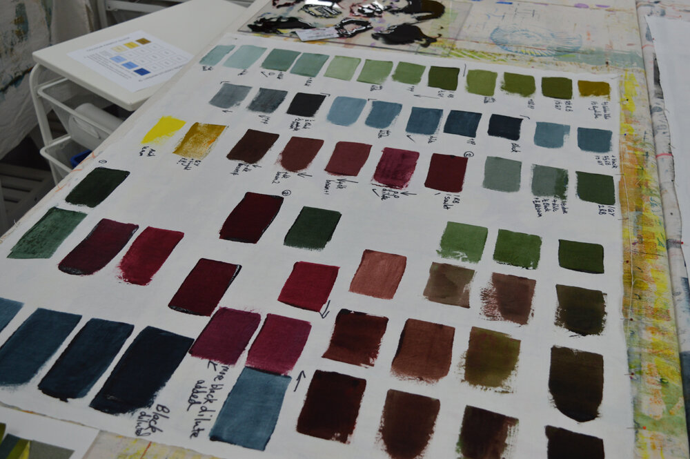
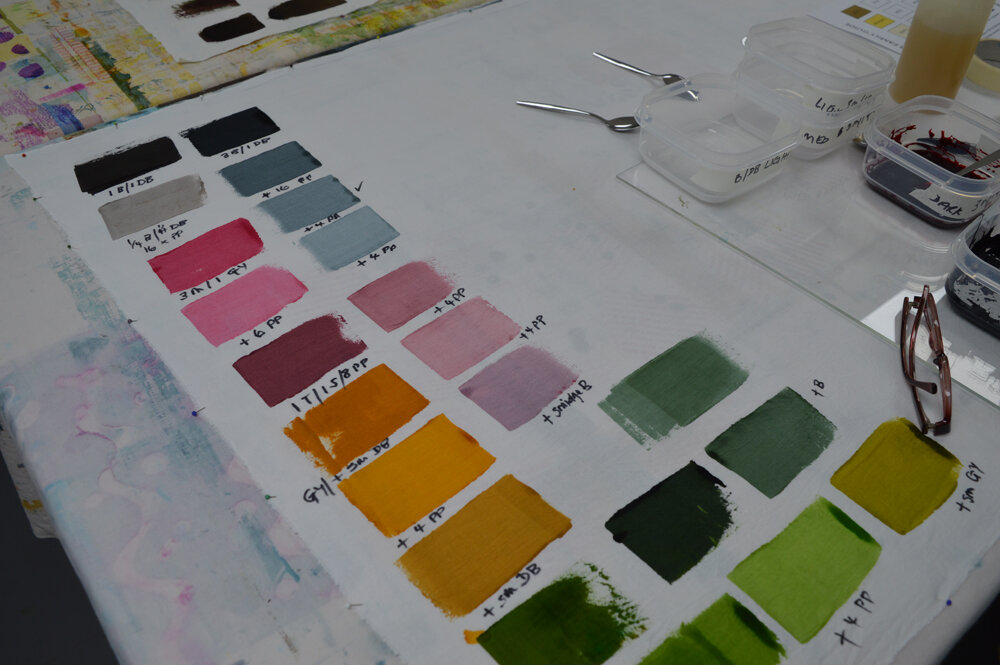
Although you can buy Procion MX dyes in 40 - 50 diffferent colours in the UK I only keep 10 colours in my studio - acid lemon, golden yellow, magenta, scarlet, turquoise, royal blue, black, dark brown, rust brown and petrol green. I could blend rust brown and petrol green myself but buy them pre-blended as I use a lot of them in my own work. The remaining 8 colours I often refer to as my ‘primaries’ - OK they are not all technically primary colours but I use the word to mean a set of colours from which you can blend any colour that you might want. I guess I could call them ‘base’ colours or ‘starting’ colours but the word doesn’t matter. What matters is understanding how they interact as you combine them. For example if you want a vibrant violet purple you need to use magenta as your ‘red’. If you use scarlet as your ‘red’ you will get very frustrated as, when blended with either of my blues (turquoise or royal blue) you will get browny purples not vibrant violets. I love the ohhs and ahhs I get from my students when they understand this and discover how to blend the colours they want. It is so important if you want to control your outcomes when you print with multiple colours of thickened dye.
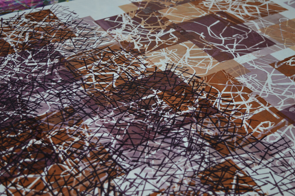
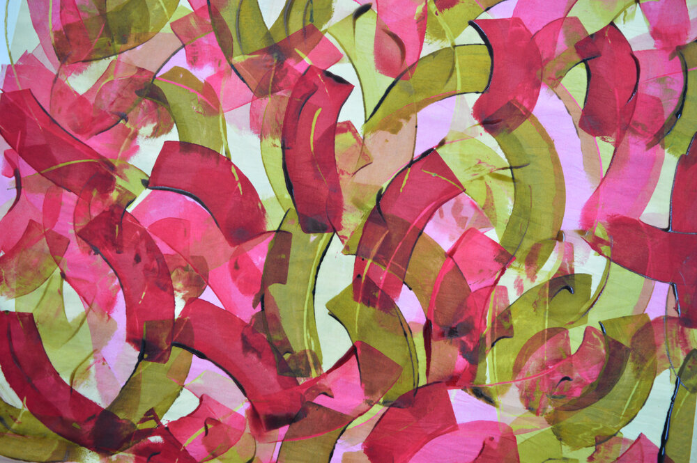
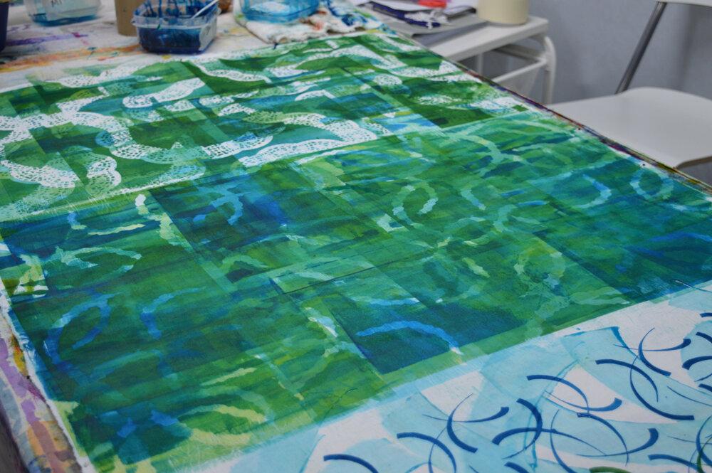
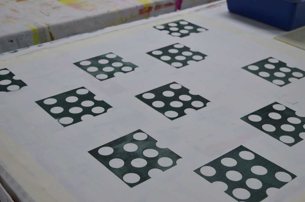
One of these days I will put together a 5 day workshop on colour but for now here is yet more eye candy courtesy of Amanda, Lesley, Barbara, Tracey, Anna and Cat.