Posts in Colour
It's all in the prep!

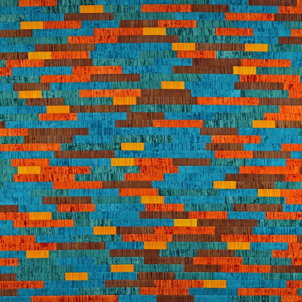
A busy few days in the studio as I prepare for two upcoming events! Festival of Quilts and my upcoming workshops in Telluride, Colorado.

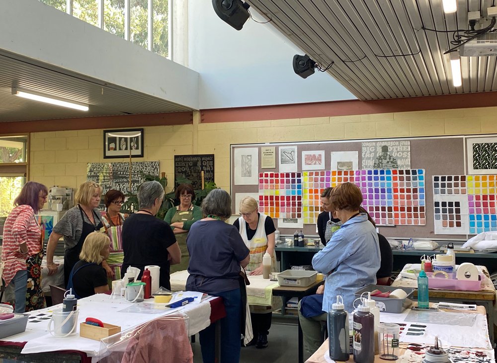
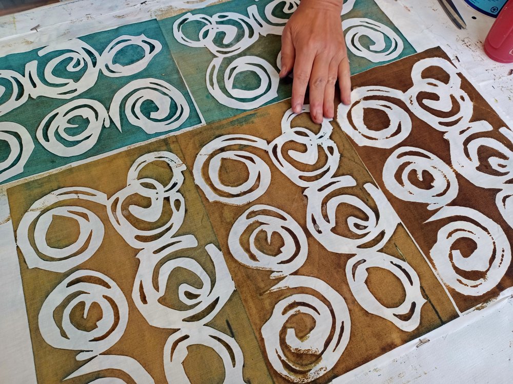
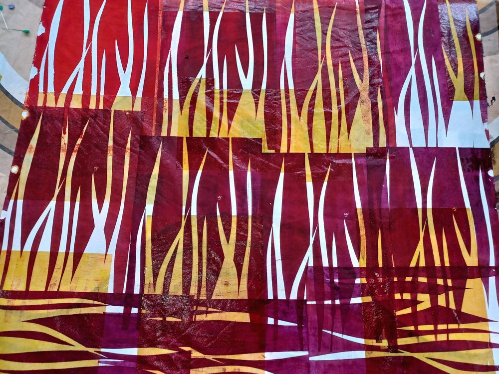
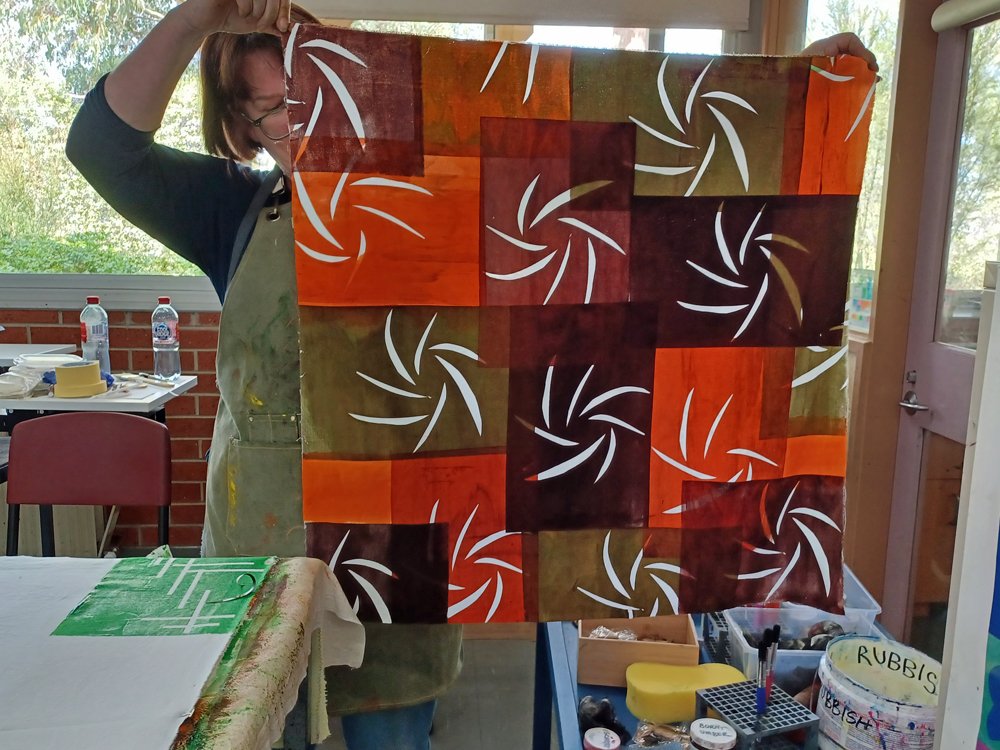
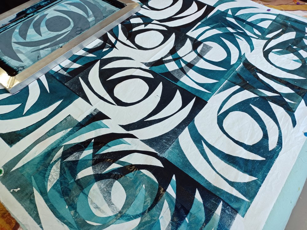
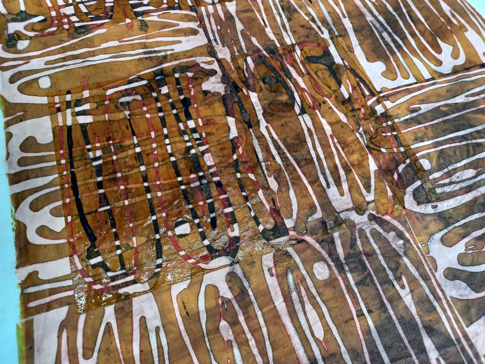
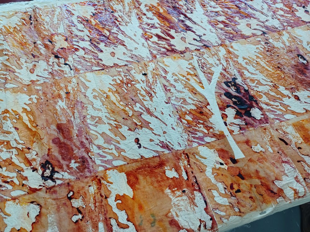
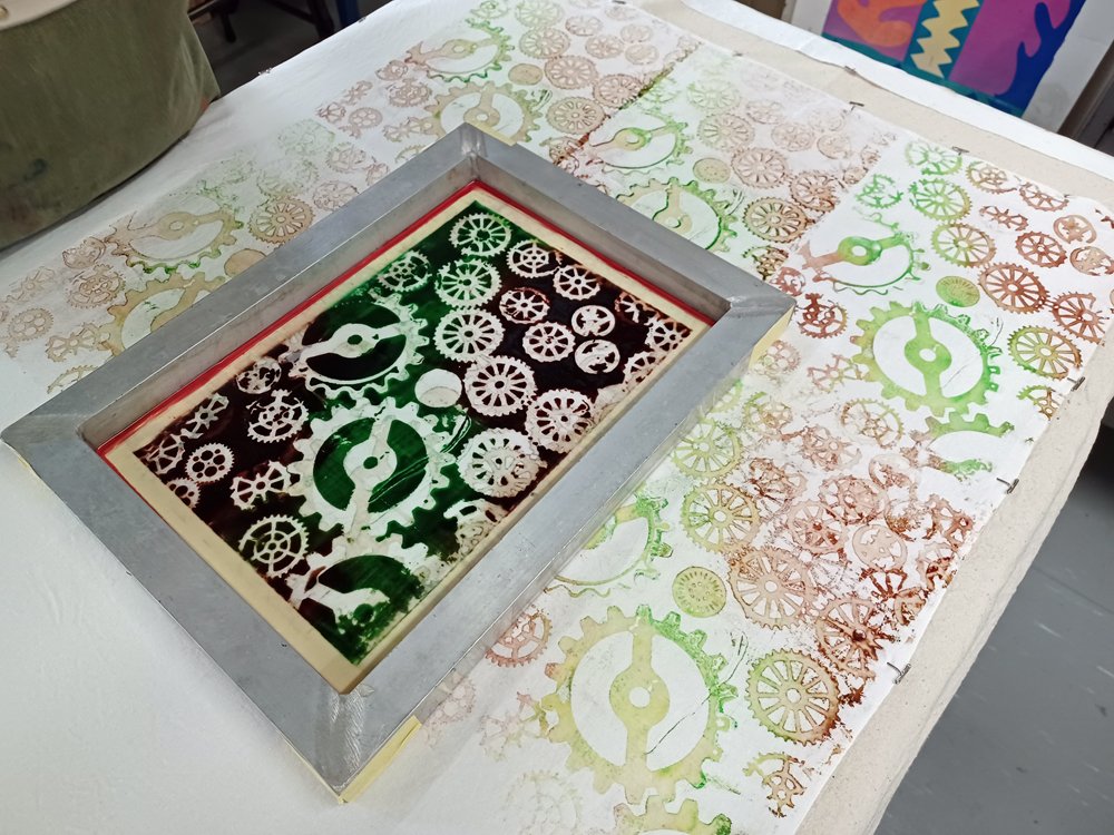
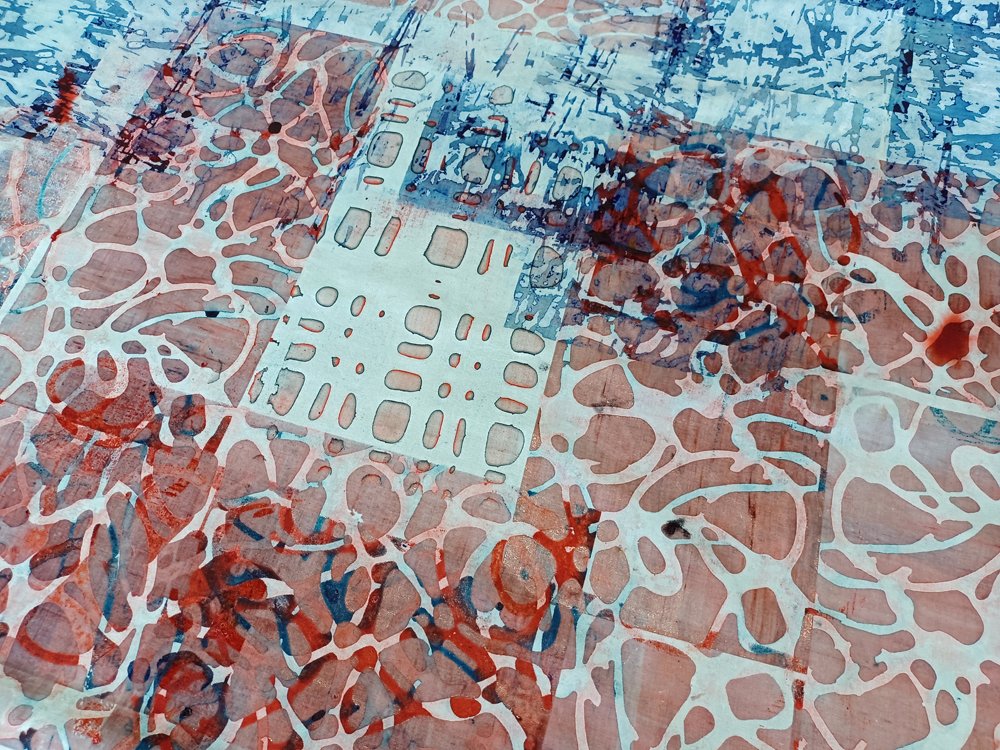
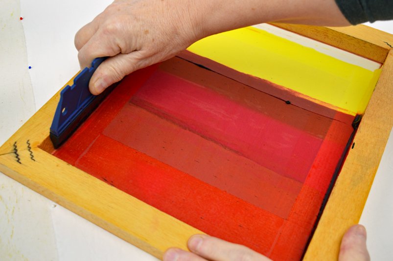
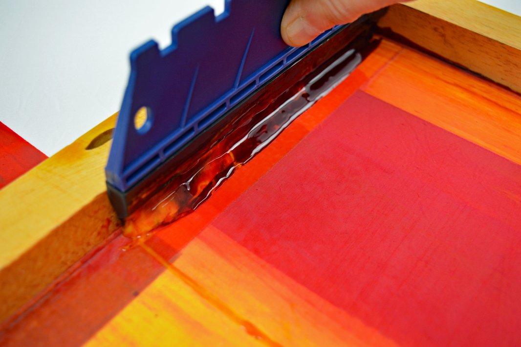
Yes it is Festival of Quilts time again. Where did the year go?? I’m not having a stand this year because of the house move but I will be demonstrating in The Creative Textile Studio on the mornings of Thursday 31st July and Friday 1st August and on the afternoon of Sunday 3rd August. This is the fourth year that myself and Hazel and Terry from InStitches have been organising the Studio and we are a well oiled machine! We each have our designated roles and a well tested packing list. I supply all the dyes, print paste, screens, squeegees and other stuff. So I’ve been busy mixing litres of print paste followed by thickened dyes. I’ve made six breakdown printing screens to use when demonstrating. I’ve also been getting some fabric packs ready to sell on the sales table. There won’t be many so if you fancy a Wonky Inspiration Print Pack you might want to visit the Studio early! We have a wonderful collection of artists demonstraing this year. You can find the timetable and more about each artist by clicking here.

(The Studio is a free feature within the show so the ‘book tickets’ button on the page is for buying tickets for the whole show).

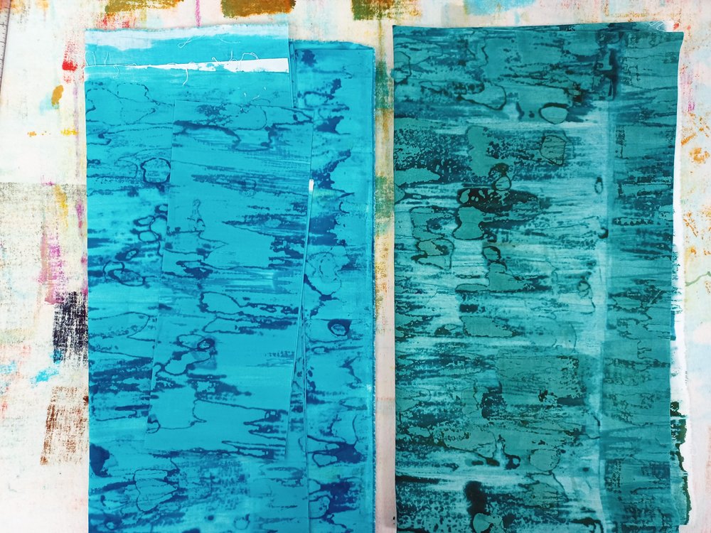
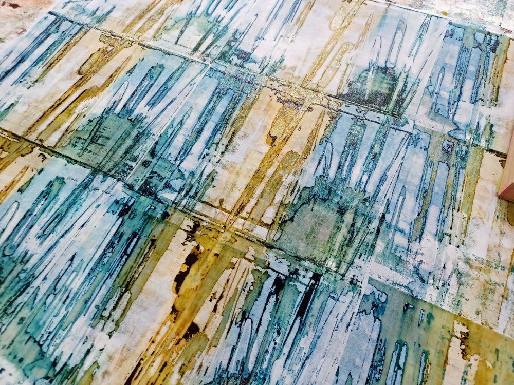
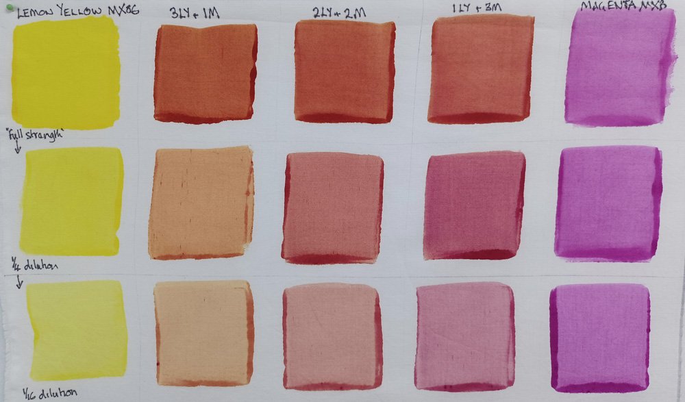
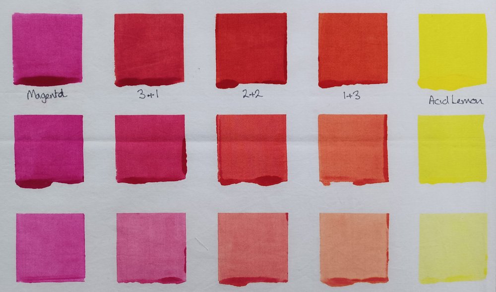
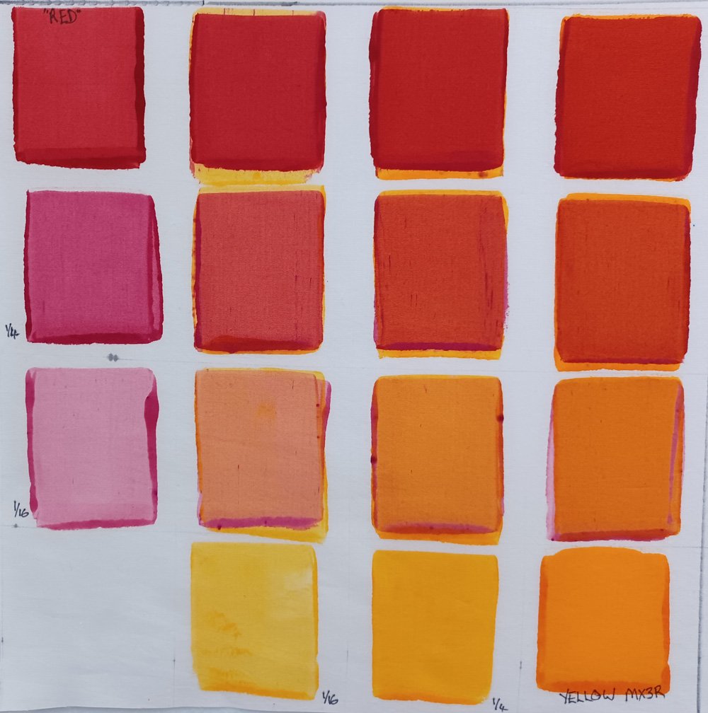
Although it isn’t until the end of September I have been making colour blankets to take with me. I bought small quantities of each of the eight US sourced dyes we will be using during the two five day workshops to make them. I selected the colours online, trying to match as closely as possible to the eight colours (6 co-primaries + black + dark brown) that I use in my studio. Hmmm … so the colours on a screen don’t always match the exact colours that you get. I know this. I even have this disclaimer in my online shop. But it is always a pleasant / not so pleasant surprise …..I haven’t rinsed and washed the blankets yet but Houdini Blue is looking distinctly purple. I’m hoping that the colour shifts towards blue after washing in which case I can see why the colour is called Houdini! If not, well it has made some really lovely muted colours……

And finally, on the house move - we lost our buyer this week so it is back to square one. Knowing that this happens all the time and that it is just a delay doesn’t make it any easier. Thankfully we haven’t committed to anything in Scotland yet so we just need to take a deep breathe and get on with life. Which means that, when I get back from Festival, I’ll have time to get back to making art instead of packing. Which is a good thing.

Art as carrot!

Breakdown Printed Fabrics

Work towards the big move is going well and I think we are still on target to put the house on the market in March although it might be on the 31st! Some areas are looking really good. We cleared all the book cases on the first floor landing and had the hall, stairs, landing and more stairs decorated last week. A new (cheap) carpet will go in next week. We also decluttered the kitchen so that it could be decorated at the same time. The cellars are mostly clear and son Joe has made lots of progress on his and Rileys (grandson) rooms. And I’m about 2/3 through the studio. Big pat on the back!

Next is the ‘dining’ room which is mostly a dumping ground for books, magazines, jigsaws, coats, bags etc and then there is my husbands study. Hmm ….. it is going to be a challenging few weeks. Luckily I can really only sort stuff for a couple of hours at a time before I loose the will to live and am forced, yes forced, to retreat to my studio. For the sake of my sanity.

And I’ve been having a wonderful time printing lots of fabric and working on new art. I’ve been using breakdown printing (what else) to create a palette fabrics that range in colour from a slightly muted blue through some beautiful chromatic greys to a slightly muted brown. I’ve adjusted my printing technique to create fabrics in differing values. The collection is inspired by the colours of the shoreline at Largs, the north ayrshire town that I hope to call home soon. I have one quilt nearly finished and am making good progress on a second piece. Their compositions are simple and abstract. As always I want the printed fabrics to be the stars of the show! As I think about composition I have been thinking about the effect of place on my mental state, a theme I explored several years ago in my Dunure series. I think about family stuff and the path my life has taken in recent years. And I look forward anxiously. So much hard work, so many uncertainties. The one certainty is art. It is my carrot.

Pigment #1

…… because we all deserve some colour in our life during these grey January days!

May I wish you all a very happy and creative 2024 and express my thanks to those of you who have brought my fabric packs! You are definitely worth it ladies!

I thought I would start the year by sharing one of the new pieces I made for my current exhibition (Beneath Our Feet). This isn’t one that was rolling round in my head for ages, instead it popped out as a fully formed idea after seeing an image of a collection of solid coloured vases made by Pilkington Tile & Pottery Company around the turn of the 19th century. Pilkington is one of the inspirations for my Artefact series with all the quilts I have made so far being pale and quite subtle in their colouring. Not this one though …. which is why I have chosen to not call it Artefact 7.

Pigment #1 celebrates the wonderful, brightly coloured glazes developed by the Pilkington chemist Abraham Lomax and others. The development of these glazes was an early example of where scientific advances, in this case in inorganic chemistry, were applied to the art of the potter. Using Dimitri Mendeleev’s newly published Periodic Table as a starting point, the Pilkington chemists carried out hundreds of controlled experiments. Oxides of copper, cobalt and iron were used to add colour to the crystalline, opalescent, eggshell, transmutation and lapis glazes developed by the company.

I selected five colours - golden yellow, rust, dark brown, a turquoise and a green made by mixing turquoise and dark brown dyes. The fabrics were breakdown printed with multiple layers of print to build up the density of marks. I then added a layer of the appropriate colour to both the front and the back of each fabric creating a set of vibrant fabrics. The fabrics were cut into stripes then into different length pieces. I kept all the golden yellow pieces 3 inches long but varied the lengths of the other colours. I then used my usual composition process - I jumbled the fabrics into a big pile, closed my eyes and picked pieces at random. These pieces were laid out in the order I picked them before being sewn together. I did swap out a couple of pieces but that was all.

All good and such fun. I took photos with my camera as I worked so that I could post on Instagram. And something really interesting happened. The image above was taken with my fancy pants camera at 300dpi and is a really good representation of the colours. The image below was taken with my phone at 72dpi …. and the colours look so different even though the lighting conditions were similar. The green is indistinguishable from the blue and the brown looks much more blue than it actually is. Which is really weird. So I used my camera to photograph pieces of the blue and green fabrics with space around the two fabrics (scroll to bottom) and they are very definitely different colours.

The science of colour is fascinating. How we each ‘see’ colour is unique as it depends on the biology of our eyes but also on the interaction of different colours as they are placed side by side. And how we ‘share’ colour is dependent of the devices we use to capture and display colour.

I love it and am looking forward to having a colour filled 2024!

Colour Play in Ballarat

It was an honour to be invited to teach at the Fibre Art event in Ballarat last month and just a little intimidating. One of the other tutors was the brilliant Ester Bornemisza who’s work I have admired for over 20 years so I knew I needed to do a good job! Thankfully my students made that that job so easy. All 12 had previous experience with Procion dyes and 10 out the 12 had experience screen printing and they absolutely flew! Being honest I think I learnt just as much from them as they learnt from me.

We started by looking at colour and specifically colour when using Procion dyes before moving onto different screen printing techniques. Inevitably the group did a lot of breakdown printing but I was also delighted to see great results from loose paper resists. Along the way the whole group helped print a long strip of fabric that was raffled at the end of the event … it raised $70 for the India Project that the Fibre Arts team run.

On the final evening each of the tutors set up a display of their students work. I asked each of my students to pick their favourite two pieces and I think our ‘exhibition’ looked amazing.

Maybe because it was a residential workshop the students really ‘gelled’. So much so that we set up a public Facebook group called Breakdown Printing Australia so that we could keep in touch and, hopefully, grow the love of breakdown printing (which IMHO is pretty blinking amazing) in the region.

So much fabric was printed …… below is some yummy eye candy! I had a wonderful time.

Keep calm (!!&**!!!!). And find a solution.

It is only a few days now until I head to Australia to teach a couple of workshops. I’m excited but the control freak in me is vaguely terrified because I can’t pack up my studio and take it with me. Nor did it make any sense to ship dyes over from the UK when the availability of different dye colours varies regionally.

Although there are lots of different Procion dye colours available I teach colour theory and colour mixing using two yellows, two reds, two blues, a black and a dark brown. So one of the lists I had to send the organizer was a list of the dye colours they should buy from a supplier in Australia. Selecting colours online is not ideal - I’ve lost count of the number of different coloured ‘turquoise’ threads I brought during lockdown in search of the ‘perfect’ turquoise for my Cadence quilts. But I did my best - I picked a lemony yellow, an orangy yellow, a blue-biased red (magenta), a yellow-biased red (scarlet), a turquoise, a blue with a slight red bias, a neutral black and a dark looking brown. And, being the control freak I am, I also ordered some of each dye to be shipped to the UK so that I could recreate my colour references for an Australian audience.

Oh boy. The first colour reference I made was a colour exchange between lemon yellow and magenta (above left). The lemon yellow was a perfect match for the acid lemon I use in my studio. So far so good! The magenta wasn’t, it had a much stronger blue bias than I’m used to……. and the colours I mixed using the Australian lemon yellow and magenta looked distinctly brown compared with my ‘UK’ colour exchange (above, right). Some bad language was used. I persevered, making more colour exchanges with the two Australian blues. Some more bad language was used and I had to deploy the gin.

The next day, after a somewhat slow and fuzzy start, I realised that I would need to find a solution. Keeping my fingers crossed that none of my Australian students would want to use a strong red wasn’t a great solution. I needed to find a strong red that would give me orangey reds when mixed with yellows and lovely violets and fuchsias when mixed with blues. So I made a colour exchange between the two Australian reds hoping that the ‘blueness’ of the magenta would balance out the yellow bias of the scarlet without creating a muted reddish brown. And it worked! The gin bottle could go back in the cupboard!

And I was able to mix some really lovely orangey reds by combing it with the orangey yellow. Phew!!

I’ll be posting lots of images on Instagram as I travel and during the workshops - if there are any more surprises I’m hoping that they are of the good variety and, if not, that I can figure out a solution whilst looking calm, collected and totally professional. And without resorting to the gin!

You can find me on instagram here - https://www.instagram.com/leahhigginsartist/

Simply Screen Printing - coming soon!

Printed using an open screen first in different values of turquoise and brown. With additional line and pattern added using a breakdown printing screen.

It’s nearly here! My new book is called Simply Screen Printing and it is a detailed step-by-step guide to screen printing textiles at home or in a studio. Suitable for absolute beginners but, hopefully, useful to those of you who are already printing. More details to follow but for now here is some eye candy!


Wonky Print Inspiration Packs and Absolutely Darling Hand Dyed Packs!

I had a wonderful time last Sunday at the Great Northern Textile Show. The organiser, Tracy Fox, did an outstanding job and is probably still laid down in a dark room recovering! I put my exhibition up on the Saturday afternoon so saw the transformation from empty sports hall to a buzzing textile show. It was wonderful to see so many old friends and to meet new textile artists and traders. And the cup cakes were gorgeous! Well done Tracy!

I had printed and dyed quite a lot of fabric for the show and sold lots but I have some left over. So I have added them to my online shop. They include a selection of Wonky Print Inspiration Packs and some Absolutely Darling Hand Dyed Packs. You can see them all here.

I’m now in book writing mode so don’t expect to be printing or dyeing more fabric until into the New Year so if you’re looking for Christmas presents or just fancy treating yourself now is the time!

Leah x

How to use those wonderful screen printed fabrics!

Beautiful piece by Elspeth. One piece of breakdown printed fabric brought alive by the insertion of thin strips of hand dyed fabric.

One thing that I hear over and over again is that some fabrics are just too nice to be cut into. It is perfectly OK to stroke fabrics lovingly for a while but screen printed and hand dyed fabrics look even better when they are used. Which is why I developed my 5 day Print, Stitch, Go! workshop. Two days printing and dyeing fabric then three days being brave and cutting into the fabrics. The five students in last weeks workshop did just that. You can see some of their work above and below. Well done ladies!

A simple but effective way of combining printed and dyed fabric by Sue.

Nearly there - Ruth auditioning woven stripes on her quilt.

Sylvia worked small, mirroring the lines in her screen printed fabric by inserting hand dyed strips of fabric.

Gerry’s cut strips ready to start piecing.

I am getting close to the end of my 2022 teaching season. I will be teaching my five day Print Your Palette workshop on 10th to 14th October before switching the studio into writing, photographing and videoing mode for the winter. I still have places on the workshop at the discounted cost of £320 if you want to join me!

What a week!
Day 5.jpg

It may still be doom and gloom in the rest of the world but my studio has been buzzing with good vibes all week!

I have had an amazing response to my first online workshop Breakdown Your Palette. A big thank you to my new students! I had a target in my head that I thought would be brilliant to reach by the end of March and I reached it yesterday …. lots of happy tears in the studio. Together we have raised over £200 for the YoungMinds charity. And it has also allowed me to start refunding deposits to those students who can’t make rescheduled studio workshop dates or who don’t want to travel until they’ve had both jabs - which is an enormous weight off my shoulders.

The only technical hitch so far has been a couple of people who couldn’t see the Sample Video - I use Vimeo to host the videos and they don’t support older versions of some web browsers. The solution is to update your browser.

This week I also received my copy of The Quilter magazine featuring an article I wrote about colour. And I gave my first ever Zoom talk to members of the Contemporary Quilt group. It was about colour. Obviously. The CQ group are a specialist group within The Quilters Guild (UK) and The Quilter is the quarterly magazine published by the Guild. I have been a member for approaching twenty years and am a big fan of all the work they do. I also appreciate the opportunities they have given me, and other tutors, to promote our work.

This week also saw me and hubby getting our first Corona virus jabs. The process was flawless with our wonderful NHS staff being support by volunteers. Another weight off my shoulders.

And finally this was the week when I should have been joining 12 very good friends for our annual five day retreat in the Lake District. The retreat has always been a form of respite … 5 days away from work and away from family. I love my family but I love them more for getting the occasional break! We couldn’t be together in person this year so instead organised a 5 day virtual retreat. Although I wasn’t able to avoid ‘work’ it was lovely sitting at my computer listening to the quiet chatter of old friends via Zoom in the background. We had our usual book review (mine were both about colour), our usual quiz (animal based, I came last) and our usual five day challenge. Janet devised five prompts that took us from a piece of white fabric to a finished vessel. We shared our progress each day, it was joyful. I started by dyeing my fabric turquoise and ended up with a vessel that is the perfect size for holding a bottle of wine! Perfect!