Keep calm (!!&**!!!!). And find a solution.
It is only a few days now until I head to Australia to teach a couple of workshops. I’m excited but the control freak in me is vaguely terrified because I can’t pack up my studio and take it with me. Nor did it make any sense to ship dyes over from the UK when the availability of different dye colours varies regionally.
Although there are lots of different Procion dye colours available I teach colour theory and colour mixing using two yellows, two reds, two blues, a black and a dark brown. So one of the lists I had to send the organizer was a list of the dye colours they should buy from a supplier in Australia. Selecting colours online is not ideal - I’ve lost count of the number of different coloured ‘turquoise’ threads I brought during lockdown in search of the ‘perfect’ turquoise for my Cadence quilts. But I did my best - I picked a lemony yellow, an orangy yellow, a blue-biased red (magenta), a yellow-biased red (scarlet), a turquoise, a blue with a slight red bias, a neutral black and a dark looking brown. And, being the control freak I am, I also ordered some of each dye to be shipped to the UK so that I could recreate my colour references for an Australian audience.
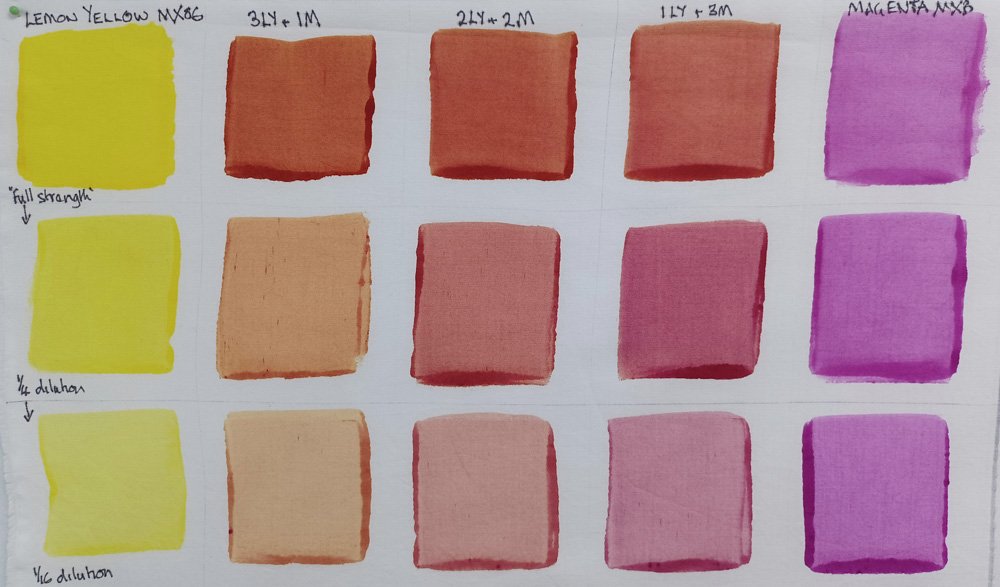
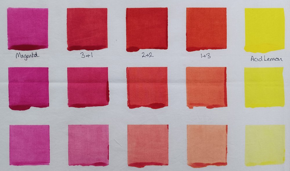
Oh boy. The first colour reference I made was a colour exchange between lemon yellow and magenta (above left). The lemon yellow was a perfect match for the acid lemon I use in my studio. So far so good! The magenta wasn’t, it had a much stronger blue bias than I’m used to……. and the colours I mixed using the Australian lemon yellow and magenta looked distinctly brown compared with my ‘UK’ colour exchange (above, right). Some bad language was used. I persevered, making more colour exchanges with the two Australian blues. Some more bad language was used and I had to deploy the gin.
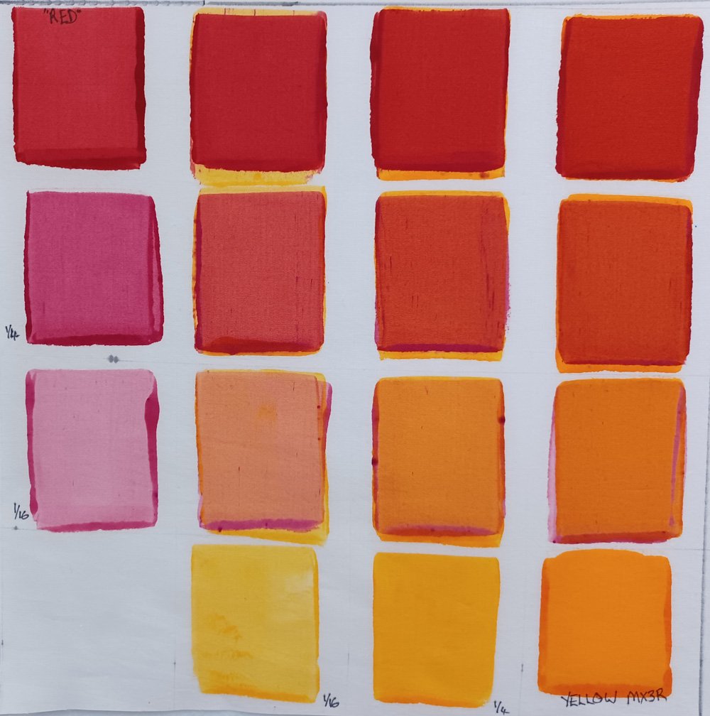
The next day, after a somewhat slow and fuzzy start, I realised that I would need to find a solution. Keeping my fingers crossed that none of my Australian students would want to use a strong red wasn’t a great solution. I needed to find a strong red that would give me orangey reds when mixed with yellows and lovely violets and fuchsias when mixed with blues. So I made a colour exchange between the two Australian reds hoping that the ‘blueness’ of the magenta would balance out the yellow bias of the scarlet without creating a muted reddish brown. And it worked! The gin bottle could go back in the cupboard!

And I was able to mix some really lovely orangey reds by combing it with the orangey yellow. Phew!!
I’ll be posting lots of images on Instagram as I travel and during the workshops - if there are any more surprises I’m hoping that they are of the good variety and, if not, that I can figure out a solution whilst looking calm, collected and totally professional. And without resorting to the gin!
You can find me on instagram here - https://www.instagram.com/leahhigginsartist/