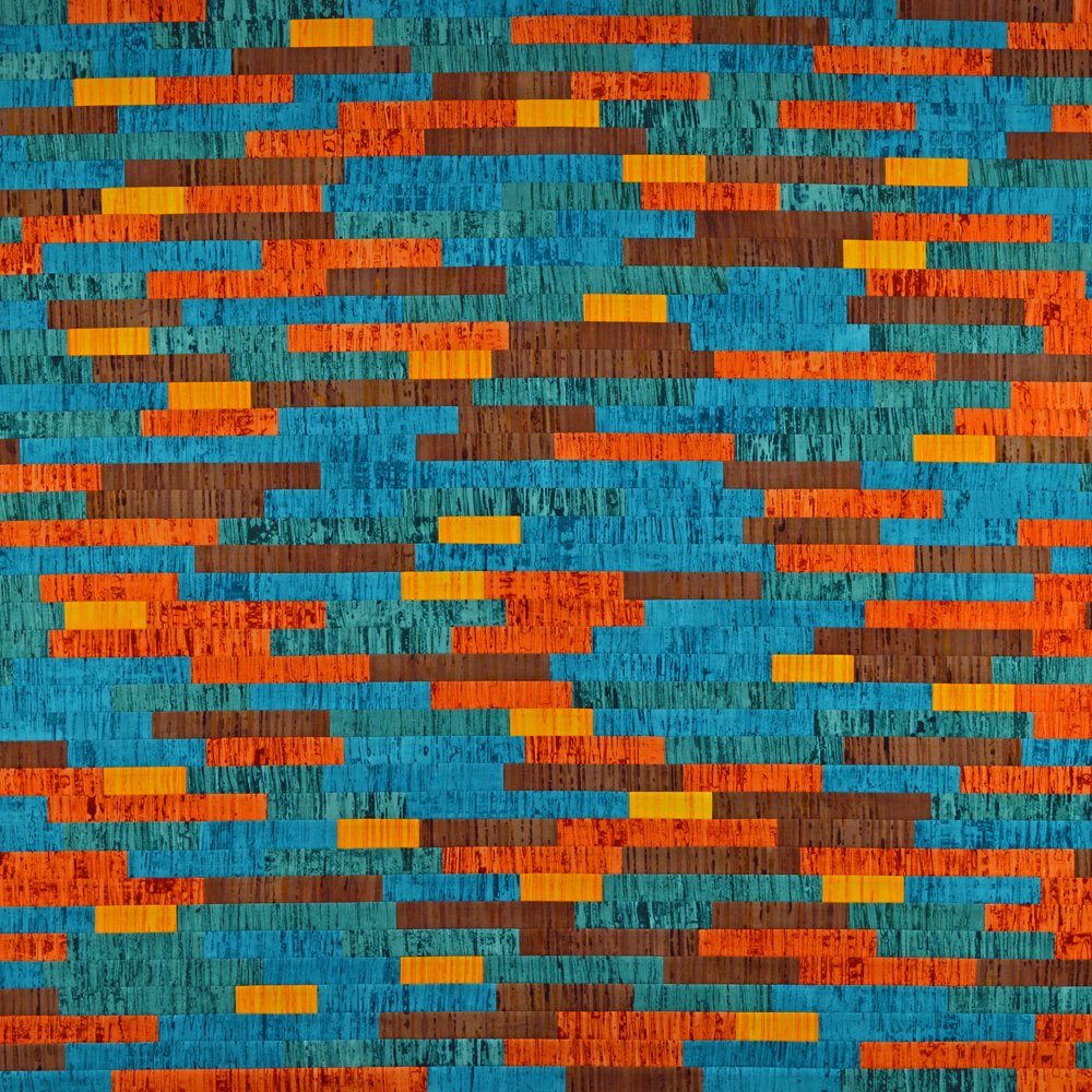
Pigment #1
…… because we all deserve some colour in our life during these grey January days!
May I wish you all a very happy and creative 2024 and express my thanks to those of you who have brought my fabric packs! You are definitely worth it ladies!
I thought I would start the year by sharing one of the new pieces I made for my current exhibition (Beneath Our Feet). This isn’t one that was rolling round in my head for ages, instead it popped out as a fully formed idea after seeing an image of a collection of solid coloured vases made by Pilkington Tile & Pottery Company around the turn of the 19th century. Pilkington is one of the inspirations for my Artefact series with all the quilts I have made so far being pale and quite subtle in their colouring. Not this one though …. which is why I have chosen to not call it Artefact 7.
Pigment #1 celebrates the wonderful, brightly coloured glazes developed by the Pilkington chemist Abraham Lomax and others. The development of these glazes was an early example of where scientific advances, in this case in inorganic chemistry, were applied to the art of the potter. Using Dimitri Mendeleev’s newly published Periodic Table as a starting point, the Pilkington chemists carried out hundreds of controlled experiments. Oxides of copper, cobalt and iron were used to add colour to the crystalline, opalescent, eggshell, transmutation and lapis glazes developed by the company.
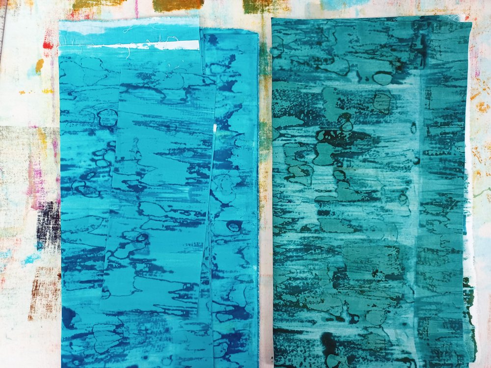
I selected five colours - golden yellow, rust, dark brown, a turquoise and a green made by mixing turquoise and dark brown dyes. The fabrics were breakdown printed with multiple layers of print to build up the density of marks. I then added a layer of the appropriate colour to both the front and the back of each fabric creating a set of vibrant fabrics. The fabrics were cut into stripes then into different length pieces. I kept all the golden yellow pieces 3 inches long but varied the lengths of the other colours. I then used my usual composition process - I jumbled the fabrics into a big pile, closed my eyes and picked pieces at random. These pieces were laid out in the order I picked them before being sewn together. I did swap out a couple of pieces but that was all.
All good and such fun. I took photos with my camera as I worked so that I could post on Instagram. And something really interesting happened. The image above was taken with my fancy pants camera at 300dpi and is a really good representation of the colours. The image below was taken with my phone at 72dpi …. and the colours look so different even though the lighting conditions were similar. The green is indistinguishable from the blue and the brown looks much more blue than it actually is. Which is really weird. So I used my camera to photograph pieces of the blue and green fabrics with space around the two fabrics (scroll to bottom) and they are very definitely different colours.
The science of colour is fascinating. How we each ‘see’ colour is unique as it depends on the biology of our eyes but also on the interaction of different colours as they are placed side by side. And how we ‘share’ colour is dependent of the devices we use to capture and display colour.
I love it and am looking forward to having a colour filled 2024!


