I feel like I have arrived

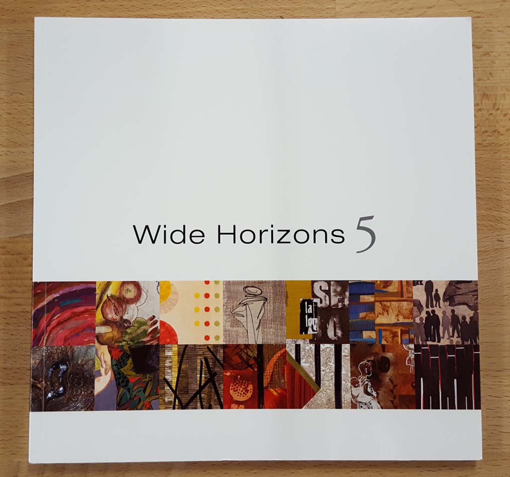
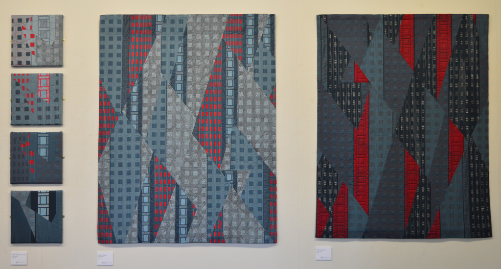
I have had a very successful couple of years with multiple pieces being accepted into some pretty prestigious exhibitions but today I realised just how far I have come. I received my copy of the catalogue for Breakout: Quilt Visions 2016 which features my piece Ruins 4. A few days ago I received my copy of SAQA's Wide Horizons V which features one of my Storm pieces. Breakout: Quilt Visions 2016

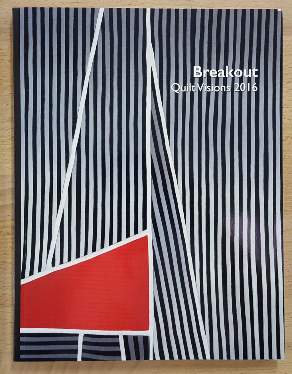
It feels like an unbelievable honour to appear in print alongside some of my 'heroes' - Gail Barr, Jette Clover, Jane Dunnewold and Wen Redmond. The selection of work in Breakout is amazing, Although the majority of artists are American most of the work is abstract rather than the more pictorial work that is popular in the US art quilt community. The exhibition is currently running at Visions Art Museum in San Diego. Unfortunately it doesn't tour which is a real shame as I would have loved to see all the pieces in the flesh.

Jette also has a piece in Wide Horizons along with some of my other favourites - Susan Chapman and Sandra M Newton. Actually I like all the pieces in this exhibition and look forward to seeing it at some stage whilst it tours in Europe.

SAQA UK - first meeting

It was my great pleasure to attend the first ever SAQA UK meeting held yesterday in Milnrow, Lancashire. SAQA (Studio Art Quilt Association) are an US based organisation but they do have a couple of hundred members in Europe and 66 here in the UK. Whilst the organisation provides some really great exhibiting opportunities it is inevitably 'US-centric' and it can be difficult for those of us making very abstract work to break through. Christine Seager, one of the SAQA Europe Reps, has initiated the UK meetings to provide more targeted support for UK members both within SAQA and in their endeavours outside SAQA. If successful she hopes that the model can be rolled out across Europe. I suggested Milnrow as a suitable meeting hall that I have booked in the past for the Etcetera group. And, of course, I took along my coffee pot! Christine and Gillian Travis lead lively discussions on what SAQA means to its members and how the UK meetings can support and promote the growth of a professional quilt / textile artist community. There will be another meeting near London early next year and I really hope that many more SAQA members will attend.

Part of the discussion was on exhibiting opportunities. SAQA currently run a biennial exhibition for members in Europe and the Middle East called Wide Horizons. (My piece Storm 2 (Dark) is currently touring with Wide Horizons V and I was delighted to get my copy of the exhibition catalogue yesterday!). Christine has fought hard and got two more opportunities for European members. The first is called Made in Europe I and will tour in the US though 2017. It is the perfect opportunity for European work to be seen by tens of thousands American quilters. The second has yet to be officially announced but will be Made in Europe II and will be shown alongside the SAQA Tranquility and Turmoil exhibition at next summers Festival of Quilts.

Wide Horizons 5


Pretty in Pink?

Using thickened dyes to create new colour families 
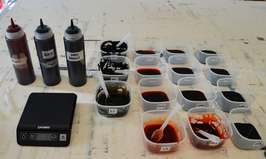
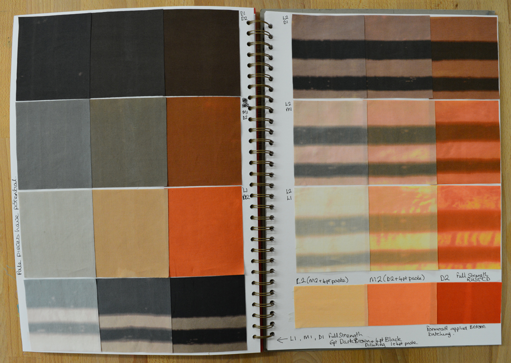
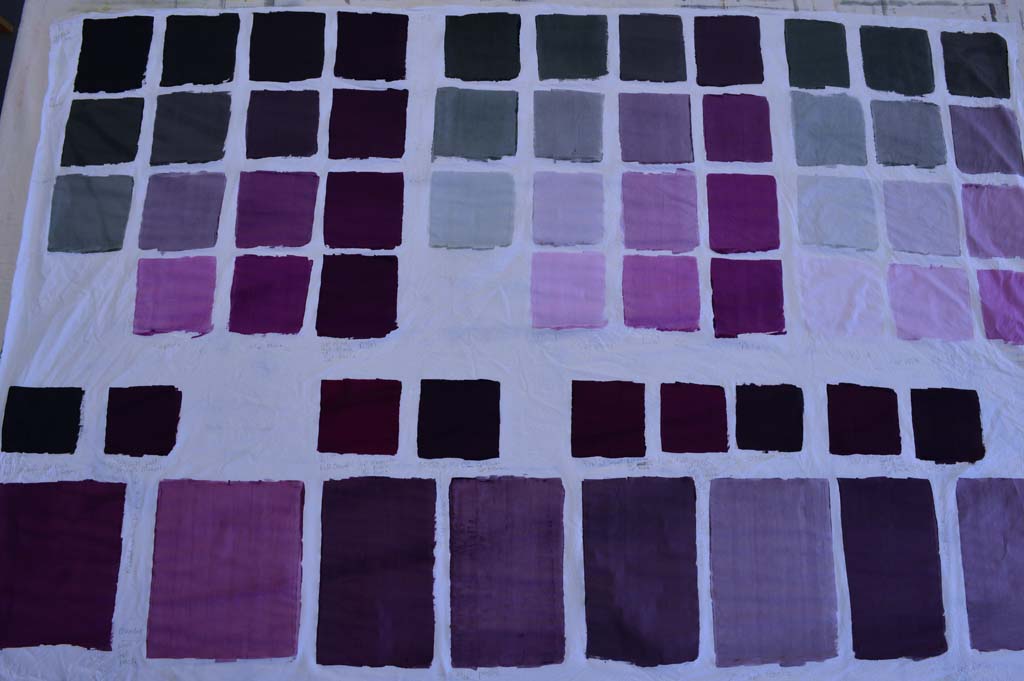
I've written about colour families before. I learnt about them on a wonderful class with Leslie Morgan. Essentially a colour family is created when you cross mix a dark, medium and light shade of two base colours. You can dye colour families or you can blend them using thickened dyes. My Hidden Message series used a dyed colour family because I wanted to create a collection of cloth with flat colours that I could then print on top of. The fabrics I used in my Ruins series were mostly breakdown printed using a colour family of thickened dyes.

The BIG IDEA that is rattling around my head will also feature breakdown printing so I have been making colour families using thickened dyes. I have already decided that one of my base colours will be a neutral black. And because I record everything I do I know how to make it with a mixture of black and dark brown. (The black dye I buy from Kemtex is actually a very, very dark blue so it needs the addition of brown to balance it).

But my idea for my second base colour was a little vague. So my first step was too blend different amounts of magenta with black and then to blend a 50/50 mix of that with my neutral black ... sounds a little confusing but I keep notes as I go. I then auditioned this 50/50 mix by diluting it with print paste to see what lighter shades would look like. I also decided to see how each of the colours would change if discharged with a thickened Formosol paste. As you can see my first attempts were very definitely still pink.

I liked the look of my fourth attempt (above, right) so then blended a full 15 piece colour family. I only needed very small amounts of each colour which is why I have a set of scales that measure to the gram! Again I discharged areas of each colour swatch.

And because my BIG IDEA is going to use very pale versions of the colour family I created an extended colour family by cross blending medium, light and very light shades of my neutral black with medium, light, very light and very very light shades of my second base colour. There are some wonderful greys here and this is definitely a very pretty colour family. But, having washed, dried, ironed, cut out swatches and put them into my sketchbook I still think it is too pink! Back to the bench Leah!

Back before the bench

I have a confession to make - I have let 'being kind to myself' because I started a new day job 5 weeks ago slide into procrastination. Now I don't mind 'value added' procrastination such as deep cleaning the studio before starting a new project. But I have been guilty of non-value added procrastination .... did I really, really need to finish watching all those Walking Dead boxed sets? Hmm - probably not! Mixing a new colour family

So how am I going to get back into a good studio habit? I'm going to do one of those things that I love most of all. I am going to develop new colour families. I have had a BIG IDEA brewing for a while and have decided that now is the time to start working on it. Inevitably (as with the colour family I mixed this week) I will waste quite a lot of dye and cloth before I get something that replicates the colours in my head. However I always keep good records of everything I mix so, in one sense, nothing is wasted. And yes I always uses scales to make sure my colour families are reproducible.

Colour family made with a 60/40 Dark Brown/Black blend and Rust. Each colour was also discharged using Formosol.

Photographing my work (again)

Happy today? (detail) 
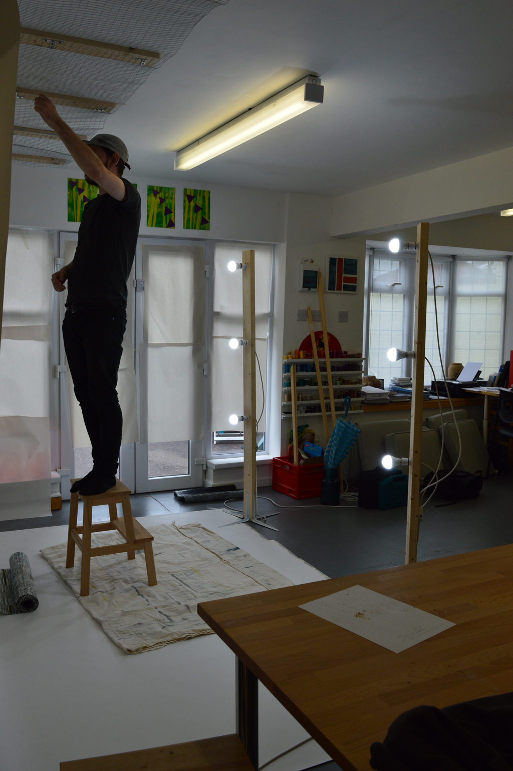
When I needed to photograph a really big Ruins piece in August I ended up borrowing a studio and some lighting. (The design walls in my wonderful studio just weren't big enough.) And whilst I was happy with the result it was a lot of effort to 'book' the studio, transport the quilt etc. So, with help from son Cal, I have built a system that will allow me to photograph big pieces and 3D pieces in the comfort of my own studio. Just in time to photograph my latest piece 'Happy today?' which is a double sided long thin piece designed to hang from the ceiling and pleat onto the floor.

We brought a 2.7m wide roll of photographic backdrop paper which sits on a narrow shelf built onto one of the long beams in the studio. This allows me to drop the paper down and along the floor. We brought a roll of metal mesh and used wood battens to fit a length to the ceiling in front of the backdrop roll. In the photo below Cal is using picture hooks and nylon hanging thread to suspend the quilt about 30cm in front of the backdrop. Cal made me two lighting stands. Each is a 6ft length of timber with four 10inch shelf brackets attached to the base to provide stability. He drilled out 3 holes on each upright through which he has attached regular bayonet light fittings. Having inherited my 'tidy' gene Cal put a junction box on each upfright so that each is run off a single plug. We used six non-directional cool white light bulbs to gave lots of good light although I need to invest in a better way of cutting the light from the french doors as this gave us a bit of problem with shadows.

Once we had finished photographing the piece we rolled up the paper and stored the lighting stands. (And moved tables, chairs and print benches back in place!). We have already decided that the system could be improved. Sometime before I use it again we need to get a 2.8m wood or metal pole to hang the roll of backdrop paper from so that it drops without any distortion. We need to replace the wire mesh with something more heavy duty especially if I want to photograph bigger, heavier pieces. And we need to paint everything white so that it looks nicer! Well maybe 'need' is a bit of an exaggeration but I do have the 'tidy' gene!

Being kind to myself

Dunure 3 Shadow box framed by Manchester Customer Framing After a 'career break' of three months I started my new day job last Monday. New job, new people, new systems, new products, new processes and new responsibilities. And a new car, laptop and phone. It has been both energising and exhausting but, so far, thoroughly enjoyable.
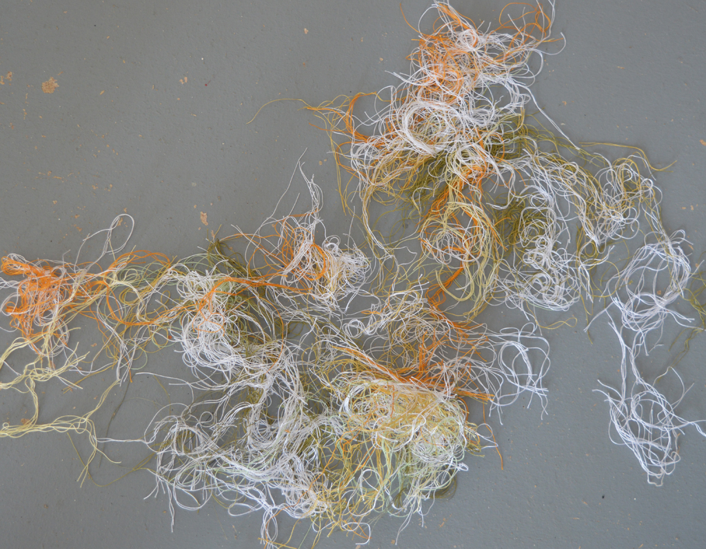
Even though I have a deadline looming for the piece I'm currently working on I decided to be kind to myself and to drop my usual weekly target of 20 hours in the studio. I also made sure that I had no commitments this weekend so that I could relax and recover from what has been a very full-on week. Actively planning to take time off from the studio is quite hard for me to do as I have a bit of a 'superhuman' complex and routinely push myself hard. But I am glad I did. I have gone to bed early a few nights, read a book, watched some TV and enjoyed a few cups of coffee in the garden. I feel full of energy and am looking forward to my alarm going off at 6.30am tomorrow morning!

The other way I have relaxed .... several hours quietly stitching in ends. After all it would have taken a truly superhuman effort for me to stay out of the studio for a full week!

Hidden Message - Working in Series

Hidden Message 4, 5, 6, 7, 8 and 11 The new Etcetera exhibition opens at Stockport War Memorial Art Gallery this Saturday and runs to 15th October. There is a preview between 7 and 9pm tomorrow (Friday 9th) if you are in the area and want to stop by.

I am showing these pieces from my Hidden Message series. There are four small tiles stretched over canvas and two quilts. Hidden Message was the first time that I intentionally decided to create a series of pieces from one source of inspiration. It has been an interesting learning curve - my starting point came from trips to Shanghai and the really bizarre cultural conflict between modern, urban China and it's one-party politics. My initial ideas involved bright colours, teapots, brand names and neon advertising signs. I made one piece, called No Time for Tea, which I loved but felt absolutely no desire to progress.

Instead I switched to a complex, muted colour family, broken fragments of skyscrapers and fabrics printed with words associated with censorship. I created two large pieces. Hidden Message 2 was originally 12 separate sections stitched onto a fabric background and Hidden Message 3 was originally 4 banners joined at the top. Both of these pieces were eventually cut into separate tiles, stretched over canvas and shown in the Etcetera exhibition at Ryedale Folk Museum earlier this year.

I kept working in this complex colourway eventually creating the Hidden Message Skyscrapers set of 8 panels. But I also decided to try out the fragmented structure and patterns in a restricted colour palette of shades of grey and red. The resulting pieces have always felt like odd-balls. They just don't 'work' if I put them alongside other pieces from the series. At one stage I was considering throwing them away but I'm glad I didn't. The exhibition in Stockport has given me the opportunity to hang them together and to assess them away from the other pieces in the series. They are their own little mini-series!

I found my 'voice' but where is the volume dial?

Work in Progress 
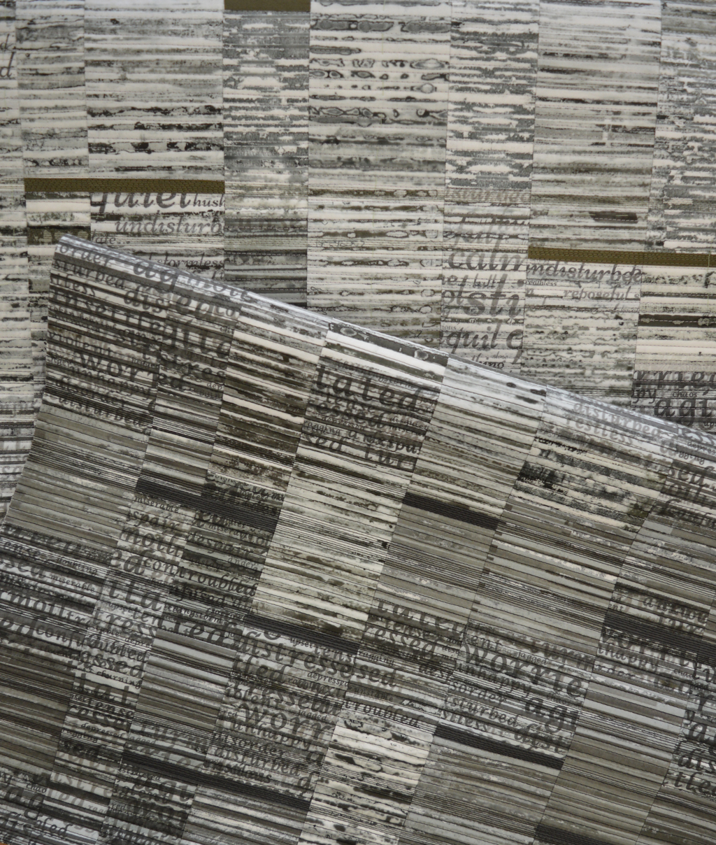
Over the last couple of years I have definitely found my 'voice'. Or my 'visual style'. Or whatever you want to call that sense of confidence that comes from developing a set of processes (or studio practice) that transforms ideas into finished pieces that are recognisably 'me'. I can point to three things that helped - making a conscious decision to work in series, attending a Colour Studies course with Leslie Morgan and moving into my purpose built studio.

I currently have two 'active' series. The Ruins series which has given me so much success and the Still / Storm series which still feels in it's infancy. In both cases I started by developing a colour palette then developed a set of printed and / or dyed fabrics. I collage and stitch samples during which ideas for 'full sized' pieces start to flow. Some ideas are very vague and require more sampling. Other ideas pop up fully formed. And demanding attention. Like the piece I am working on now.

I keep a list of potential 'calls for entry', particularly those without a theme or size restrictions. But I let the work itself dictate what size and even what form my finished pieces will take. And I no longer give in to the temptation to create 'one-offs' to fit a specific call for entry. This limits where I might place my work but sometimes there is a really good match between my work and a particular call. Such as the current SAQA 'Layered Voices' call. The piece is going to be 4 metre long strip hung such that the bottom section is draped and partially hidden on the floor. It will be double sided. And stitched with hundreds and hundreds of parallel lines. And every end of thread will be carefully sewn in. So shouted my voice!

Unfortunately my voice does not care that the call ends on 30th September and that I start a new day job on the 12th. Or that we are hanging the next Etcetera exhibition at Stockport War Memorial Art Gallery this week. Ho hum. Better get back to my sewing machine!

Taking a break

What better way to spend Bank Holiday weekend then with my friend Ruth Brown. We try to meet up two or three times a year in one of our studios for some dedicated 'play' time. This time I visited Ruth in her studio on Sunk Island and took over all my book making stuff.  In between lots of catching up, coffee and cake (and some experimental work with breakdown printing that I will share later) I finished a book that I had started during our family holiday in June. It is just smaller than A5 and I used a waxed, coloured linen thread and coptic stitch to join the book covers to the signatures (paper). Really happy with how neat the stitching looks! 30 August 2016 1

I also took over some mulberry paper to see how it performed when making bookcloth. My previous pieces have all used Kozu paper which is a little pricey. The mulberry paper (from Colourcraft) worked beautifully. I have covered 3 boards ready to make a sort of 'double' book in which one of the boards is a common back board. This is a seriously addictive hobby!