 I've written about colour families before. I learnt about them on a wonderful class with Leslie Morgan. Essentially a colour family is created when you cross mix a dark, medium and light shade of two base colours. You can dye colour families or you can blend them using thickened dyes. My Hidden Message series used a dyed colour family because I wanted to create a collection of cloth with flat colours that I could then print on top of. The fabrics I used in my Ruins series were mostly breakdown printed using a colour family of thickened dyes.
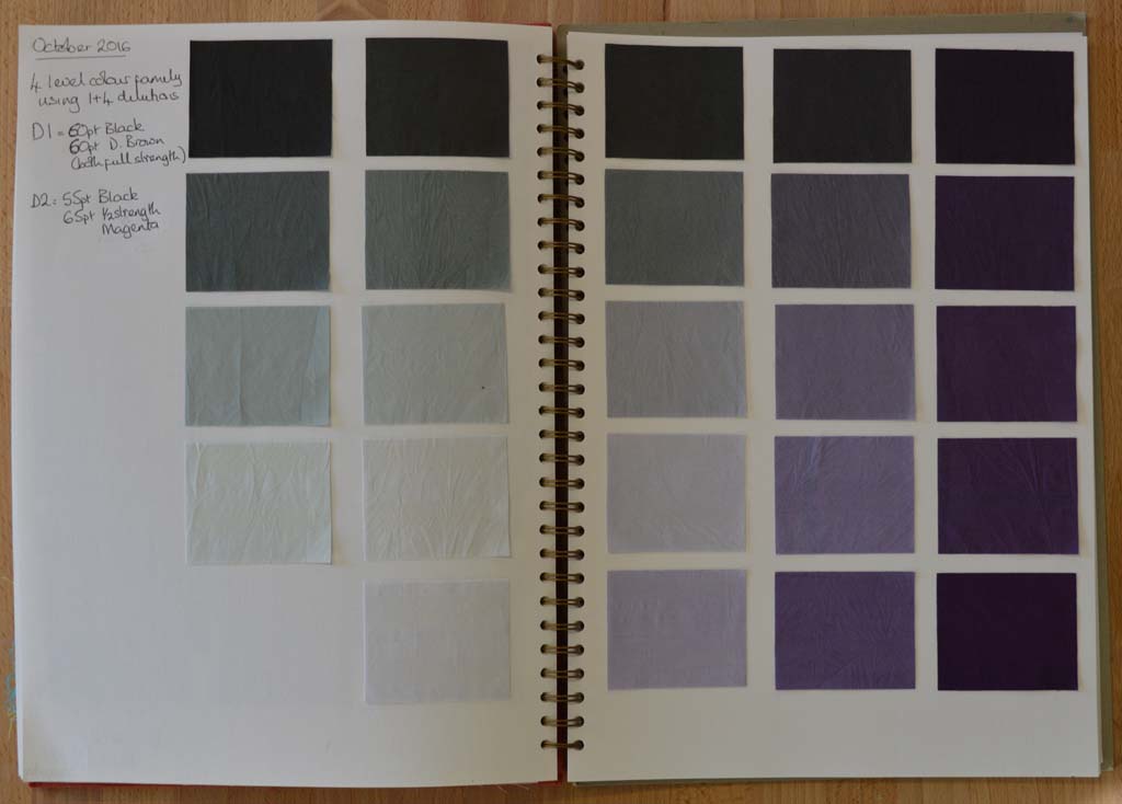
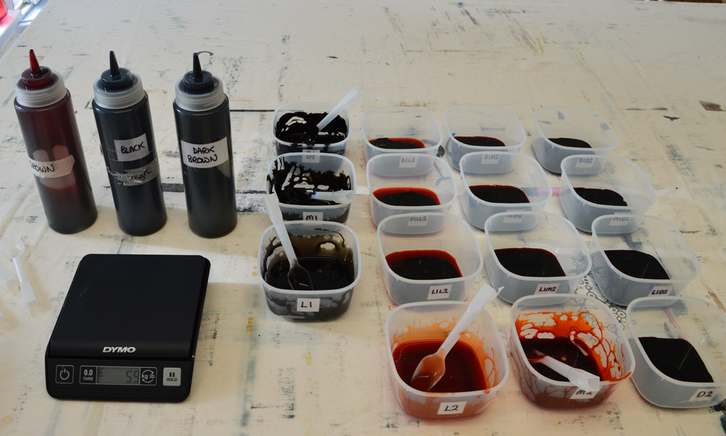
The BIG IDEA that is rattling around my head will also feature breakdown printing so I have been making colour families using thickened dyes. I have already decided that one of my base colours will be a neutral black. And because I record everything I do I know how to make it with a mixture of black and dark brown. (The black dye I buy from Kemtex is actually a very, very dark blue so it needs the addition of brown to balance it).

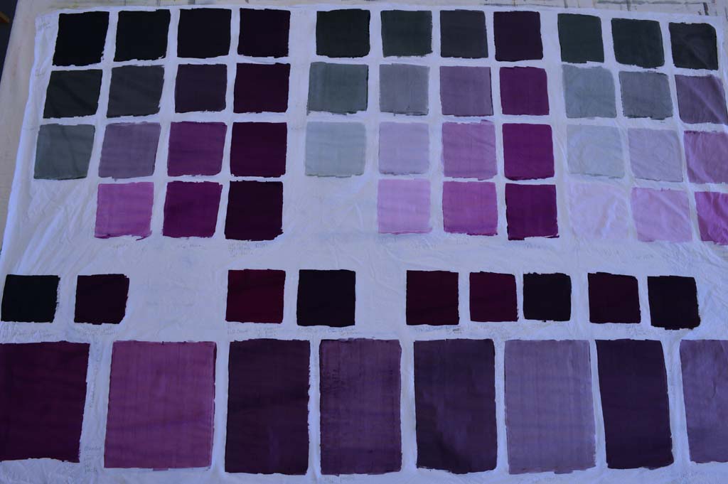
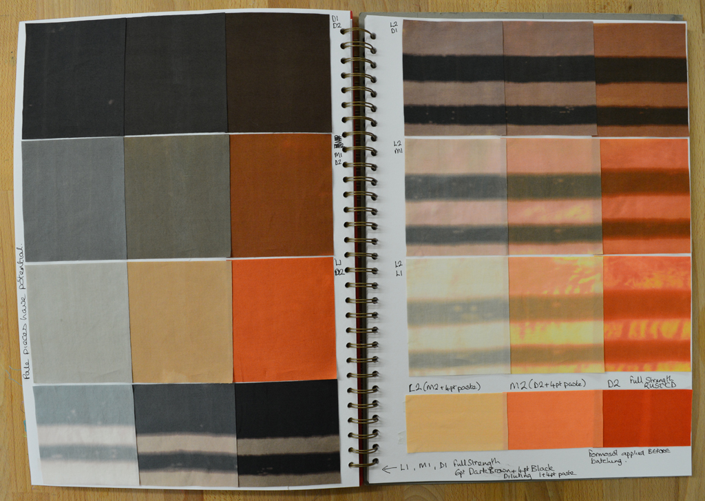
But my idea for my second base colour was a little vague. So my first step was too blend different amounts of magenta with black and then to blend a 50/50 mix of that with my neutral black ... sounds a little confusing but I keep notes as I go. I then auditioned this 50/50 mix by diluting it with print paste to see what lighter shades would look like. I also decided to see how each of the colours would change if discharged with a thickened Formosol paste. As you can see my first attempts were very definitely still pink.

I liked the look of my fourth attempt (above, right) so then blended a full 15 piece colour family. I only needed very small amounts of each colour which is why I have a set of scales that measure to the gram! Again I discharged areas of each colour swatch.

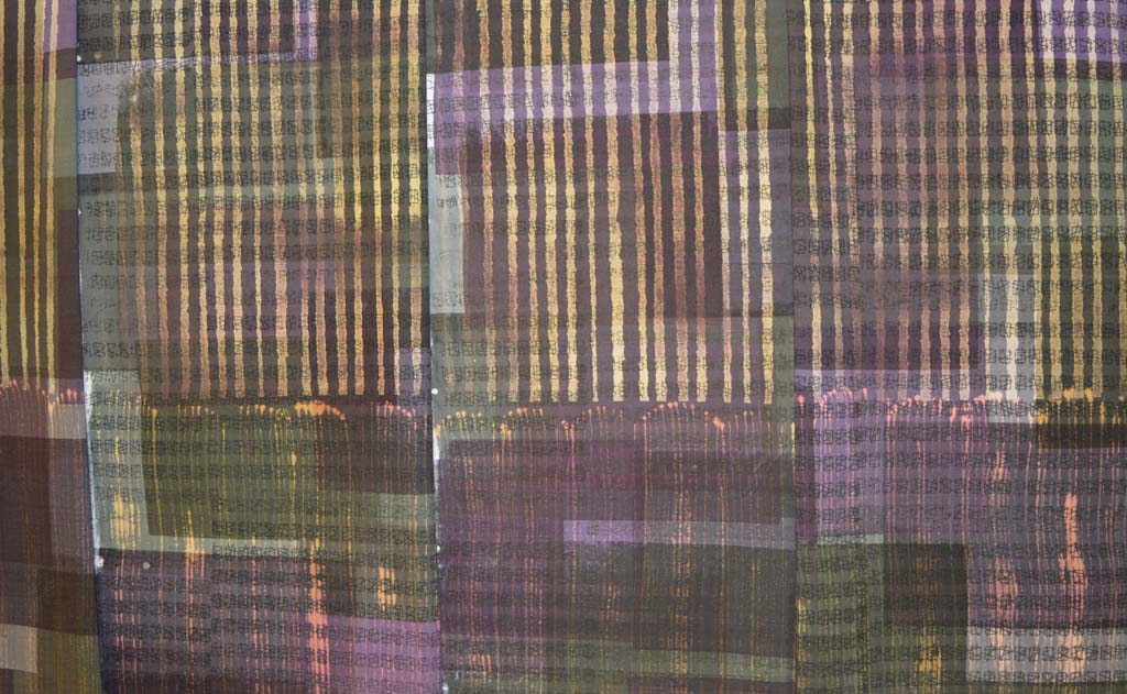
And because my BIG IDEA is going to use very pale versions of the colour family I created an extended colour family by cross blending medium, light and very light shades of my neutral black with medium, light, very light and very very light shades of my second base colour. There are some wonderful greys here and this is definitely a very pretty colour family. But, having washed, dried, ironed, cut out swatches and put them into my sketchbook I still think it is too pink! Back to the bench Leah!

 I recently posted that I can't created in chaos. And that messy in my studio is when there are snippets of thread and fabric on the floor. Well I got really, really messy (for me) over the long weekend we have just enjoyed in the UK. I also got sore feet from standing for hours. And my rotary cutter needed a long lie down in a dark room afterwards. But look what I got in return - trays of cut 'bricks' and bondaweb backed 'brickettes' ready to build backgrounds in my Ruins and my View series.
 I started sampling ideas for my new series using a selection of dyed fabrics pulled from my stash. Early outcomes did not exactly grab me so I also tried using stencils to take colour out (discharge) and to add colour. Interesting but still not right. I added back colour. And got rather depressed until I decided to change the scale and to add stitch. Bingo!
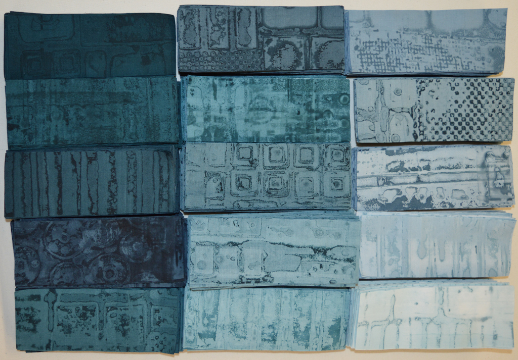 None of us arrive where we are fully formed. When our first child was born my husband and I barely knew how to change a nappy. We learnt how to be parents 'on the job'. Didn't always get it right (sorry kids!) but we had no choice but to keep 'practicing', to keep learning.
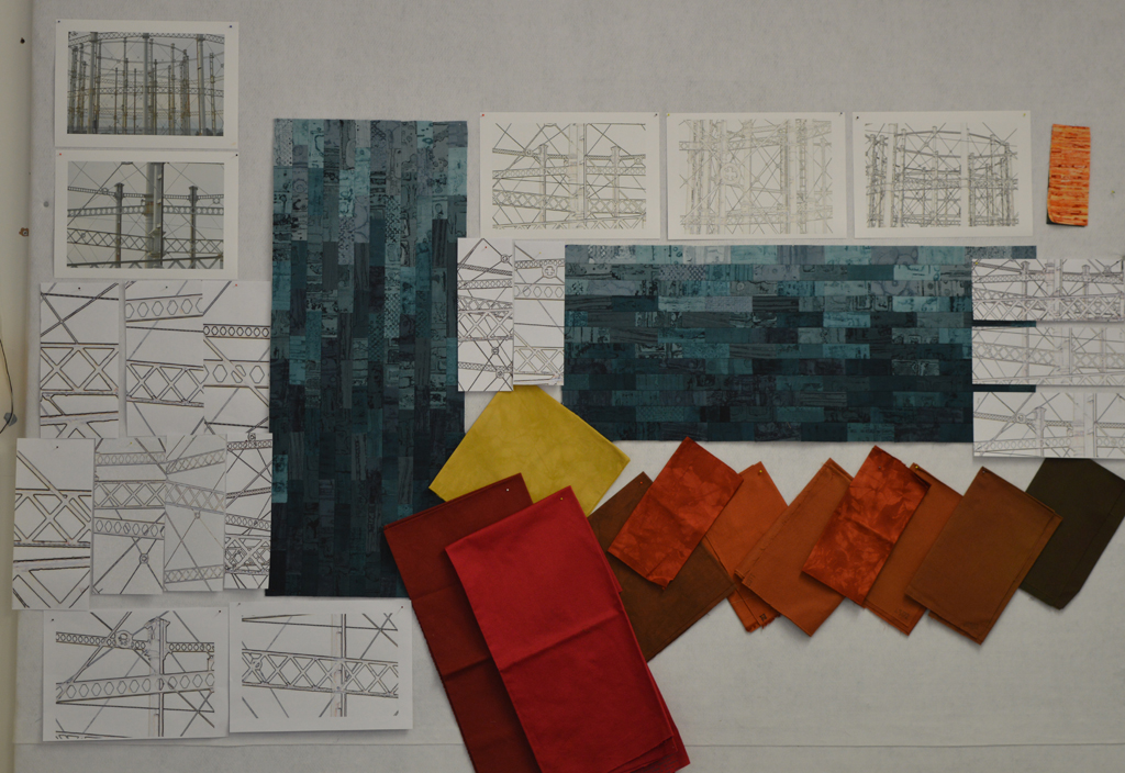
 It is a good job that I have a Plan B as my experiments over the last week or so have failed to give me a 'WOW' moment. The results didn't even fall into the 'Ugly Duckling' category of pieces that might fit in with what I'm trying to achieve with some additional process. The experiment has been educational but not in any way that is connected with what I think I'm trying to achieve.
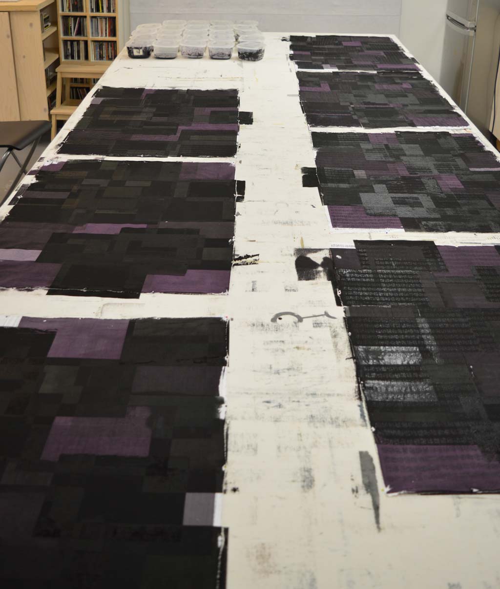
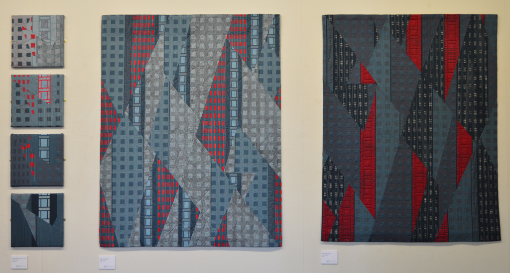
 After multiple attempts I am now happy with my new colour family. I am calling it 'traces' as I'm hoping to use it to create a new body of work based on iconic industrial buildings that no longer exist. I spent my childhood summers staying with my grandparents in a small village north of Nottingham. The area was criss-crossed with coal seams and every journey took us past pit heads. These buildings don't exist anymore but I bet most people my age who spent time in the north of England know exactly what I am thinking off.
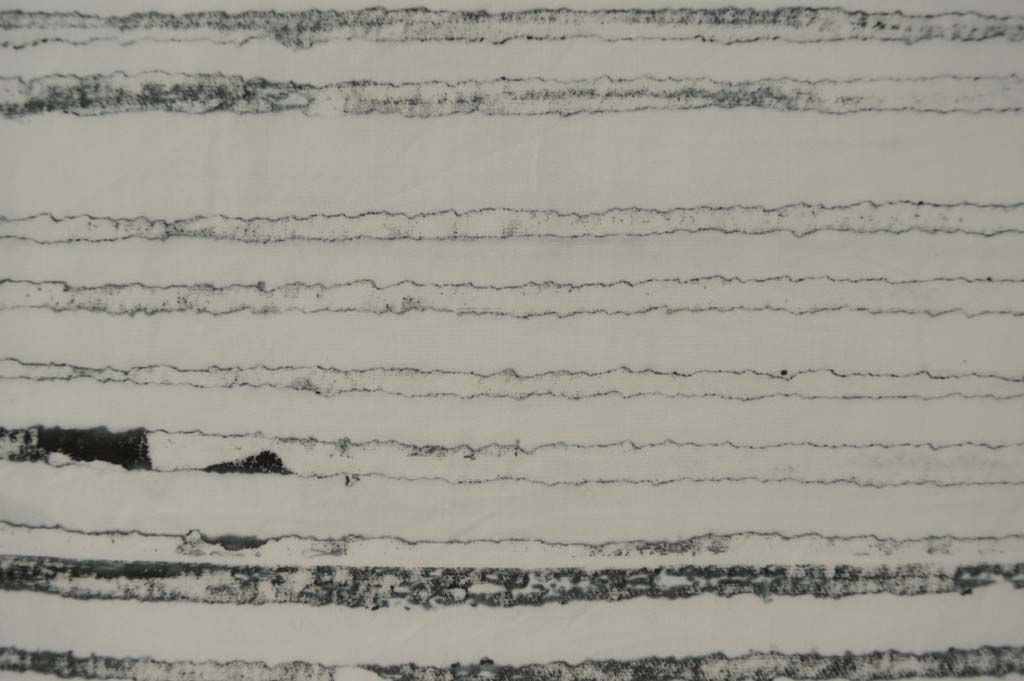
 The new