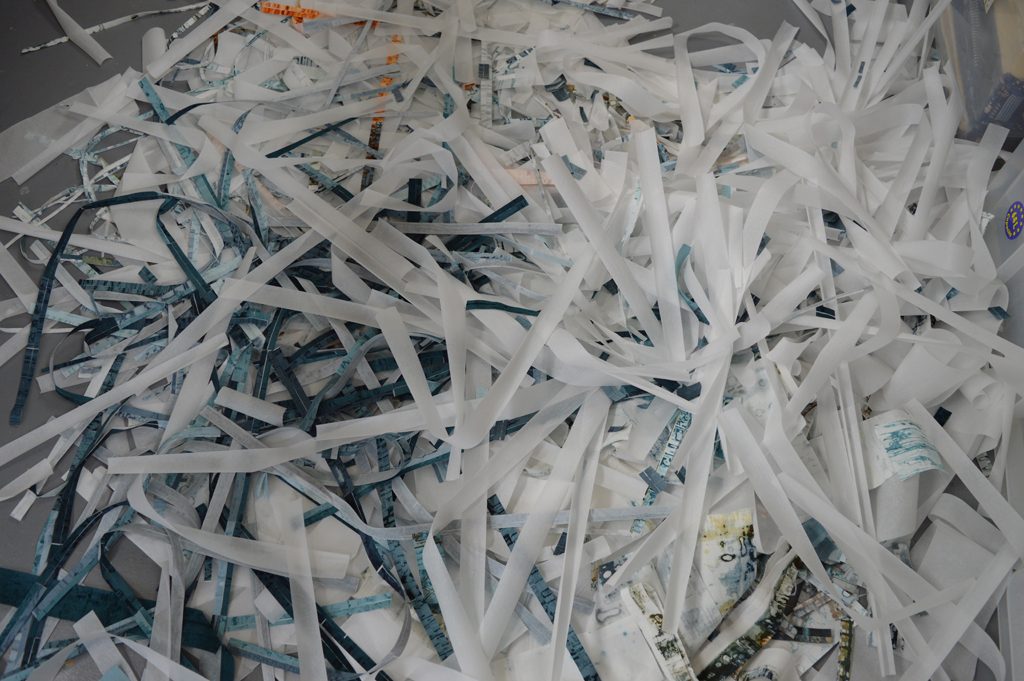
 I recently posted that I can't created in chaos. And that messy in my studio is when there are snippets of thread and fabric on the floor. Well I got really, really messy (for me) over the long weekend we have just enjoyed in the UK. I also got sore feet from standing for hours. And my rotary cutter needed a long lie down in a dark room afterwards. But look what I got in return - trays of cut 'bricks' and bondaweb backed 'brickettes' ready to build backgrounds in my Ruins and my View series.

I love printing and it is so tempting to just keep on printing, especially on sunny days when breakdown screens dry quickly. But it is only by cutting up the fabrics that I can see if I have the right balance of colour and pattern. I can see that I have enough fabric to start making backgrounds. I use the bricks to piece backgrounds for my large quilts and I use the brickettes to fuse backgrounds for smaller works. But I can also see that I will need more of the darker fabrics in both series to complete the work I am planning for the rest of this year. Which means more printing. Happy days!
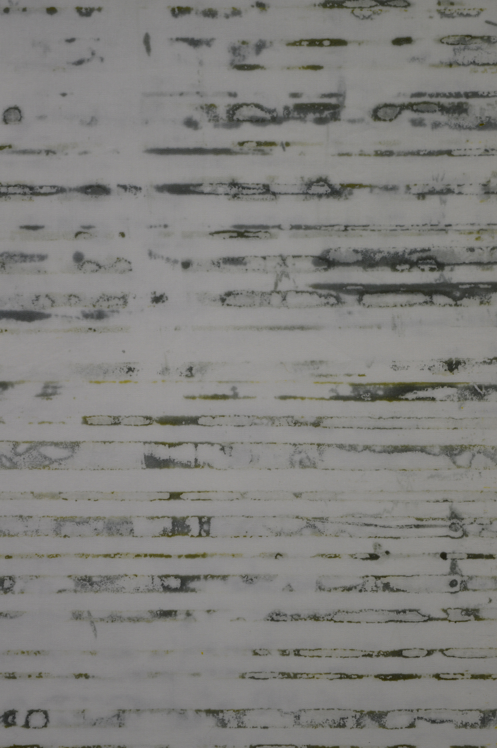
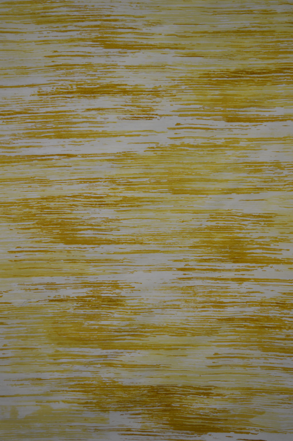
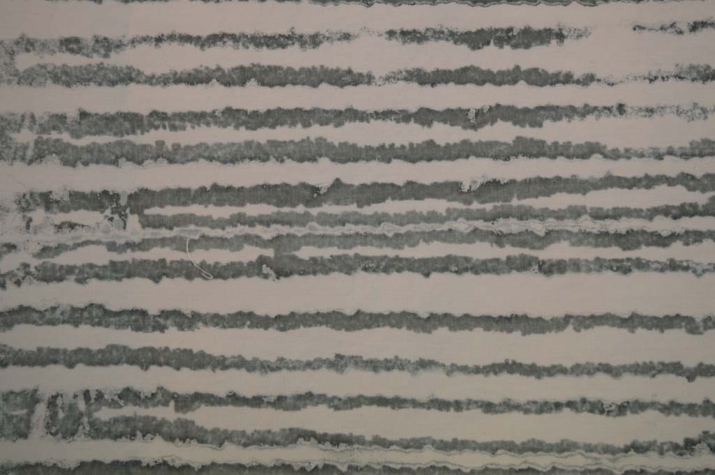 In between wrapping presents last week I did manage to prepare and pull some breakdown screens. I got some really promising marks by using a screen made with torn strips of freezer paper gently ironed onto the screen before rollering on a very thin layer of black thickened dye. I also made a screen using strips of torn masking tape. I wanted the marks to be delicate so pulled through with lots of print paste. And replaced the paste if it got tinted with colour.