Posts tagged Breakdown Printing
A question of genre
sherdley-road-leah-higgins.jpg

Every artist has a bridge piece in them don't they? This is mine. It is not an unusual bridge in terms of design but it is quite striking when seen from the link road in St Helens. And I've tried to capture that in this quilt. The colours look solid from a distance but closer inspection reveals lots of lovely texture created by using breakdown printing in a limited colour palette. It has been made for my upcoming exhibition with Helen Conway at The World of Glass, St Helens.

sherdley-road-detail-leah-higgins-low-res.jpg

I am really happy with this piece and may make more 'bridge' pieces but it did make me wonder about genre. I have intentionally tried to work in a more abstract way in recent years but, despite the colours used, this piece doesn't feel abstract. So what is it?

The Tate defines abstract art as 'art that does not attempt to represent an accurate depiction of a visual reality but instead uses shapes, colours, forms and gestural marks to achieve its effect'. Wikipedia defines it as art 'that uses a visual language of shape, form, colour and line to create a composition which may exist with a degree of independence from visual references in the world'. Hmm … well the colours may be abstract but, as I wanted it to look like a bridge, the finished piece cannot be called abstract.

The Tate defines figurative art as 'any form of modern art that retains strong references to the real world and particularly to the human figure'. Wiki says that figurative art 'describes artwork - particularly paintings and sculptures - that is clearly derived from real object sources, and is therefore by definition representational'. And the Tate defines representational as a 'blanket term for art that represents some aspect of reality, in a more or less straightforward way'. The quilt is not a painting, or a sculpture nor does it refer to the human figure but figurative seems like a good fit.

So what about the quilt world? If I wanted to enter it into Festival of Quilts which category would I choose? They don't have an 'abstract' category but their definition of an Art Quilt is 'quilts with both a strong visual impact and a high quality of execution designed to be displayed as artwork and communicating an idea, emotion or concept through the medium of textile and stitch'. Sherdley Road has strong visual impact and you will need to make my word for the fact that it is incredibly well made but it doesn't represent an idea, emotion or concept. It represents a bridge. Which means that it fits with their description of a Pictorial Quilt which are 'quilts depicting a scene or subject eg: people, animal, flowers etc as the main body of the quilt. A figurative or representational piece'. Hmm ….. A lot of the pieces entered into this category are very literal - often photo like representations of their subject. Wonder how my piece would be judged? I guess there is only one way to find out!

Different but the same

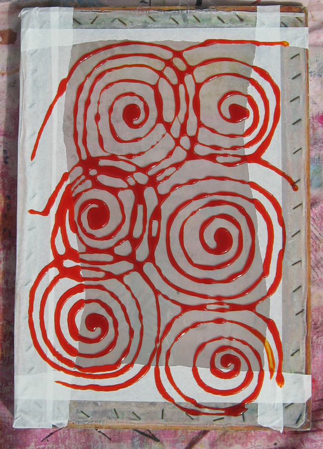
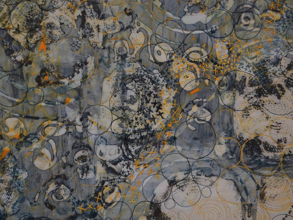
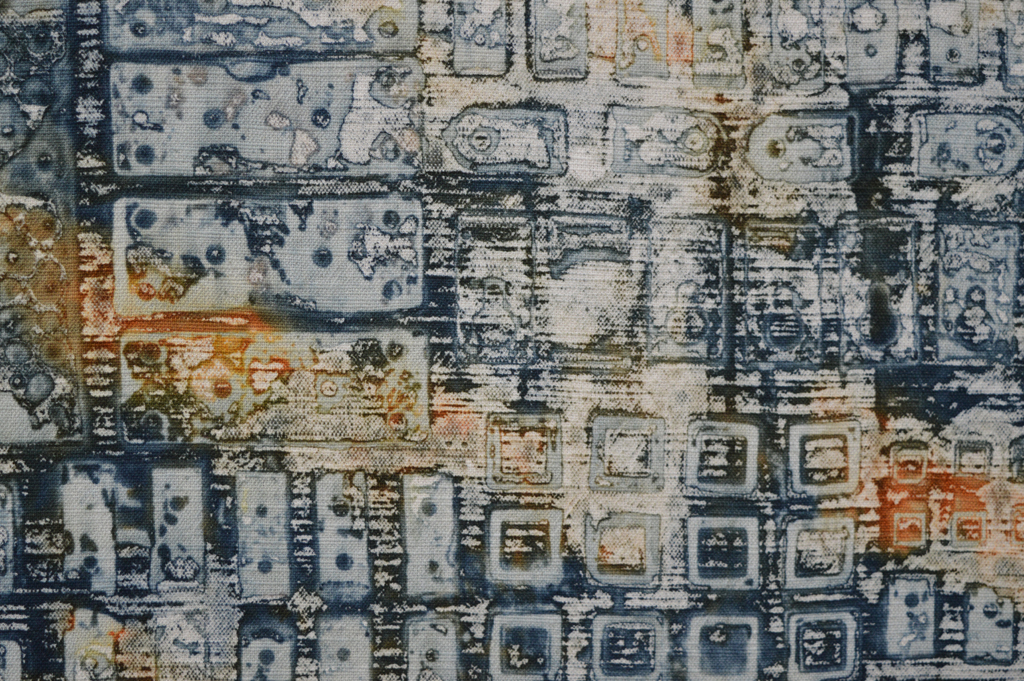
It will come as no surprise when I say that 95%+ of the textiles I use in my work are created using breakdown printing.  Sometimes I include dyed pieces, sometimes I add a layer of print using thermofax but breakdown is my love.

For the last few years I have printed knowing that the majority of cloth is going to be cut into rectangles and used to build backgrounds for series like Ruins. Which means that I don't think about composition when making the screens. I may choose square type shapes to embed or keep things aligned in one direction. When I print the screens I tend to place the prints side by side until I have filled the piece of fabric. Again I'm not thinking about composition. I occasionally cut out a particularly lovely section of cloth to use to cover book board but mostly the cloth gets cut down and pieced.

I love this process and expect to be using it for years but I'm also keen to find new ways to use breakdown - I love experimenting. I've played with printing with both thickened dye and discharge paste before batching my cloth. I've played with multiple layers of colour on a screen. Both gave interesting results but didn't fit with what I was trying to achieve at the time.

And then I saw some images on Instagram by the lovely Leslie Morgan of Committed to Cloth / the Creative Studio and had a lightbulb moment. Leslie and her students were painting thickened dye on screens to give very defined shapes (often buildings) then experimenting with colour exchange when they printed off the dried screen. Wonderful stuff that got me thinking about positive and negative space and how I could use breakdown screens to create series of monoprints.

So I have been playing. And having so much fun. Watch this space ..

Ups and downs

After four really productive weeks of making small art I have had a disappointing week; struggling to get any level of momentum. I spent the week as I planned to - researching and creating cloth for the third string of work that I will exhibit next year. The inspiration comes from those industries, and those structures, that no longer exist - the coal mining industry around St Helens, Lancashire being a great example. I wasn't working completely from scratch. I have learnt from a couple of failed attempts at printing cloth so I had a pretty clear idea of what I wanted to achieve and how. And I'd already found a great resource on line - the Sutton Beauty and Heritage site. But I didn't know if it would all come together. I really needed to lock myself in the studio for a whole weekend to completely immerse myself in the process. Knowing that, at most, I could only work for 3 hours in an evening was enough of a limitation that it throw me. And then there was the start of major building work on our home - likely to be a massive distraction for the next couple of months. Here is what I achieved:

  • Day 21 - at home all day because of builders I actually spent about 6 hours in the studio but only 1 hour on small art. Not sure what happened to the other 5 hours!
  • Day 22 - 1.5 hours researching and making thermofax screens
  • Day 23 - 2 hours - took a break from the new work and instead stitched Kilns 4.
  • Day 24 - 2 hours printing and experimenting with discharge.
  • Day 25 - a scant 1 hour washing and ironing fabrics

Only 7.5 hours in total. I don't have the luxury of time with two exhibitions in the first half of next year so cannot afford weeks like this! So this weekend I focussed on getting my act together / pulling my finger out / got down off the fence and finally made some decisions on this series! The results are rather pale and ethereal. I have finished a piece and put it into a picture frame I had in the studio. It didn't photograph very well and the mountboard is the wrong shade of white but it actually looks rather lovely. Certainly lovely enough to make more. Which is what I will be doing in the 6th week of my 100 (week) day challenge.

As messy as it gets!

I recently posted that I can't created in chaos. And that messy in my studio is when there are snippets of thread and fabric on the floor. Well I got really, really messy (for me) over the long weekend we have just enjoyed in the UK. I also got sore feet from standing for hours. And my rotary cutter needed a long lie down in a dark room afterwards. But look what I got in return - trays of cut 'bricks' and bondaweb backed 'brickettes' ready to build backgrounds in my Ruins and my View series.

I love printing and it is so tempting to just keep on printing, especially on sunny days when breakdown screens dry quickly. But it is only by cutting up the fabrics that I can see if I have the right balance of colour and pattern. I can see that I have enough fabric to start making backgrounds. I use the bricks to piece backgrounds for my large quilts and I use the brickettes to fuse backgrounds for smaller works. But I can also see that I will need more of the darker fabrics in both series to complete the work I am planning for the rest of this year. Which means more printing. Happy days!

It takes all sorts

It's a wet morning here in Dunure so time to stitch sleeves onto quilts, time to drink coffee and read the newspaper, and time to think. To think about the work I need to create for my exhibitions next year. And time to think about how I work.

One of the reasons that I've chosen to partner with Helen Conway is that we share the same professional, 'get it done' attitude to making our art and exhibiting our art. We plan our time and know that we will fill the galleries. We share out the administrative stuff and trust each others decisions. We will compromise where we need to.

But we are very different in the way we actually create. Helen is like a sponge - she sees inspiration pretty much everywhere and is constantly spinning new ideas. Not just about the subject of her work but also about the materials she uses. I know that she uses journaling to provide some order to her thoughts but mostly she goes into her studio and just starts. She works in a mess of materials, tools and books. To me it looks like chaos but to Helen it is where she finds creativity.

I am the opposite. The world is full of inspiration but I knew that I would not develop as an artist if I continued to hop from one idea to the next. Or if I continued to take workshops on different techniques. So I have chosen to work in series and to limit the number of techniques / materials I use. And I am very disciplined about it. The old me would have been busy trying to create something based on the beautiful sunsets here in Dunure but the current me enjoys the sunset then continues to stitch sleeves on quilts. I do most of my 'designing' in my head. I don't just go into the studio and start. I occasionally write ideas down but mostly I let them brew and filter as I work in the studio. Yes I will spend lots of time getting the exact colours and textures I want but the experimenting and sampling is really just fine tuning the decisions I have already made in my head. And I can't work in chaos. 'Messy' in my studio is when there are snippets of thread and fabric on the floor. I wash up and tidy as I go. I typically plan my activities for the week and go into the studio knowing exactly what to do first (even if that is to sweep the floor). I'm not at all good at spontaneity.

But I recognise my strengths and weaknesses and have chosen, for now at least, to work with a media - breakdown printing - that cannot be 100% controlled, that introduces unintentional marks into my work. Marks that will hopefully resonate with Helen's work when we exhibit together in 2018.

Inspiration

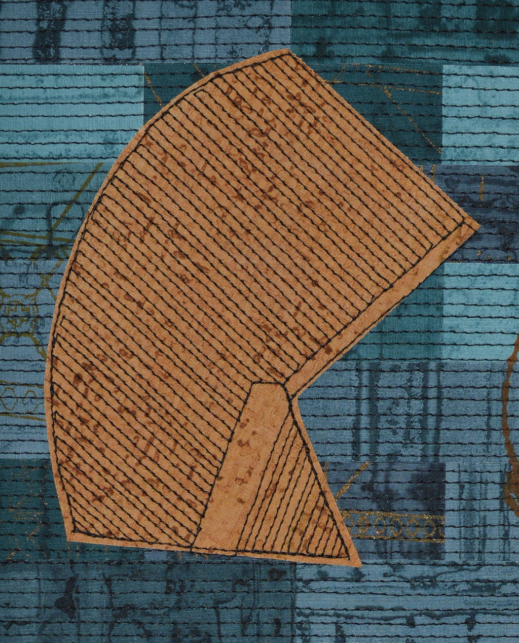
Inspiration is a very personal thing. My inspirations are nearly all urban. I love industrial landscapes although it is getting harder to distinguish between pale grey corrugated metal retail parks and pale grey corrugated metal factories. Some would say that both are factories.

But occasionally there is a flash of colour, a wonderful shape or an interesting interplay of lines breaking up the sky. The Pilkington Glass site on Canal Street, St Helens is fabulous. It has the usual grey boxes, pipes and conveyors running between buildings. It also has towers and shapes that are quite unique and, hopefully, still recognisable as I try to use them in an abstract form in the work I'm creating for my joint exhibition with Helen Conway in St Helens next year.


Coming up for air

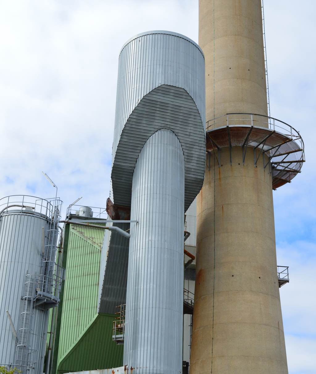
One of my goals for 2017 was to increase the number of blog posts by posting at least once a week. I've noticed that I get more 'traffic' when I put out posts close together. But I'm failing dismally. Why? Probably because I feel like my posts should have a proper subject, ideally something I've not covered before. It was easy last year when I was making and submitting lots of pieces. I could write about each piece, about my sucesses and my failures.

But this year is different. It is a 'making' year. With the exception of a piece for Fine Art Quilt Masters (submitted today, horray!) everything I am making is for the two exhibitions I have scheduled with Helen Conway in 2018. Because I have a long leadtime I'm working differently. I'm focussed right now on printing all the fabrics I am going to need. This will go on for another two to three months and whilst I can Instagram some nice images there is not a whole lot to write about that I haven't already covered. In between printing I am also developing some small works and some hand made books. I can, and will, write about these but have accepted that this is one goal I won't achieve.

What is it about spring?

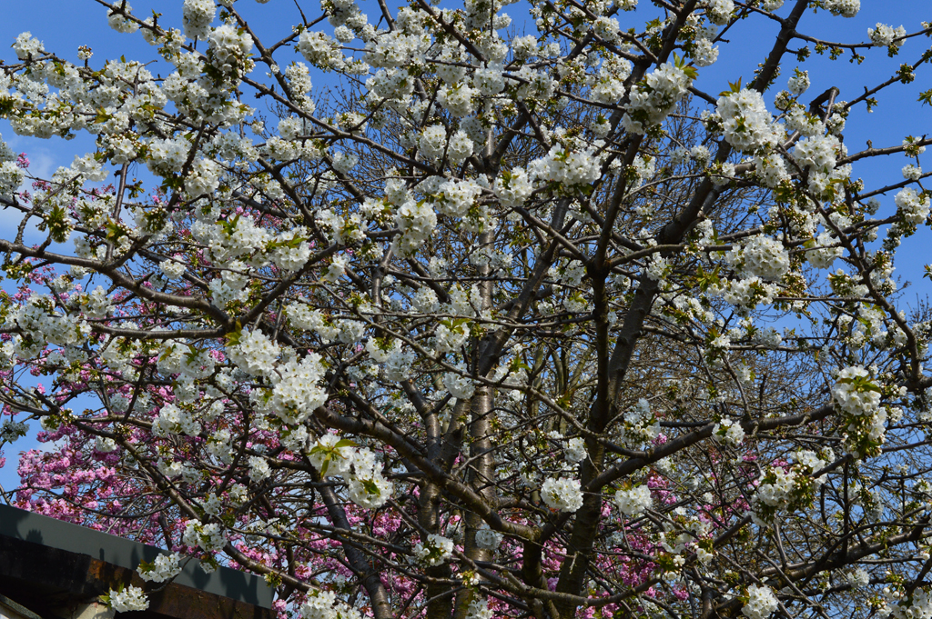
This last weekend was perfect. Blue skies. A balmy 20C. Blossom on the cherry tree. Coffee in the garden. And long, productive hours in the studio.

April and May are my favourite months. A combination of lighter evenings and some long weekends thanks to the Easter and May public holidays make it almost impossible not to hit my target of 20 hours in the studio each week. Being able to dry my breakdown screens outside speeds up the process and gives much better results than I achieve on screens that have dried overnight in the studio. And rinsing out printed fabric is much kinder on my hands when my cold water feed isn't finger numbingly cold.

So this weekend I got up early enough both days to drive my son to work for a 7.30am start. I would like to say that I did this just out of love but, honestly, it was so that I could be in the studio before 8am each day! I spent both days happily printing more fabric for my Ruins series. When screens or cloth were drying I continued to work on small samples. Such a productive couple of days.

And the good times keep on coming ... Easter means a 4 day weekend!! And chocolate!

Find something you love

I make a mean lasagne. I could eat it every day but hate washing saucepans so guess what - I don't want to make lasagne every day. But I love all aspects of breakdown printing and I could very happily spend every day making beautiful fabric. I love mixing the dyes and preparing the screens. I love pinning out my cloth and pulling the screens. I even love washing my screens, washing the objects I use on my screens and washing my printed cloth. Because I love it I have spent hundreds of hours learning to  sort of control the outcomes and it now forms the foundation for all of my art. I made my first breakdown screens during a Committed to Cloth workshop in 2010. I wasn't really aiming for anything - I just picked a couple of colours and made two screens.

I printed the golden yellow screen first by pulling through with more golden yellow. I wasn't that impressed. Then I pulled the petrol green screen on top. I was worried that I had lost all the first layer. And then I washed the cloth and feel in love.

The joy of breakdown printing for me is in the detail. Those tiny areas of texture that are impossible to create in any other way. When I made that first piece of printed fabric into a piece of finished art I added stitch that mirrored some of that detail. Today I use breakdown in a very different way but thought you might like to see how I started!

Knots and Crosses (detail)