Now you see it, now you don't!
14 Jan 2018 7.jpg

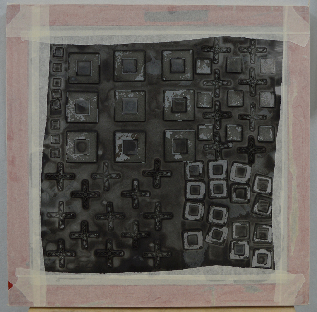
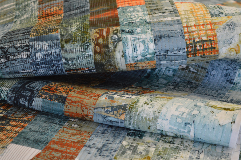
In my last post I shared the breakdown printing technique I use to put colour and texture onto my cloth. This series of work is inspired by industrial structures that once littered our landscape but now rarely exist outside of memories and museums. Their impact on the landscape has faded; has been built over. So for my cloth, having put down a layer of colour, I now strip most of that colour back off. Here is how.

14 Jan 2018 1.jpg
14 Jan 2018 2.jpg

Using a steam iron I crumple and crease my fabric. I am trying to create an uneven surface that acts as a resist to the discharge solution. I use Formosol dissolved in warm water and apply with a 'dry' brush. I don't want to flood the cloth. I leave the cloth to dry overnight then use a steam iron to activate the Formosol and remove colour. This bit is rather noxious. Ideally you should use a gas mask but I find ironing near an open door with a stiff breeze is effective. I use the iron as a tool, selectively applying heat so that I get different levels of discharge. The 'black' dye I used to print the cloth is actually a blend of a blue-black dye and a dark brown dye. When I discharge the colour strips away to leave a yellowish brown that rather looks like a nicotine stain. 

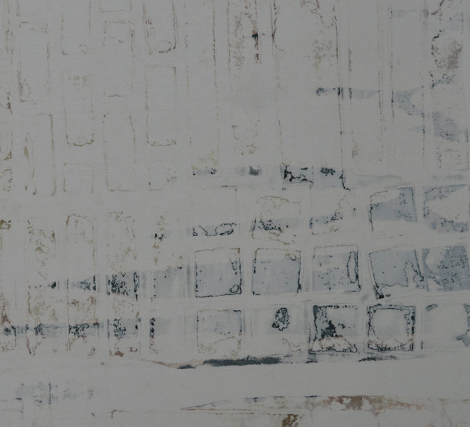
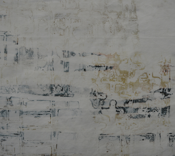
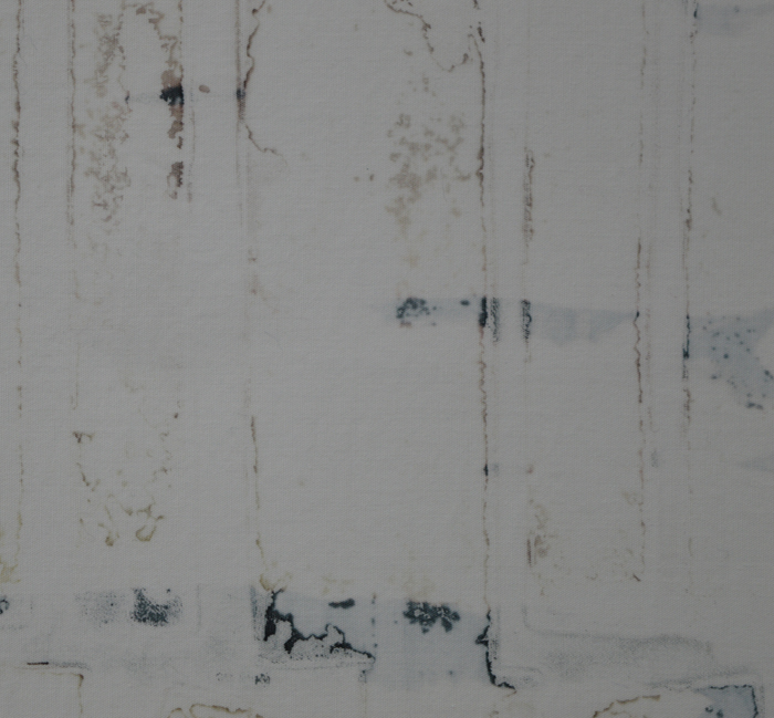
Once I'm happy with the level of discharge I wash my fabrics at 60C and they are ready to use. Or not. Sometimes I over-do the discharge process and end up with a piece of fabric that is too pale. Sometimes the colour discharges to more of a red brown. In both cases I resist the temptation to throw them in the bin. Instead I add another layer of breakdown printing and another layer of discharge. 

Now you see it ...
30 Dec 2017 9.jpg

Some people get nervous about sharing their process / techniques. I don't. Mostly because I use methods that do not give exact, reproducible results. Every screen I pull is different. Although years of experience do direct my work it is the serendipitous nature of breakdown printing that makes each piece of fabric unique. 

Over the last few weeks I have been printing fabrics for a series of work inspired by those industrial structures that no longer really exist - brick kilns, pit winding wheels for example. I have been printing in one colour - grey - but some of the fabrics have picked up traces of rust from some of the metal objects I use to make my screens. I start by adding a small amount of thickened dye to the back of a screen. I spread the dye using brushes, foam brushes or rollers but leave the coverage rather uneven. 

I then use my wonderful collection of 'things' to embed into the dye. I keep some screens specifically for use with metal brackets, buttons etc as over the years they have got rather rusty. 

I use different size screens but in the winter, when the screens have to dry indoors, I make sure to only use a thin layer of thickened dye and to use small screens. I would rather clean and make up more screens than pull a screen where the dye has flowed into blobs before drying. Fellow breakdown printers will know what I mean!

Once the screens are completely dry I take off the embedded objects. And yes, I wash them every time. Sometimes I print the screen as is. Other times I use torn masking tape to create wells around the screen. Using torn masking tape breaks up the edge of each print. Having pinned my white, soda soaked fabric to my print bench I print the screen using thickened paste. As I want pale, delicate marks I tend to dump out unused paste if it picks up dye from the screen and replace with fresh paste.

I aim to apply different patterns / textures across the cloth so don't have to worry about composition. Using multiple screens means that I don't get too much pattern repeat. I let the fabric become touch dry before rolling up in plastic and leaving overnight to fix the dye. The fabrics are then washed and dried ready for the next process.

Finishing
Ruins work in progress 1024.jpg

I often use this time of year to finish those things that I have kept putting off. In my day job that might be writing a stack of reports or clearing out filling cabinets. In the studio it is adding sleeves and labels to finished pieces and making bags to store them in. I love every other process that makes up my art. I love washing screens, I love sewing in ends and I love sewing down facings. Adding labels and sleeves and making bags - nope. But it needs doing and it gives me the opportunity to reflect on the year and think about the year ahead.

2017 has been a quiet 'art' year for me especially compared to 2016. The year has been spent mostly making work for the two exhibitions I have with Helen Conway in 2018 so I haven't really had much new work available to enter as many 'Calls for Entry' as I did in 2016. I was disappointed that a new piece, Liverpool Street Salford wasn't selected for Fine Art Quilt Masters in the summer as it would have been really neat to be selected three years in a row. But I was absolutely thrilled that an older piece, Ruins 1, was accepted into Quilt-Art-Quilt in Auburn, New York. I was even more thrilled when it won Best in Show and was sold. I have two other pieces exhibiting this year. Ruins 7 is touring with Quilt Nation and Happy Today? is touring with SAQA Layered Voices. Both pieces were made and selected in 2016 but opened in 2017. But that is all. A quiet year.

Behind the scenes however I have been busy. The stats for 2017; 1053 hours in the studio in 2017 compared to 964 hours in 2016. That means an average of 20.25 hours per week compared to 18.5 hours a week. During that time I have finished 21.58 square metres of art compared to 18.87 square metres in 2016. Go Leah! In 2016 I made 9 'major' pieces and a couple of small pieces. In 2017 however I knew that I needed to make more small art for the 2018 exhibitions. Challenging myself to spend 100 week day evenings just making small art was a great way of making that happen. I made 52 small pieces during that time. In addition I have made 5 big pieces of art and have made 3 small pieces for the international fibre group I joined in 2017 Cloth in Common. Not a bad haul for the year but I still have a lot of work to do for the second exhibition in 2018. 

On paper I should have been able to spend more time in my studio and produce more art in 2017. I left my day job in August and should have been able to put in extra hours whilst looking for a new job. But my mother-in-laws sudden illness and passing turned everything upside down. There were days when I was just too sad to stitch but, once again, my studio and my art have provided great comfort to me. As have our family and friends. Thank you.

And so to 2018. Mine and Helen's first exhibition will be at World of Glass in St Helens from 17th March to 4th May. I have one piece left to finish for this. Our second exhibition will be at Stockport War Memorial Art Gallery from 26th May to 1st July. I have a somewhat intimidating amount of work to do before then. Beyond that I need to decide what Calls for Entry to pursue. I also want to apply for gallery space for a solo exhibition(s) in 2019. And I need to find a day job. Should be a quiet year.

Leah HigginsComment
Knowing when to stop.
17 Dec 2017 1.jpg

Earlier this month my Cloth in Common fellow artist Lisa Walton posted on Facebook that she was giving up on a piece. She wrote 'Sometimes you have to admit defeat. I’ve had an idea for a quilt in my head for months. Very different style and techniques for me. I tried and tried and tried but yesterday I gave up. It was worth a try but too far from my comfort zone'. Now Lisa is an extremely talented and experienced textile artist and, I'm guessing, had tried to work through problems with the piece before admitting defeat. But I was surprised by the percentage of people who responded with comments along the lines of 'don't give up / you can do it'. And I wondered about whether the balance of responses would be the same if Lisa worked with paint and canvas?

Is it the muddy distinction between art, craft and hobby when working with cloth and stitch that makes throwing work away an anathema to many people? I bet every quilter on the planet knows what a UFO is (and has a box full of them).

This is a discussion I've had with many friends. I found it amazingly liberating a few years ago to get rid of all the commercial fabric I knew I was never going to use, all the dust covered unfinished quilt tops and all old finished quilts, cushion covers, patchwork bags etc that I knew I was never going to show to another living soul. A lot of fabric, a few unfinished projects and a couple of finished pieces were taken by friends but the rest went in the bin. I kept and over-dyed the larger pieces of fabric to use for backing and bindings but that was it. Why - because my work has moved on. And when I work in my studio today it is always 'with intend' and never just something to fill my time.

Developing new work is not a straight path; it is trial and error and there are always casualties. Sometimes my first attempts at printing cloth are just plain ugly. They make great Facebook posts but if adding more print or discharging them doesn't recover them then they need to go. If the pieces are small they go in the bin. If not they get recycled as backings. Sometimes the samples I make don't work. Which can be frustrating if I've spent hours on them but sampling is a really important process for me. It allows me to fine tune my ideas. So no wonder that samples get thrown in the bin.

And then there are finished pieces. I like working in series because it allows me to dig deep and really develop my ideas. But the reality is that not all pieces in a series make the grade. Some pieces go wrong part way through. And some just don't have the 'wow' factor when they are finished. I have a large piece that I had been making to submit to the European Quilt Triennial that isn't working. The sample I made worked. A smaller piece I made in this new series worked. But not this one. After 50+ hours work I have admitted defeat. And used my precious studio hours on another new piece (details photographed) that is working. 

17 Dec 2017 2.jpg
Studio Eye Candy.

SAQA (Studio Art Quilt Associates) recently posted a gallery of photos of some of its' members studios. I always enjoy looking at how other artists arrange their studios - it is a great way to find new storage ideas and gives an insight into how different artists work. So grab a cup of coffee ....

13 Dec 2017 1.jpg

Some artists, like Linda Syverson Guild, have such wonderful views from their studio that it surprises me that they get any work done! Others, such as Terry Aske have beautifully organised studios with their fabrics and threads arranged rainbow style. I am lucky enough to have a good sized study but I am definitely jealous of Susan Webb Lees' space. Big with lots of different tables and surfaces. Others have small spaces that force them to keep tidy such as Eileen Williams. Most of the photos show tidy studios but Uta Lenk sent a photo of her studio in use. How does she produce such wonderful work from the chaos?

One thing that did surprise me was the lack of 'wet' studios in the gallery. No photos of messy print benches or dye buckets. SAQA want more photo's via Instagram and #saqaartstudios. Maybe I should send them some of mine next time I have a printing session!

A quiet week

Not many words needed. A beach that is more rock than sand. A stone harbour with boats that look too small to conquer the waves. Views of snow topped mountains on Arran. Blue skies and numb fingers. Perfect Dunure.

My new website!

Fingers and toes crossed ... this post should be reaching you from my newly designed website. Please have a look around. And please, please let me know if something isn't working! I hope you like what you see.

I like the more stripped back look of this website and the fact that the Squarespace template I used included lots of different ways of displaying images. Which is very handy as my art is all sorts of shapes and sizes. It was also really easy to import my blog posts from my old Wordpress site. And then there was the shop - easy to set up although you can only use a single aspect ratio for all the product images. I have spent a lot of time in Photoshop over the last couple of weeks!

Whilst deciding what to show in the galleries I realised that there are some older works that I'm very unlikely ever to get the opportunity to exhibit again so I have put them on sale in my new shop. I have also listed many of the small pieces I made during my recent 100 (week) day challenge. Although I made them for my upcoming exhibitions in 2018 I did get rather carried away and made more than I really need. You'll notice in the galleries that several of my large works shown in the galleries are marked as not for sale. This is either because they are touring or because they will be exhibited next year. 

Now after several weeks sat in front of a computer I need to get back to making art! 

Marketing ourselves

I've been a little quiet on social media for the last couple of weeks as I am building myself a new website. A photo of me banging my head against a monitor doesn't make for a good Instagram moment! I have been thinking about upgrading my website for a while - it is a basic Wordpress site that has served me well but I feel like I have out grown it. And seeing as I am resting between jobs (aka unemployed) it seemed like a good time.

I want a site that looks more contemporary, that allows me to display my work in lots of ways, that allows me to sell my work online, that can house a blog and that can 'grow' with me. Oh and I also want it to be a lot easier to use than Wordpress. My research fell into two categories - finding the best set up (site host, e-commerce provider etc) and looking at lots of sites to help me decide how I want mine to look. The first part was easy. I picked Squarespace as it is a one stop shop that is cheaper than other options. It is very easy to use and I can upgrade my basic plan if I need more functionality in the future. The Help section is really good and, if I get stuck, my daughter and her partner having been using it for years for their shop Good Press.

The second part - looking at other people's sites - was very enjoyable as I've seen some great art but it was also a bit surprising. Very, very few of the textile artists have a shop function or even list prices. And yet many of them will list a price when they exhibit work in galleries or at shows and I'm sure are as thrilled as I have been when somebody buys their work. So I wondered why not? Maybe it feels like setting up a shop is too much effort given that the number of sales is always, unfortunately, going to be small? (Which maybe it was before sites like Squarespace made it quite straightforward). Or are we worried that the audience will see us as less serious about our art if we put a price on it? Do we worry that it will be seen as craft rather than art? Are we concerned that viewers will scoff when they see the price of the work?

I hope not. I am deadly serious about my art. It is a passion. An obsession. I am going to continue to make art even if I never sell another piece. But let's get real. Making art costs money - if you add up everything you have spent this year on materials, on submission fees, on postage, on running costs for the space you work in, on your website, etc, etc, how much does it come too? And then there is time. I approach my art with the same professional attitude I use in my day job - my time has value and I want to be rewarded for the investment I make in my art. Being curated into shows is fantastic, thrilling and a big motivator. But somebody liking my work enough to spend money on it - now that is in a different league so why wouldn't I make it as easy as possible to buy?

A question of genre
sherdley-road-leah-higgins.jpg

Every artist has a bridge piece in them don't they? This is mine. It is not an unusual bridge in terms of design but it is quite striking when seen from the link road in St Helens. And I've tried to capture that in this quilt. The colours look solid from a distance but closer inspection reveals lots of lovely texture created by using breakdown printing in a limited colour palette. It has been made for my upcoming exhibition with Helen Conway at The World of Glass, St Helens.

sherdley-road-detail-leah-higgins-low-res.jpg

I am really happy with this piece and may make more 'bridge' pieces but it did make me wonder about genre. I have intentionally tried to work in a more abstract way in recent years but, despite the colours used, this piece doesn't feel abstract. So what is it?

The Tate defines abstract art as 'art that does not attempt to represent an accurate depiction of a visual reality but instead uses shapes, colours, forms and gestural marks to achieve its effect'. Wikipedia defines it as art 'that uses a visual language of shape, form, colour and line to create a composition which may exist with a degree of independence from visual references in the world'. Hmm … well the colours may be abstract but, as I wanted it to look like a bridge, the finished piece cannot be called abstract.

The Tate defines figurative art as 'any form of modern art that retains strong references to the real world and particularly to the human figure'. Wiki says that figurative art 'describes artwork - particularly paintings and sculptures - that is clearly derived from real object sources, and is therefore by definition representational'. And the Tate defines representational as a 'blanket term for art that represents some aspect of reality, in a more or less straightforward way'. The quilt is not a painting, or a sculpture nor does it refer to the human figure but figurative seems like a good fit.

So what about the quilt world? If I wanted to enter it into Festival of Quilts which category would I choose? They don't have an 'abstract' category but their definition of an Art Quilt is 'quilts with both a strong visual impact and a high quality of execution designed to be displayed as artwork and communicating an idea, emotion or concept through the medium of textile and stitch'. Sherdley Road has strong visual impact and you will need to make my word for the fact that it is incredibly well made but it doesn't represent an idea, emotion or concept. It represents a bridge. Which means that it fits with their description of a Pictorial Quilt which are 'quilts depicting a scene or subject eg: people, animal, flowers etc as the main body of the quilt. A figurative or representational piece'. Hmm ….. A lot of the pieces entered into this category are very literal - often photo like representations of their subject. Wonder how my piece would be judged? I guess there is only one way to find out!