Posts tagged Composition
A question of genre
sherdley-road-leah-higgins.jpg

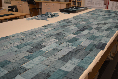
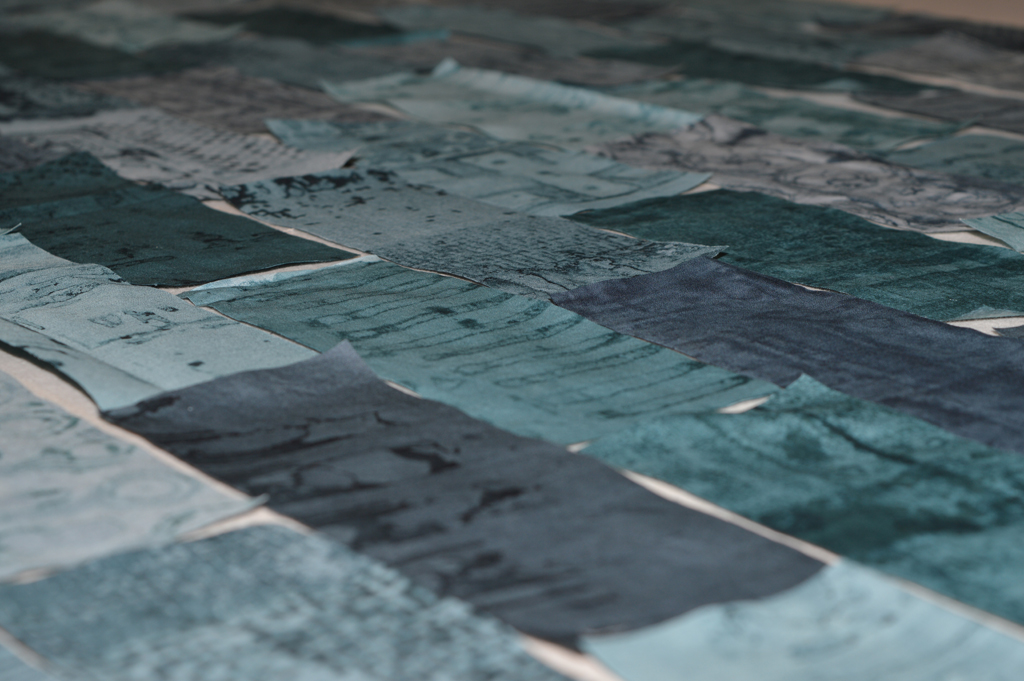
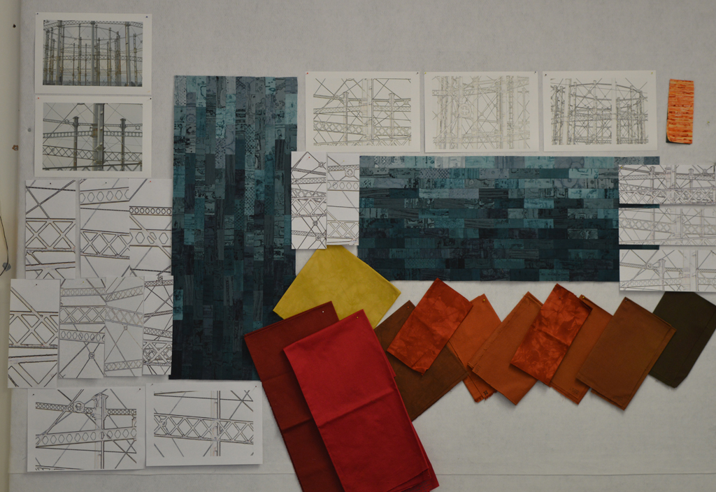
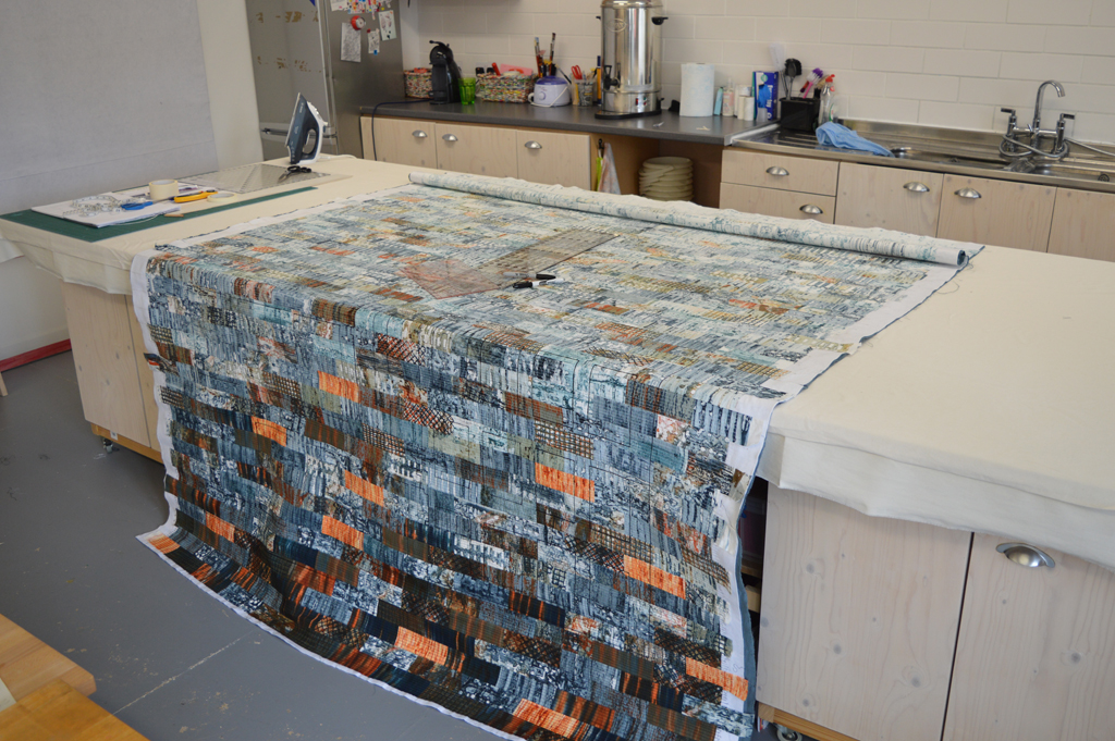
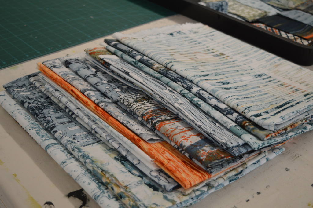
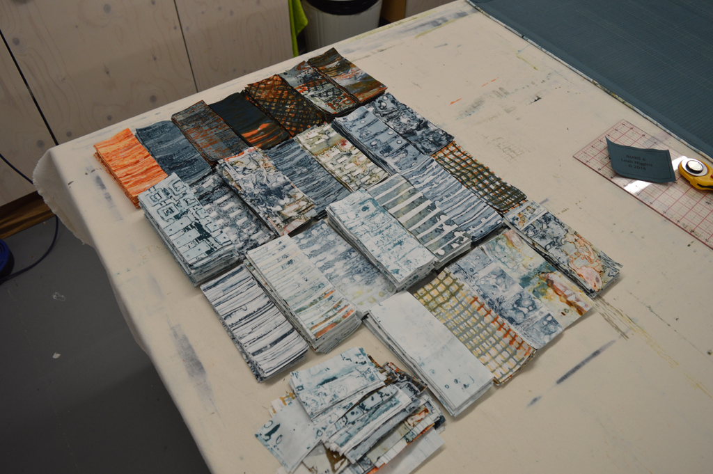
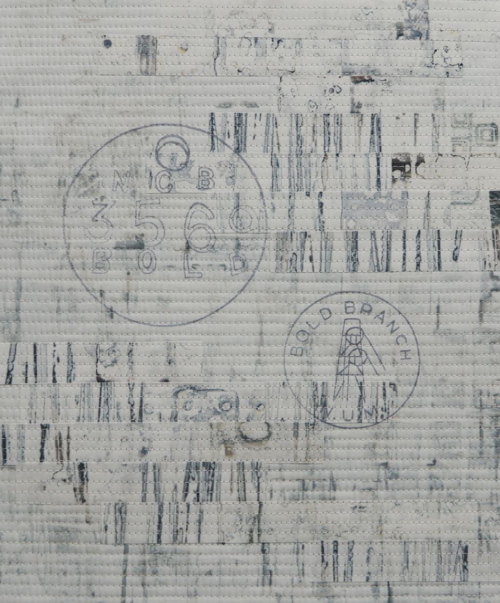
Every artist has a bridge piece in them don't they? This is mine. It is not an unusual bridge in terms of design but it is quite striking when seen from the link road in St Helens. And I've tried to capture that in this quilt. The colours look solid from a distance but closer inspection reveals lots of lovely texture created by using breakdown printing in a limited colour palette. It has been made for my upcoming exhibition with Helen Conway at The World of Glass, St Helens.

sherdley-road-detail-leah-higgins-low-res.jpg

I am really happy with this piece and may make more 'bridge' pieces but it did make me wonder about genre. I have intentionally tried to work in a more abstract way in recent years but, despite the colours used, this piece doesn't feel abstract. So what is it?

The Tate defines abstract art as 'art that does not attempt to represent an accurate depiction of a visual reality but instead uses shapes, colours, forms and gestural marks to achieve its effect'. Wikipedia defines it as art 'that uses a visual language of shape, form, colour and line to create a composition which may exist with a degree of independence from visual references in the world'. Hmm … well the colours may be abstract but, as I wanted it to look like a bridge, the finished piece cannot be called abstract.

The Tate defines figurative art as 'any form of modern art that retains strong references to the real world and particularly to the human figure'. Wiki says that figurative art 'describes artwork - particularly paintings and sculptures - that is clearly derived from real object sources, and is therefore by definition representational'. And the Tate defines representational as a 'blanket term for art that represents some aspect of reality, in a more or less straightforward way'. The quilt is not a painting, or a sculpture nor does it refer to the human figure but figurative seems like a good fit.

So what about the quilt world? If I wanted to enter it into Festival of Quilts which category would I choose? They don't have an 'abstract' category but their definition of an Art Quilt is 'quilts with both a strong visual impact and a high quality of execution designed to be displayed as artwork and communicating an idea, emotion or concept through the medium of textile and stitch'. Sherdley Road has strong visual impact and you will need to make my word for the fact that it is incredibly well made but it doesn't represent an idea, emotion or concept. It represents a bridge. Which means that it fits with their description of a Pictorial Quilt which are 'quilts depicting a scene or subject eg: people, animal, flowers etc as the main body of the quilt. A figurative or representational piece'. Hmm ….. A lot of the pieces entered into this category are very literal - often photo like representations of their subject. Wonder how my piece would be judged? I guess there is only one way to find out!

I should be cleaning the bathroom but ....

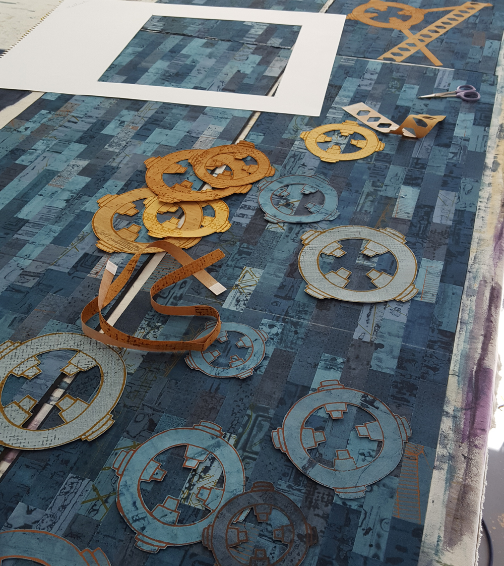
Sometimes you just get into something and you don't want to quit! On Wednesday I spent 5 hours cutting things out - which is very calming but hard on the hands. Yesterday I spent 7 hours working on a large Ruins piece (4 hours machine stitching and 3 hours sewing in ends, which is also very calming but hard on the shoulders). And today, day 65 of my 100 (week) day challenge I have spent 3.5 hours collaging and sticking things down. Which wasn't hard on anything - it was just great fun!

100 (week) day challenge update

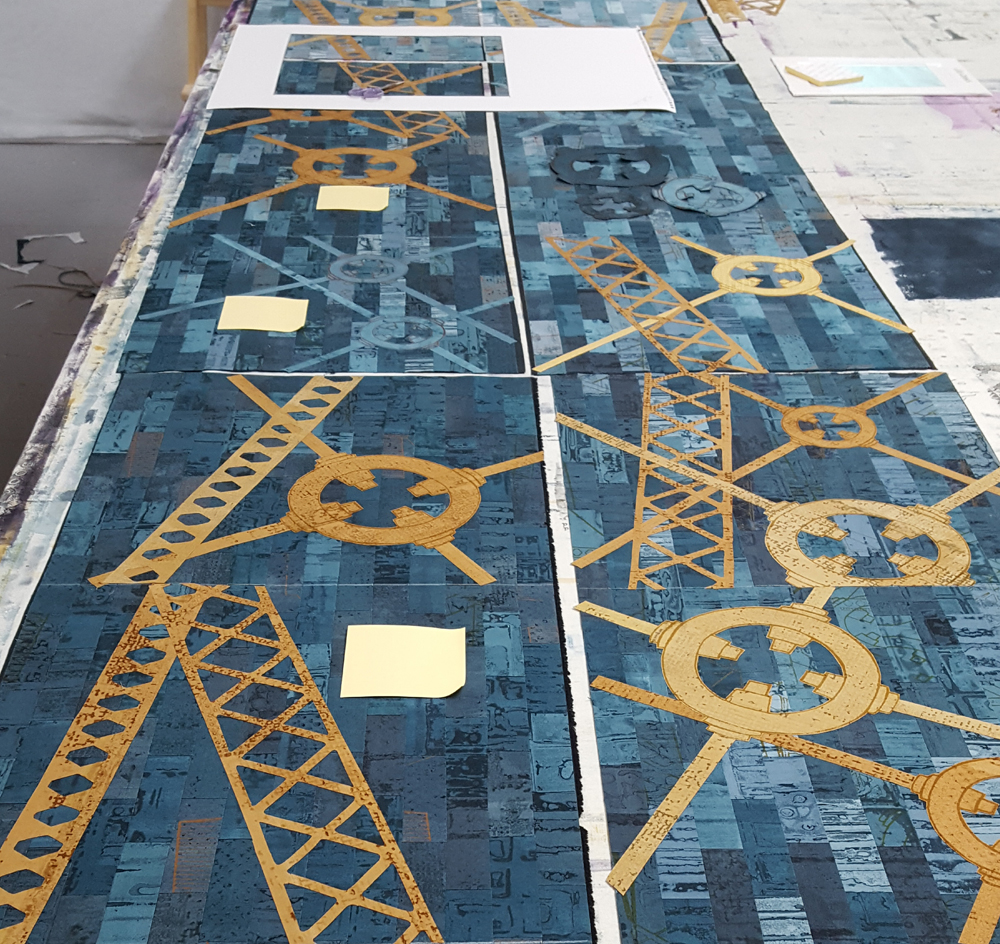
I've completed 35 days / 7 weeks of my challenge and I'm really happy with my output but it still feels like hard work making myself go to the studio some evenings.

Today I have spent 6 hours at my sewing machine sewing hundreds of parallel lines on my latest large scale Ruins piece. And I have enjoyed every minute of it. Tomorrow evening I will be stitching parallel lines on the last of the small Canal Street pieces for next years exhibition and it will feel like a chore. Same process but on very different scales. I don't need a psychiatrist to tell me that my heart still wants to work BIG. But those small scale pieces are necessary - if only because they are more affordable. So I will keep going. Maybe when I get to 100 hundred days I will have fallen in love with working small ....

  • Day 26 - 1 1/4 hours making thermofax screens.
  • Day 27 - 2 1/2 hours finishing thermofax screens and starting Fragments pieces.
  • Day 28 - 2 3/4 hours spent collaging 6 Fragments pieces ready for stitch.
  • Day 29 - was out in the evening with the day job but still managed 1 1/2 hours - go Leah!
  • Day 30 - Oops, had to spend two hours labelling and packing quilts to send to Festival of Quilts.
  • Day 31 - 1 hour spent on layouts for the exhibition at World of Glass (I have more than enough small pieces, yes!) and 1 hour spent stitching.
  • Day 32 - 2 hours stitchin'
  • Day 33 - didn't happen, hot and stuff day so gave in to the temptation that is ice cream and a good book.
  • Day 34 - 2 1/2 hours stitch'
  • Day 35 - 2 1/2 hours stitching and adding little red accents to the Fragments pieces.
Find something you love

I make a mean lasagne. I could eat it every day but hate washing saucepans so guess what - I don't want to make lasagne every day. But I love all aspects of breakdown printing and I could very happily spend every day making beautiful fabric. I love mixing the dyes and preparing the screens. I love pinning out my cloth and pulling the screens. I even love washing my screens, washing the objects I use on my screens and washing my printed cloth. Because I love it I have spent hundreds of hours learning to  sort of control the outcomes and it now forms the foundation for all of my art. I made my first breakdown screens during a Committed to Cloth workshop in 2010. I wasn't really aiming for anything - I just picked a couple of colours and made two screens.

I printed the golden yellow screen first by pulling through with more golden yellow. I wasn't that impressed. Then I pulled the petrol green screen on top. I was worried that I had lost all the first layer. And then I washed the cloth and feel in love.

The joy of breakdown printing for me is in the detail. Those tiny areas of texture that are impossible to create in any other way. When I made that first piece of printed fabric into a piece of finished art I added stitch that mirrored some of that detail. Today I use breakdown in a very different way but thought you might like to see how I started!

Knots and Crosses (detail)

Sampling and getting there in the end!

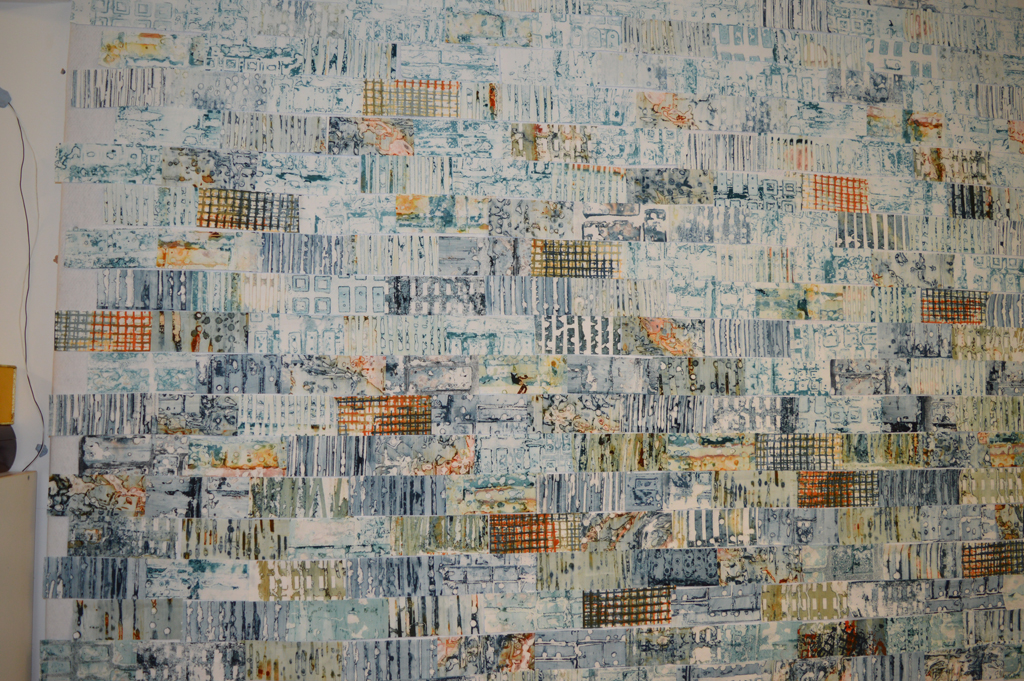
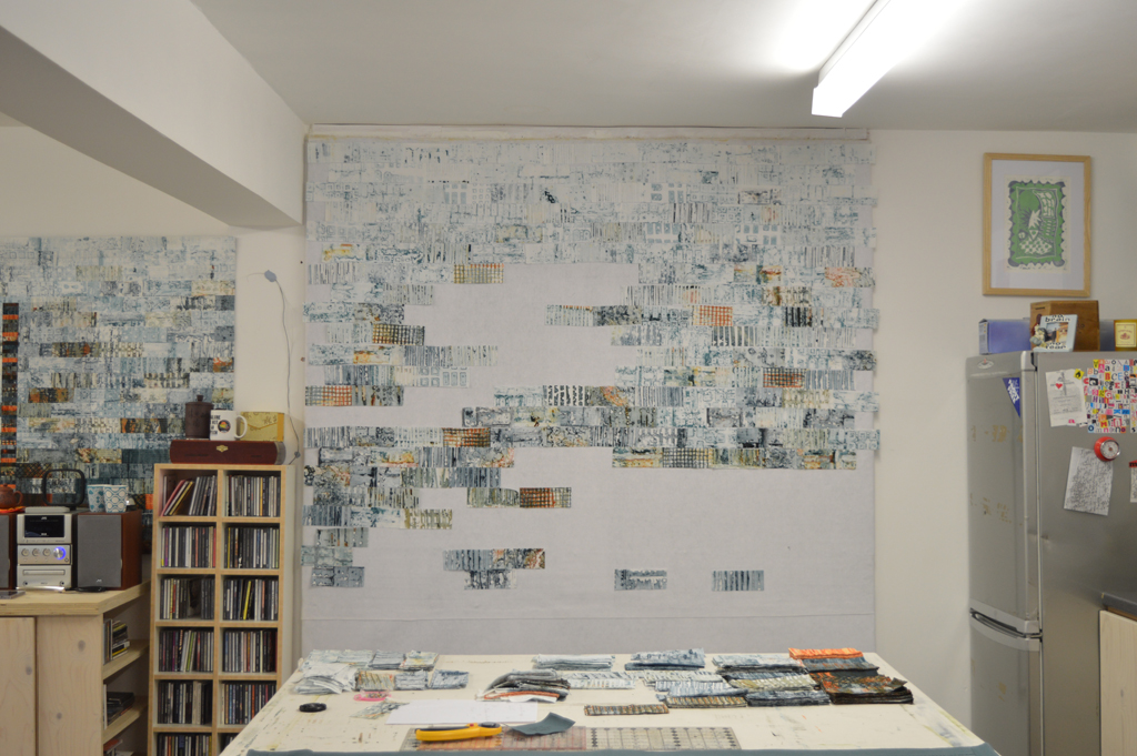
I started sampling ideas for my new series using a selection of dyed fabrics pulled from my stash. Early outcomes did not exactly grab me so I also tried using stencils to take colour out (discharge) and to add colour. Interesting but still not right. I added back colour. And got rather depressed until I decided to change the scale and to add stitch. Bingo!

The sample above is definitely a step in the right direction. However looking at it I realised that the colours of the appliqued strips were not really 'me'. Being dyed fabric, they lacked the texture I usually work with. Pieces from this new series will be shown alongside pieces from my Ruins series in the exhibition I am doing with Helen Conway at Stockport War Memorial Art Gallery in Autumn 2018. So I pulled out my colour diary and compared my little sample with the colour family used in Ruins. The background for the new series uses a colour family made from black and petrol green. In my Ruins series I use petrol green and a colour family made from rust and black. Doh ... it seems so obvious now!

Building walls, the stats so far ....

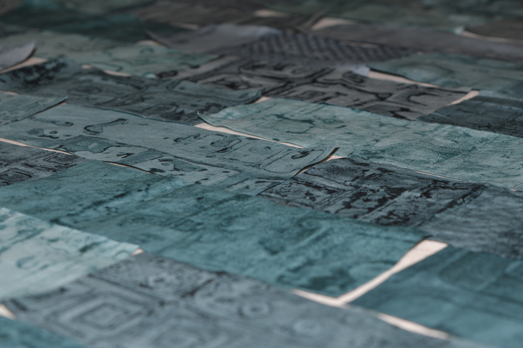
Wall building is getting a LOT of bad press right now but not all walls are a pathetic attempt to pander to a small misguided minority. (OK - political rant over). My walls are going to be things of beauty that invite people in for a closer look and, hopefully, make them smile!

I am in the middle of making my first, full scale wall / background for my new series. I have given the series the tentative title 'The View From Here' or View for short. The advantage of working in series is that once I get going I have idea after idea that I know will 'work'. And I can often create new pieces in the series in what is for me a relatively short period of time. The disadvantage is the hours and hours I put in up front and figuring out what that means when it comes to planning and pricing my work.

I have been tracking my total studio hours for a couple of years but as I started to work on View I decided to collect data on how those hours were spent. So here are the stats so far ....

  • Printing = 50 hours (made approx 15 square metres of cloth which, based on experience, could convert to about 10 square metres of finished art. However I can already tell that I have too high a proportion of light pieces so will need to print more medium and dark fabrics to 'balance' my palette)
  • Research and sampling = 17 hours (and still more questions than answers!)
  • Cutting bricks = 7 hours (yes I cut all the printed fabric into pieces 2.5 x 6.5inches)
  • Building my first wall = 11 hours (layout complete and about half way through joining the bricks into long strips)

So that is a total of 85 hours and still a long way from even knowing what the first piece will look like. I am making an investment in time (and money) doing something I love and I hope will give pleasure to others. Not building a wall on borrowed money that divides people and makes the world a scarier place. (Rant definitely over, sorry).

That wonderful tingly feeling

In my last post I talked about how creativity tends to creep up on me when I am immersed in process. I follow a set process when developing a new series ... I work on the colours first - pinning them on my design wall for assessment. Then I do the printing and pin pieces up until my design wall is covered. I discard fabric that doesn't 'fit' without thinking too hard about why. I then sample different types of construction. In my Hidden Message series this resulted in several pieces going in the bin before I was happy. With my Ruins series (and the series I am developing now) building a background made of bricks felt 'right'. Having stitched some small sample backgrounds I turn to my design wall again. I don't do sketchbooks - I do pinning things to a design wall until something 'clicks'.

Today I pinned up my two sample backgrounds. I rummaged through my boxes of dyed fabric and pinned up a selection of colours. I am not going to decide yet if the foreground will consist of dyed fabric or printed fabric or stitch yet. They are just up there. I added a couple of photos I took last summer of an old gasworks.

Then I used one of my favourite 'tools' - I cropped and enlarged small sections from the photo and pinned the results up. And I got that wonderful tingly feeling! I don't know what size the finished pieces will be or how I will apply the foreground but I do know what I'm going to be spending the next few months doing.

Being brave

A word of warning before I start - those you know me might want to sit down.

Ruins 7 - work in progress

I have now finished the background stitching on Ruins 7. It is big; a massive 5 square metres. Which equates to hundreds of parallel lines of stitching achieved by spending hours and hours at my sewing machine. And it looks great - well worth the investment I have made in it so far.

I wanted to do something a little different with this piece and had, in my mind, stitched silhouettes of ruined, bombed out buildings. I went on-line to get some images to work from. Sadly there are far too many images out there - from London and Dresden in the second World War to Aleppo today. I started by sketching in a notebook but could get no sense of scale. So I decided to draw out the full sized design. Cue lots of hours drawing, tearing up paper and drawing again until I was sort of happy. I draw onto blank newsprint paper as I know it tears easily and thought I could pin it to the quilt and stitch through.

I thought wrong. Trying to manhandle the quilt and paper on my sewing machine was horrendous. If I had a swear box in the studio I could have paid my mortgage off!! I thought long and hard about my options …. And decided to draw the design directly onto the quilt. And not with a pencil (which wouldn't really show up) or with a water soluble marker pen (as I have no intention of letting the piece near water). I decided to use a black permanent marker pen. Yeaks!!

I am using free machine quilting in a black thread to 'etch' over the lines so most of the marks should be hidden. Assuming I don't make a mistake …… Is that brave or really stupid?

Recipe for the next Ruins background

Cultivate a selection of beautiful breakdown printed fabrics in choosen colour family of rust and half-strength black with some added petrol green.

Cut into pieces each 2.5 x 6.5inches. Keep all scraps just because they are too nice to throw away (and I may want to make some more miniature pieces!)

Select and clear my biggest design wall. Put the football on the radio (optional).

And randomly add fabric pieces to the design wall. OK so not completely randomly. I want this piece to be approximately 70 inches wide by 100 inches high being pale at the top and dark at the bottom. The design wall is not big enough so I will have to do this in two halves. I select pieces semi-randomly from the piles then just put them up on the design wall going from left to right, row after row. Every 4 or 5 rows I stop and rearrange anything that looks really out of place but I try not to do too much of this. Carry on until design wall is covered.

Tweak a little then leave to 'marinate' overnight. I always make sure that I look at the composition in both daylight and under artificial light before I start stitching.

Unfortunately the design wall had it's own opinion of the composition and shed lots of pieces overnight. Darn!! (Probably my own fault as I had to slightly overlap the pieces so that I could fit 12 on each row).  Or maybe this is just another way to randomise the position of the pieces? Look on the bright side Leah.