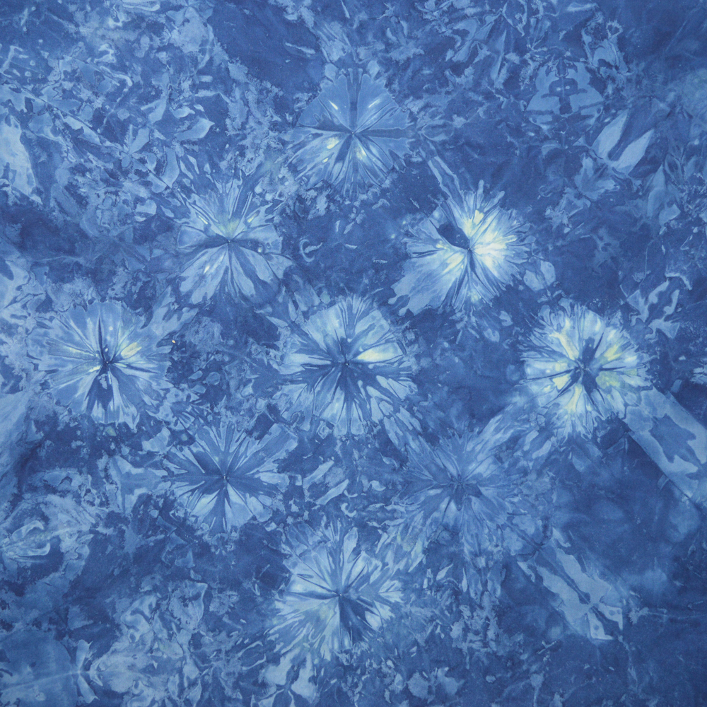
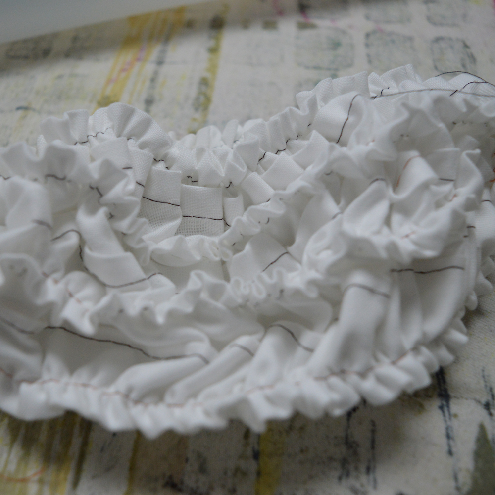
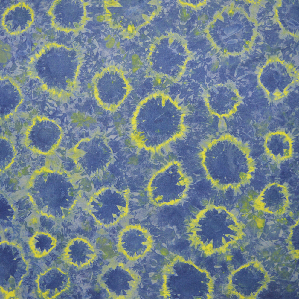
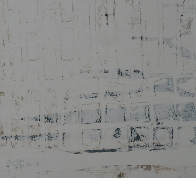
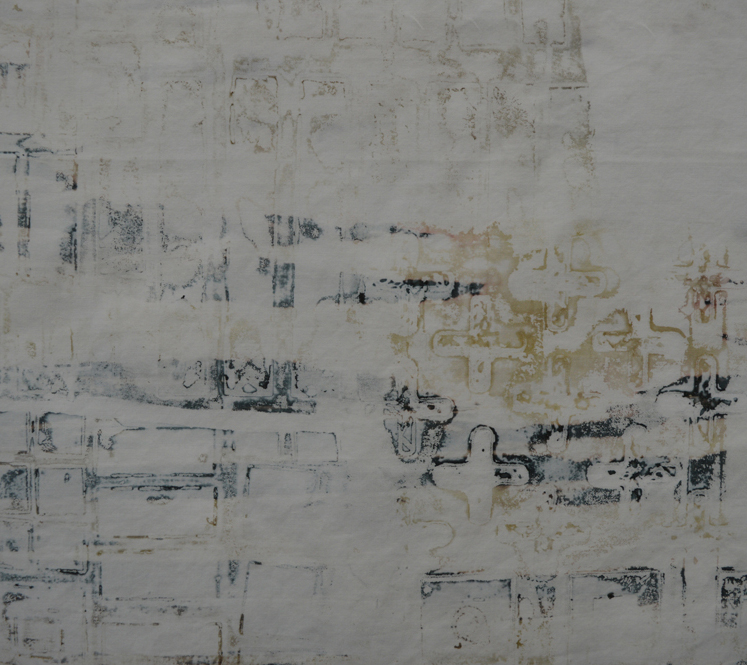
Hilary Kimber: open screen over a string resist
I ran my first two day screen printing workshop this last weekend and loved every minute of it. With only two days it was difficult to know what to include. I started with a focus on using temporary resists that are readily available and relatively cheap; masking tape, freezer paper and sticky back plastic. You could probably spend two days just on masking tape resists but I wanted the students to go away with a sense of the range of options open to them. Their work was wonderfully varied.

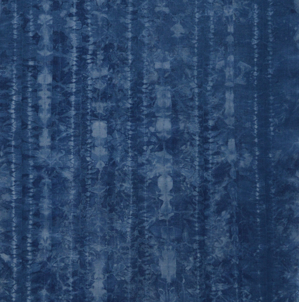
Judy Tomlinson: masking tape resist pulled through with three values of turquoise and yellow giving some lovely greens

Jean Martin and Judy Tomlinson: masking tape resist pieces
We moved on to breakdown printing - where the thickened dye / print paste that is dried on the screen acts as a temporary resist. The weather wasn’t kind but the screens just about dried over night. I loved hearing the students ohhs and ahhs and can’t wait until next May when I teach my 5 day Breakdown Your Palette class.
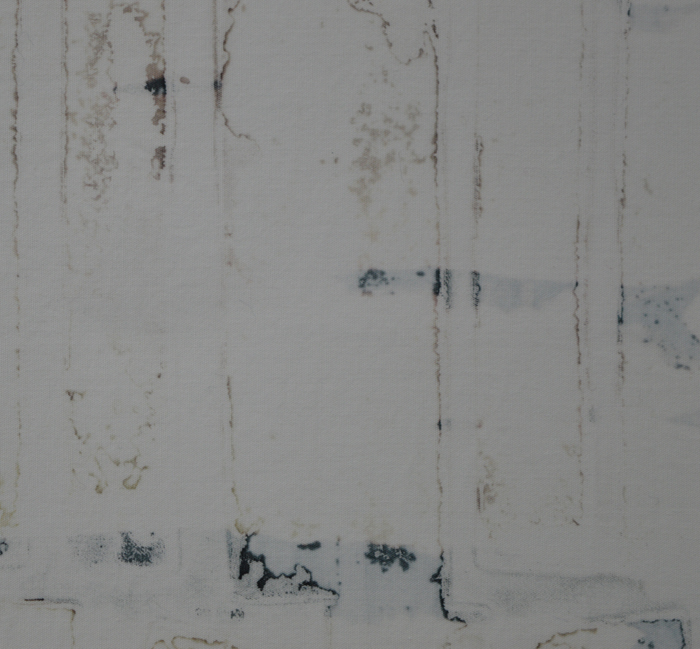
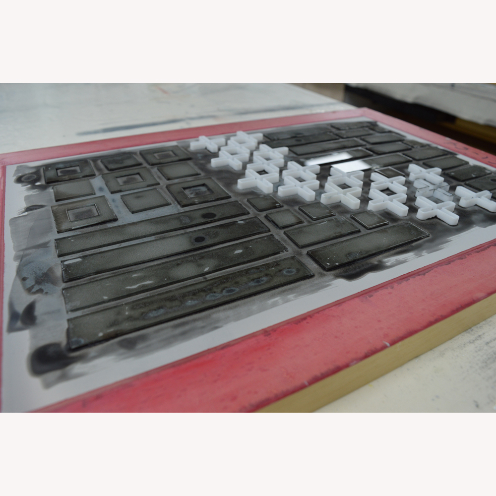
We looked at different ways of using an open screen - on pinned out fabric, on scrumpled fabric and, with wonderful results, onto fabric with string on the surface. Love Hilary’s piece! And somehow we found time to play with thermofax screens.
It gave me a warm fuzzy feeling seeing the groups confidence grow in the two days! I am so glad that I took that big step into teaching. The next two day class in February is already full but there are still places on the workshop in 27th and 28th April 2019. Can’t wait.

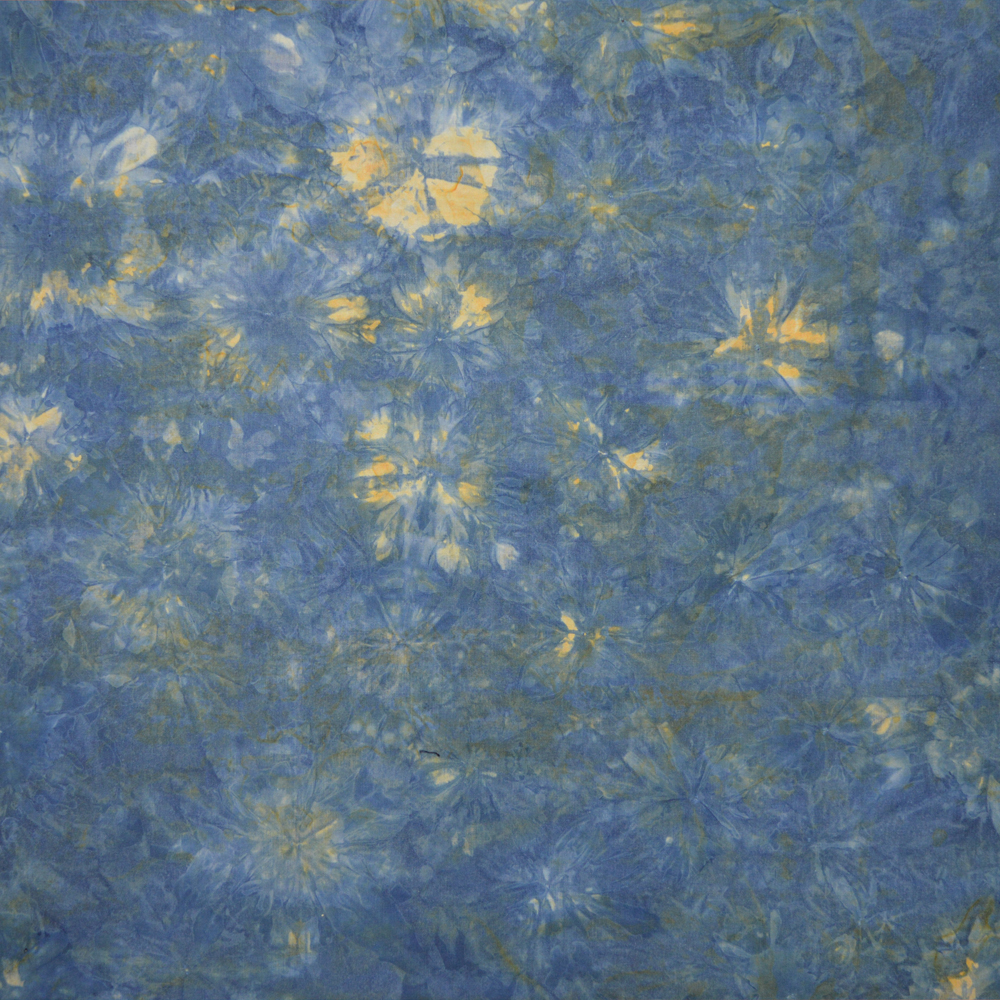
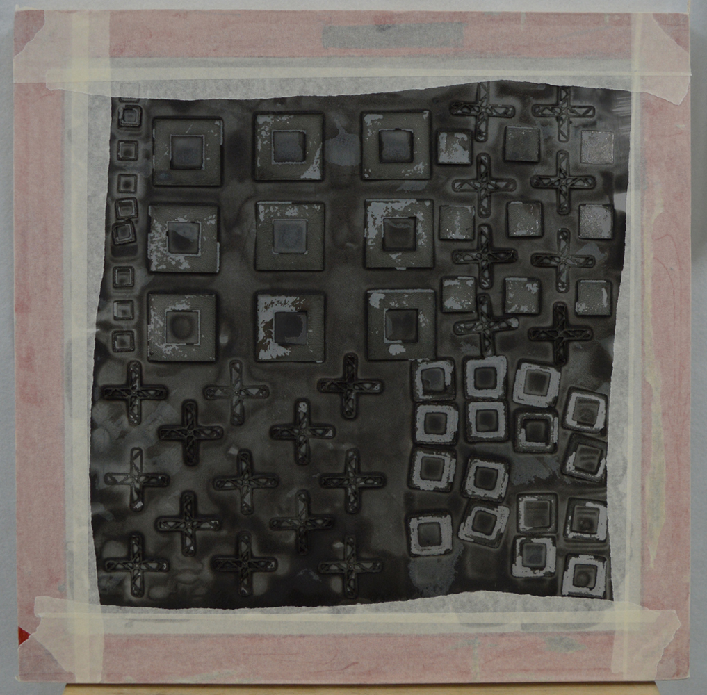
Anita Bennett: using thermofax screens to create texture
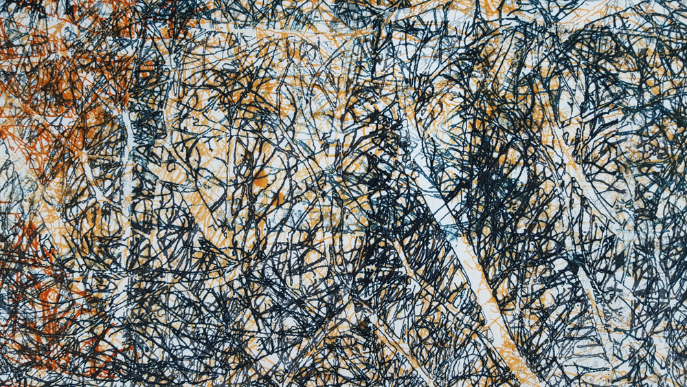
Maggie Pearson: repeated layering of a thermofax screen