Posts in Techniques
Artist interrupted

One of the things I like about my new day job is that there is less travelling and generally more 'regular' hours. I will have more time in the studio and be better able to plan my output.

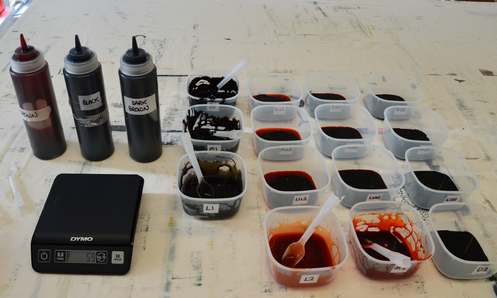
But this week I have had a couple of very long days and on Saturday I fly out to the US for a week. So my plan to work at the bench breakdown printing with my new colourway is on hold. I print using thickened procion dyes on cotton so I could leave the printed pieces rolled up in plastic for weeks before I wash them out but I prefer to get in a rhythm of printing, washing / drying, assessing then printing. Don't ask my why but the first piece of fabric I print after a period away from the bench is always disappointing and often butt ugly!

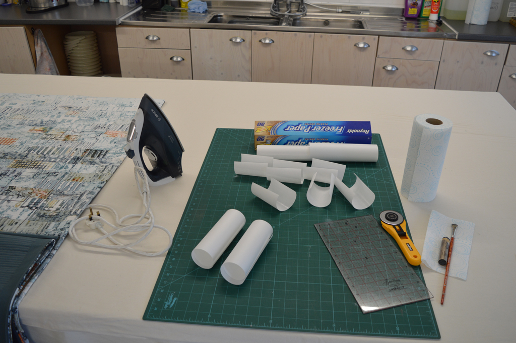
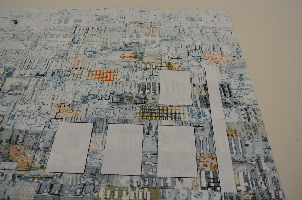
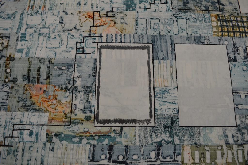
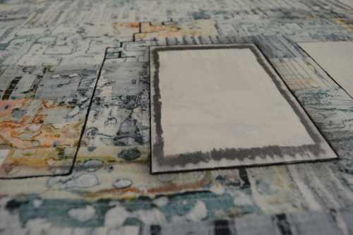
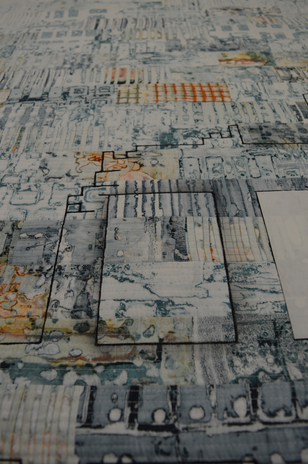
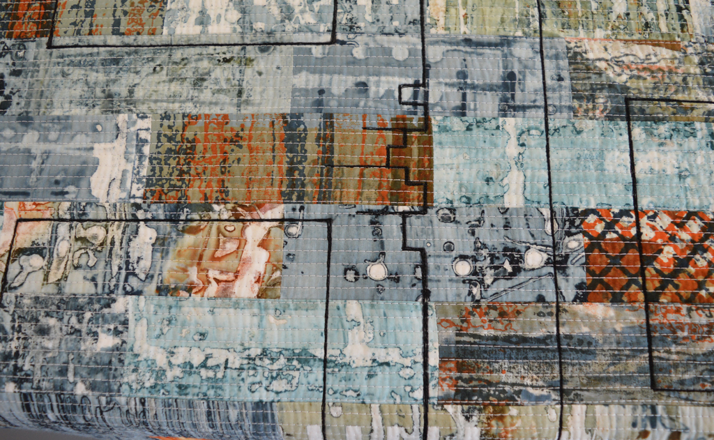
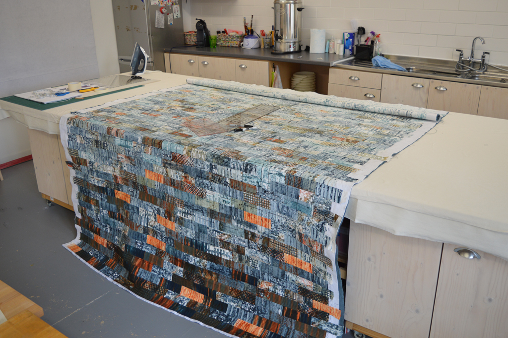
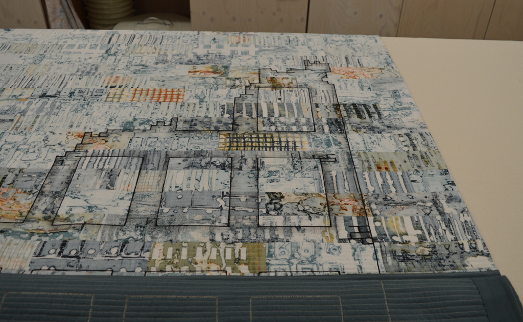
Instead I have spent my few hours in the studio this week working on my piece for the SAQA call Made in Europe. All the 'construction' work is complete and I am now stitching lots and lots of parallel lines. If you look closely above you will see that I keep my lines straight by using my walking foot as a guide and placing masking tape strips about 1 inch apart. I may not be in complete control of my schedule but boy do I control those lines!

Happy with the colours, now time to get printing

New 24 piece colour family 
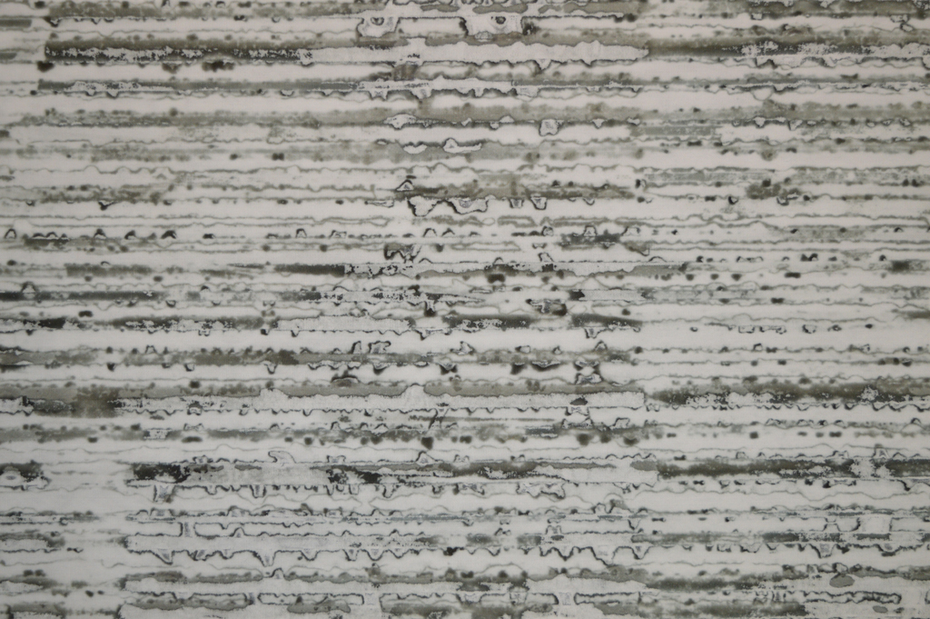
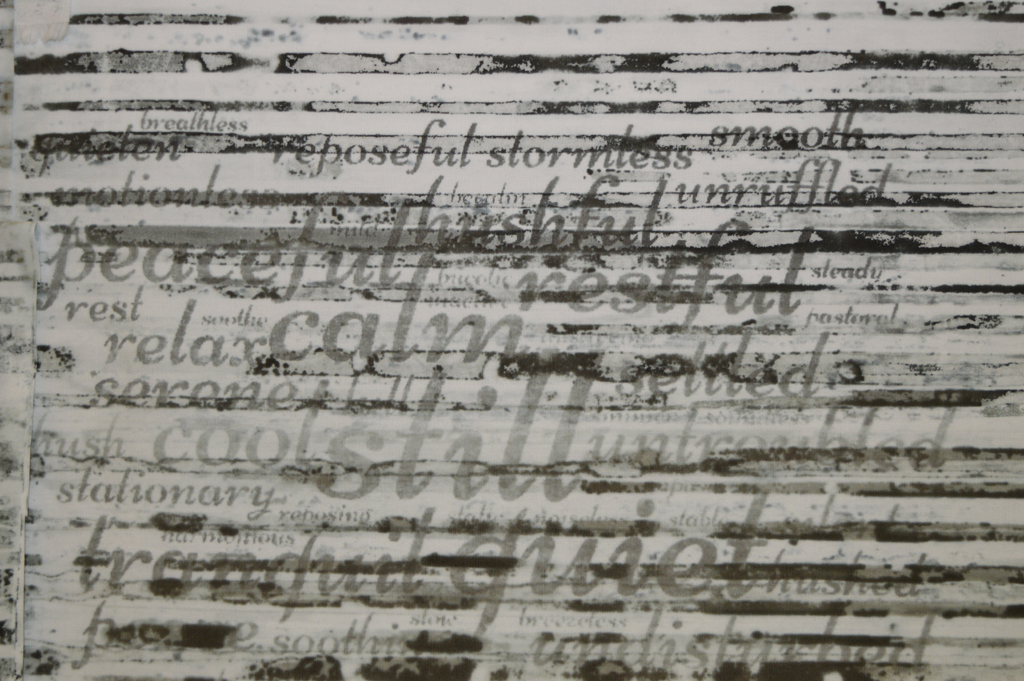
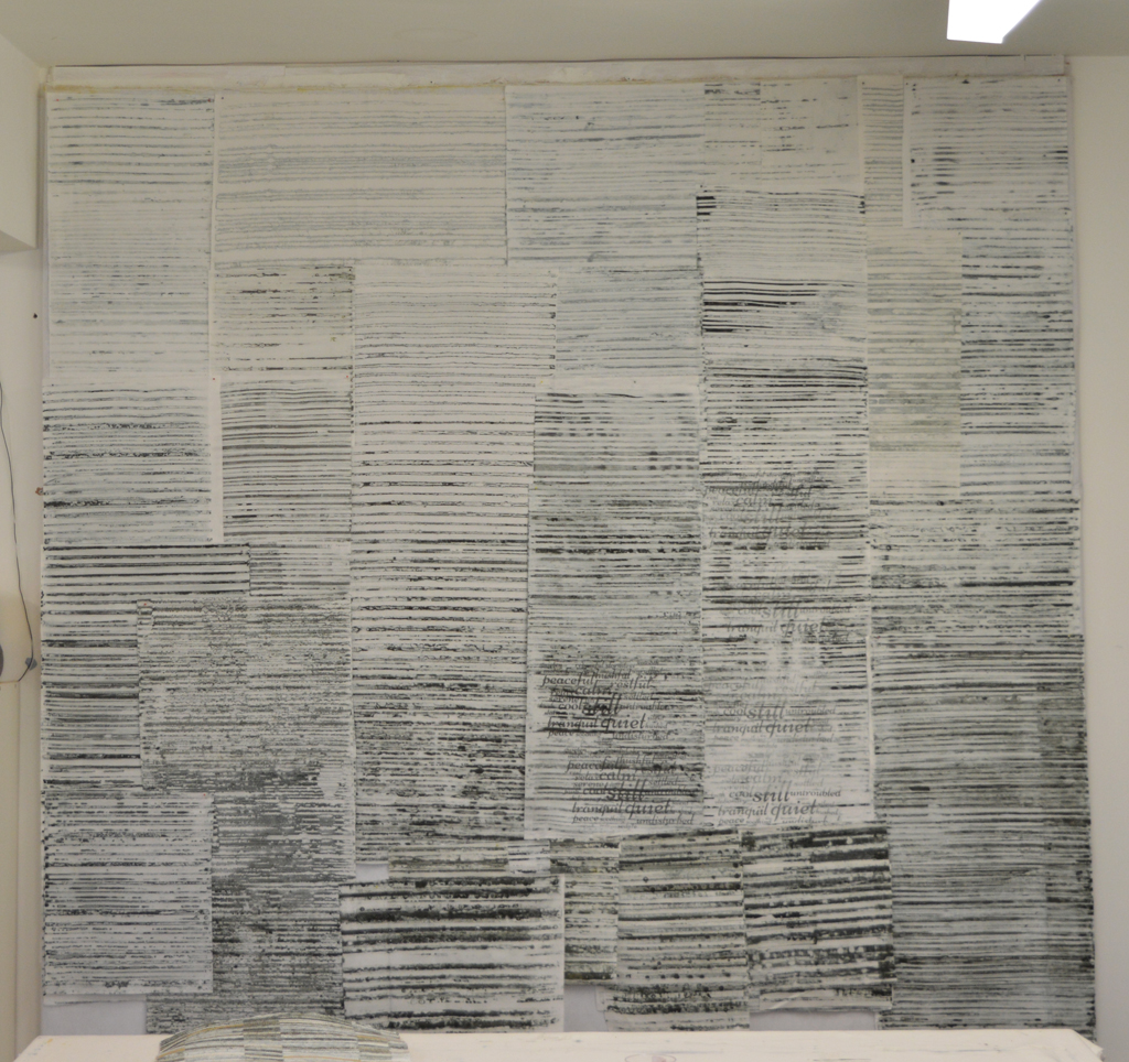
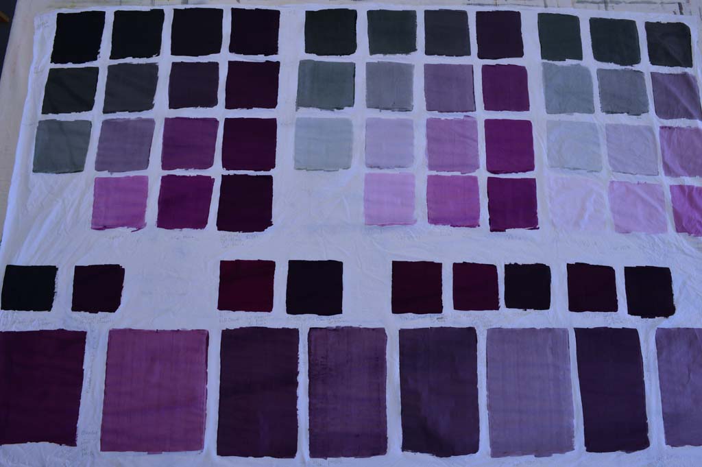
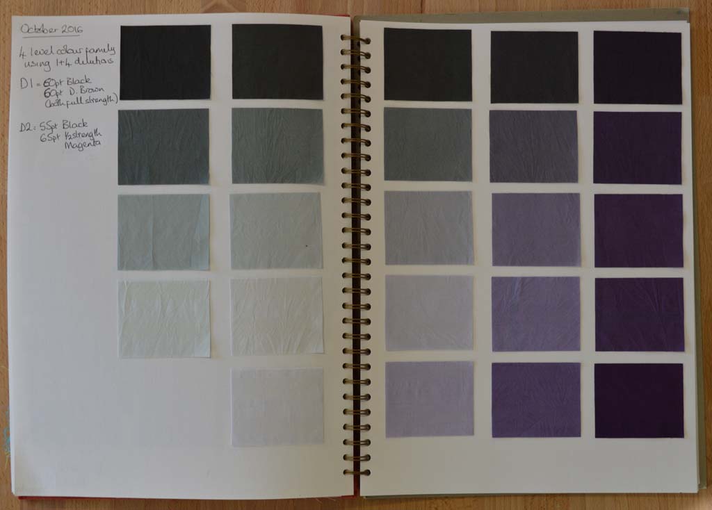
After multiple attempts I am now happy with my new colour family. I am calling it 'traces' as I'm hoping to use it to create a new body of work based on iconic industrial buildings that no longer exist. I spent my childhood summers staying with my grandparents in a small village north of Nottingham. The area was criss-crossed with coal seams and every journey took us past pit heads. These buildings don't exist anymore but I bet most people my age who spent time in the north of England know exactly what I am thinking off.

I used magenta dye as one of the starting colours as an ironic reference to the way we tend to look at the past through 'rose tinted glasses'. Although many people mourned the loss of community when the coal industry declined I don't think anybody could remember working conditions in the pits or the polution in the surrounding areas through rose tinted glasses hence I have blended the magenta with black to the point where the colour just tips over from pink to purple. I particularly like the paler colours in the family.

Now that the colour family is fixed I've started work on creating the palette of fabrics. This could take several months as my ideas tend to evolve gradually as I work at the bench. However the way I used breakdown printing in my Still / Storm series gave results that were similar to what I have in mind for this new series. So this is where I'm starting.

Fragile lines created by breakdown printing


Pretty in Pink?

Using thickened dyes to create new colour families 
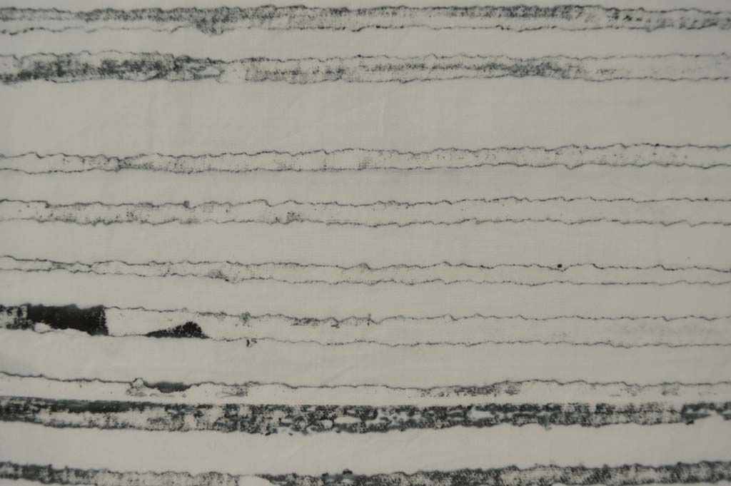
I've written about colour families before. I learnt about them on a wonderful class with Leslie Morgan. Essentially a colour family is created when you cross mix a dark, medium and light shade of two base colours. You can dye colour families or you can blend them using thickened dyes. My Hidden Message series used a dyed colour family because I wanted to create a collection of cloth with flat colours that I could then print on top of. The fabrics I used in my Ruins series were mostly breakdown printed using a colour family of thickened dyes.

The BIG IDEA that is rattling around my head will also feature breakdown printing so I have been making colour families using thickened dyes. I have already decided that one of my base colours will be a neutral black. And because I record everything I do I know how to make it with a mixture of black and dark brown. (The black dye I buy from Kemtex is actually a very, very dark blue so it needs the addition of brown to balance it).

But my idea for my second base colour was a little vague. So my first step was too blend different amounts of magenta with black and then to blend a 50/50 mix of that with my neutral black ... sounds a little confusing but I keep notes as I go. I then auditioned this 50/50 mix by diluting it with print paste to see what lighter shades would look like. I also decided to see how each of the colours would change if discharged with a thickened Formosol paste. As you can see my first attempts were very definitely still pink.

I liked the look of my fourth attempt (above, right) so then blended a full 15 piece colour family. I only needed very small amounts of each colour which is why I have a set of scales that measure to the gram! Again I discharged areas of each colour swatch.

And because my BIG IDEA is going to use very pale versions of the colour family I created an extended colour family by cross blending medium, light and very light shades of my neutral black with medium, light, very light and very very light shades of my second base colour. There are some wonderful greys here and this is definitely a very pretty colour family. But, having washed, dried, ironed, cut out swatches and put them into my sketchbook I still think it is too pink! Back to the bench Leah!

Back before the bench

I have a confession to make - I have let 'being kind to myself' because I started a new day job 5 weeks ago slide into procrastination. Now I don't mind 'value added' procrastination such as deep cleaning the studio before starting a new project. But I have been guilty of non-value added procrastination .... did I really, really need to finish watching all those Walking Dead boxed sets? Hmm - probably not! Mixing a new colour family

So how am I going to get back into a good studio habit? I'm going to do one of those things that I love most of all. I am going to develop new colour families. I have had a BIG IDEA brewing for a while and have decided that now is the time to start working on it. Inevitably (as with the colour family I mixed this week) I will waste quite a lot of dye and cloth before I get something that replicates the colours in my head. However I always keep good records of everything I mix so, in one sense, nothing is wasted. And yes I always uses scales to make sure my colour families are reproducible.

Colour family made with a 60/40 Dark Brown/Black blend and Rust. Each colour was also discharged using Formosol.

Photographing my work (again)

Happy today? (detail) 
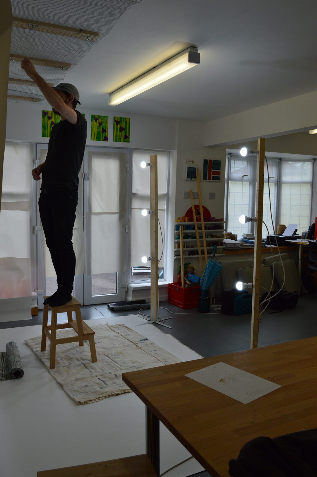
When I needed to photograph a really big Ruins piece in August I ended up borrowing a studio and some lighting. (The design walls in my wonderful studio just weren't big enough.) And whilst I was happy with the result it was a lot of effort to 'book' the studio, transport the quilt etc. So, with help from son Cal, I have built a system that will allow me to photograph big pieces and 3D pieces in the comfort of my own studio. Just in time to photograph my latest piece 'Happy today?' which is a double sided long thin piece designed to hang from the ceiling and pleat onto the floor.

We brought a 2.7m wide roll of photographic backdrop paper which sits on a narrow shelf built onto one of the long beams in the studio. This allows me to drop the paper down and along the floor. We brought a roll of metal mesh and used wood battens to fit a length to the ceiling in front of the backdrop roll. In the photo below Cal is using picture hooks and nylon hanging thread to suspend the quilt about 30cm in front of the backdrop. Cal made me two lighting stands. Each is a 6ft length of timber with four 10inch shelf brackets attached to the base to provide stability. He drilled out 3 holes on each upright through which he has attached regular bayonet light fittings. Having inherited my 'tidy' gene Cal put a junction box on each upfright so that each is run off a single plug. We used six non-directional cool white light bulbs to gave lots of good light although I need to invest in a better way of cutting the light from the french doors as this gave us a bit of problem with shadows.

Once we had finished photographing the piece we rolled up the paper and stored the lighting stands. (And moved tables, chairs and print benches back in place!). We have already decided that the system could be improved. Sometime before I use it again we need to get a 2.8m wood or metal pole to hang the roll of backdrop paper from so that it drops without any distortion. We need to replace the wire mesh with something more heavy duty especially if I want to photograph bigger, heavier pieces. And we need to paint everything white so that it looks nicer! Well maybe 'need' is a bit of an exaggeration but I do have the 'tidy' gene!

Adding colour to a finished quilt

Ruins 7, work in progress It is scary stuff adding colour to a piece that I have already invested hours and hours of my time in but it needed to be done. I was not happy with the piece and would probably have filed it in the bin so what did I have to loose? But it has been a long time since I added colour to a finished piece so I spent a pleasant morning trying different types of media and different application techniques on some small Ruins samples. I chose a Markal oil stick and yesterday started applying colour to Ruins 7.

Getting organised

Ironing freezer paper masks on the quilt

Adding Markal to the mask

Brushing across the Markal onto the cloth using a small stiff brush

Removing the mask to see if there is enough colour applied

Lessons learnt. Don't apply Markal too close to the edge of the mask as it is really easy to accidently slip off the paper. Make sure you remove any small specs that have fallen off the oil stick before you start brushing. Wash your hands regularly. And remember to breath!

Taking a moment

Breakdown printing is seriously addictive. When the sun is shining and screens are drying in a couple of hours it is really tempting to just keep on printing. Breakdown printing

Especially when it is giving me such yummy results. But I've been here before and know that it is important to stop and take a moment. So today I have put all my newly printed fabrics through the washing machine (twice), dried them, ironed them and assessed them.

Thermofax printing at same time as breakdown printing

The piece of art that exists in my head will be mostly monochromatic and will be pale at the top and dark at the bottom. So I have cut into my fabrics and pinned the 'good' pieces on my design wall. Standing back I can see that I have lots of light and medium pieces but none that are really dark. I can also see that the inclusion of words is interesting but I only I have a couple of small pieces so far.

Auditioning fabrics on my design wall

Not all pieces made the grade yet so I have a pile that I will soda soak again and print over either to include words or to make much darker or both. Although breakdown printing is not an 'exact' process it does become more predictable the more you do so hopefully the next round of printing will give me palette of fabrics I need to move on to the composition time. Lets hope the good weather lasts!

Being brave

A word of warning before I start - those you know me might want to sit down.

Ruins 7 - work in progress

I have now finished the background stitching on Ruins 7. It is big; a massive 5 square metres. Which equates to hundreds of parallel lines of stitching achieved by spending hours and hours at my sewing machine. And it looks great - well worth the investment I have made in it so far.

I wanted to do something a little different with this piece and had, in my mind, stitched silhouettes of ruined, bombed out buildings. I went on-line to get some images to work from. Sadly there are far too many images out there - from London and Dresden in the second World War to Aleppo today. I started by sketching in a notebook but could get no sense of scale. So I decided to draw out the full sized design. Cue lots of hours drawing, tearing up paper and drawing again until I was sort of happy. I draw onto blank newsprint paper as I know it tears easily and thought I could pin it to the quilt and stitch through.

I thought wrong. Trying to manhandle the quilt and paper on my sewing machine was horrendous. If I had a swear box in the studio I could have paid my mortgage off!! I thought long and hard about my options …. And decided to draw the design directly onto the quilt. And not with a pencil (which wouldn't really show up) or with a water soluble marker pen (as I have no intention of letting the piece near water). I decided to use a black permanent marker pen. Yeaks!!

I am using free machine quilting in a black thread to 'etch' over the lines so most of the marks should be hidden. Assuming I don't make a mistake …… Is that brave or really stupid?