Posts in Textile Art
Just itchin'
28 October 2018.jpg

I have an itch. I can feel it growing inside of me, gaining momentum. It’s at the edge of my consciousness now whatever I’m doing. It needs scratching!

Yep, all the ideas about a new series of works on the printing and publishing industry that have been brewing in my head for weeks have started to come together. This is how I work. I don’t use sketchbooks when developing new ideas but I do like to have something pinned to my design wall or sat on my desk that is always there, in the corner of my eye, as I work on other things.

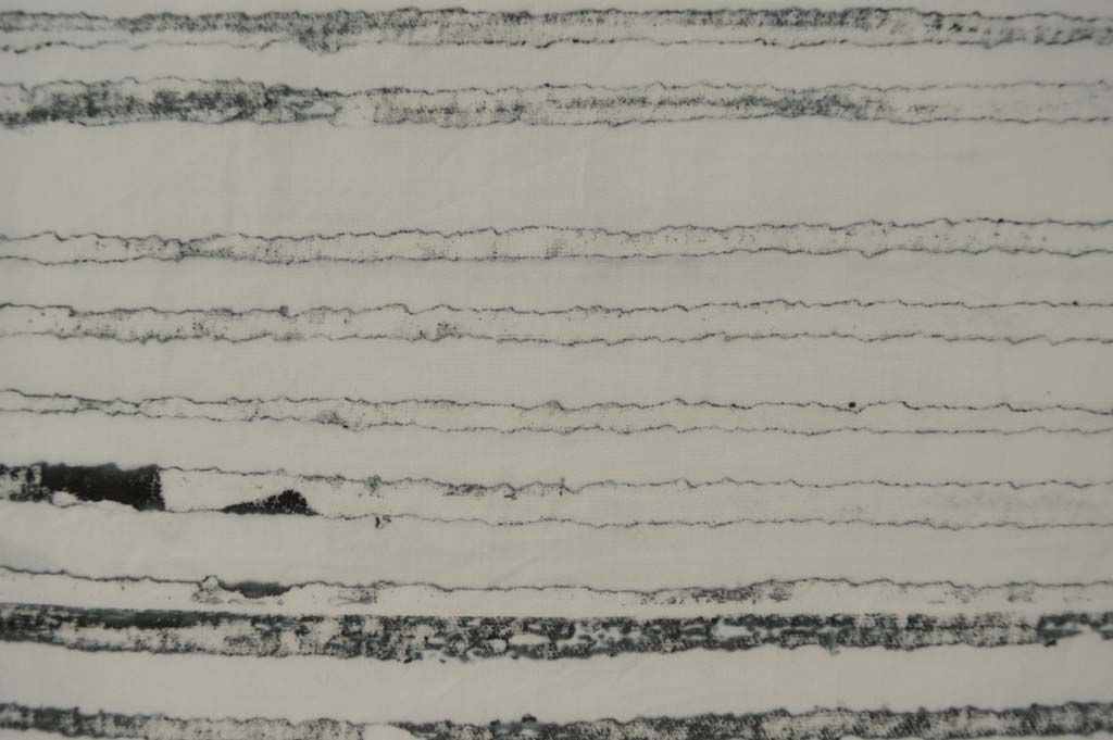
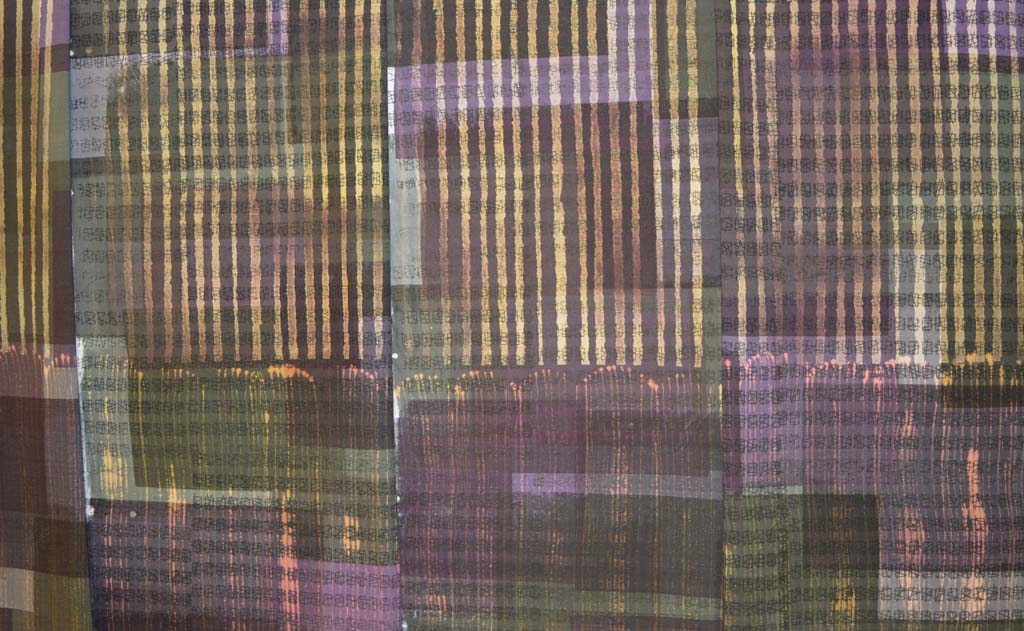
I started thinking about printing and how it has, as an industry, changed and continues to change when I printed some fabrics using simple grid based breakdown screens in July. I made a small quilt called Process Colour for my stand at Festival of Quilts expecting it to be a one-off. But I don’t think it’s going to be. Actually I know it isn’t going to be. I liked how the simplicity of a grid become complex it broke down. I liked printing in only black. I cut some thin strips of the printed fabrics. There is no text but they somehow remind me of newsprint. And so my mind has continued to churn ideas around.

I thought about introducing text on top of some of the fabrics using old wooden print blocks. I wasn’t sure how but I’ve had the blocks sat next to my computer for a while now and they have been the catalyst that has caused an ‘idea’ explosion in my head. I need to get the ideas out. I need to play. I need to print!

Watch out Birmingham!
New work: Process Colour #1

New work: Process Colour #1

With one day to spare I am all ready for Festival of Quilts. How do I know? Because I have checked everything off my Festival of Quilts 2018 checklist. I love a good checklist! Have I forgotten anything ....

  • FoQ paperwork / car pass / Hi-Vis / Exhibitor Passes - check
  • Float / Phone / Tablet / Chargers / card reader / power bank - check
  • Sack truck - check
  • Two table tops (with pre-drilled holes for legs) - check
  • Eight legs (in their handmade carrying bags) - check
  • Makita drill / small screws / screw driver / spirit level - check
  • Two table cloths - check
  • One stool (but I will be too busy to use it!) - check
  • Small steps (can't reach top of stand) - check
  • Quilts for stand (in their handmade bag) - check
  • Postcards / stands - check
  • Leaflets / stands - check
  • Fabric for sale (lots) - check
  • Display boxes - check
  • Velcro dots - check
  • Panel pins - check
  • Small hammer - check
  • Duck tape and cable ties (thanks for the tip Ruth) - check
  • Double sided tape - check
  • Invisible tape - check
  • Scissors - check
  • Wet wipes - check
  • Hand fan (hot flushes!) - check
  • Notebook - check
  • Pens / pencils - check
  • Twine - check
  • Fabric care slips - check
  • Business cards - check
  • Labels for quilts - check
  • Price labels for fabric - check
  • A4 workshop 'adverts' for stand (love laminating!) - check
  • 100 snazzy paper bags / labels - check
  • Lint roller (for the quilts) - check
  • Tape measure - check
  • Fine pins - check
  • Calculator - check
  • Newsletter sign up sheet - check
  • Workshop sign up forms - check
  • Paypal sign (yes I take PayPal and cards) - check
  • Price / availability list for workshops - check
  • Joe (oldest son, my gofer, and, he says, ace salesperson) - he is around here somewhere!
  • Clothes to wear (by far the hardest decisions!) - check

If you are at Festival please come see me on stand H35 in the main hall! It will be lovely to put faces to names x

And my spare day .... unless it is pouring down I'm taking my grandson to the beach and eating ice cream. 


The Final Countdown
card front copy2.jpg

Well maybe that is a little bit dramatic but it is now only 44 days until my exhibition with Helen Conway opens at The World of Glass in St Helens. And only 37 days until we drop off the art work. Today Helen and I met with the curator Hannah to discuss layout and the minutia of things we need to do between now and then.

Getting the layout of the exhibition finalised is really important. Hannah and her team will hang the work and we wanted to be sure that we have the right number of pieces to fill this beautiful space. Turns out we can include an extra 4 metres of wall without crowding the space. Good job I made more pieces than I thought I needed. It does however mean that I will need to correct the scaled 3D model I have made!

So my to do list for the next 37 days:

  • Send out the remaining Preview Invites.
  • Finish final quilt (the original piece was finished in December but I liked it so much that I submitted it to the European Quilt Triennial. So now I am making a replacement. A 135cm x 240cm replacement. Good job I work in series!).
  • Cut, drill and label top and bottom battens for three large quilts.
  • Make storage bags for each large quilt.
  • Iron, de-lint and carefully roll three large quilts in tissue paper before storing in their bags.
  • Add hanging mechanism and mirror plates to 20 small pieces stretched over canvas.
  • Wrap these 20 pieces in bubble wrap, find a box to store them in and print out a hanging plan for them.
  • Decide whether 6 medium sized pieces currently stretched over canvas would actually look better framed (OK so maybe I should of thought of this earlier!)
  • Add hanging mechanism and mirror plates to said 6 pieces.
  • Wrap them in bubble wrap and print out a hanging plan for them.
  • Collect 8 framed pieces from Manchester Custom Framing.
  • These will come with hanging mechanisms and will be carefully wrapped so will just need a hanging plan printing.
  • Make labels for everything. Sounds simple, takes forever to get them perfect.
  • Get postcards printed ready for sale in the gallery.
  • Decide whether to have limited edition prints for sale and get them printed.
  • Get poster printed onto foam board for entrance to gallery (Helen is organising the design).
  • Organise something for visitors to leave their details and comments on.
  • Sort out drinks and nibbles for the preview with Helen.
  • Decide what I will wear (this is the item that stresses me out most!).

Easy!

As messy as it gets!

I recently posted that I can't created in chaos. And that messy in my studio is when there are snippets of thread and fabric on the floor. Well I got really, really messy (for me) over the long weekend we have just enjoyed in the UK. I also got sore feet from standing for hours. And my rotary cutter needed a long lie down in a dark room afterwards. But look what I got in return - trays of cut 'bricks' and bondaweb backed 'brickettes' ready to build backgrounds in my Ruins and my View series.

I love printing and it is so tempting to just keep on printing, especially on sunny days when breakdown screens dry quickly. But it is only by cutting up the fabrics that I can see if I have the right balance of colour and pattern. I can see that I have enough fabric to start making backgrounds. I use the bricks to piece backgrounds for my large quilts and I use the brickettes to fuse backgrounds for smaller works. But I can also see that I will need more of the darker fabrics in both series to complete the work I am planning for the rest of this year. Which means more printing. Happy days!

Find something you love

I make a mean lasagne. I could eat it every day but hate washing saucepans so guess what - I don't want to make lasagne every day. But I love all aspects of breakdown printing and I could very happily spend every day making beautiful fabric. I love mixing the dyes and preparing the screens. I love pinning out my cloth and pulling the screens. I even love washing my screens, washing the objects I use on my screens and washing my printed cloth. Because I love it I have spent hundreds of hours learning to  sort of control the outcomes and it now forms the foundation for all of my art. I made my first breakdown screens during a Committed to Cloth workshop in 2010. I wasn't really aiming for anything - I just picked a couple of colours and made two screens.

I printed the golden yellow screen first by pulling through with more golden yellow. I wasn't that impressed. Then I pulled the petrol green screen on top. I was worried that I had lost all the first layer. And then I washed the cloth and feel in love.

The joy of breakdown printing for me is in the detail. Those tiny areas of texture that are impossible to create in any other way. When I made that first piece of printed fabric into a piece of finished art I added stitch that mirrored some of that detail. Today I use breakdown in a very different way but thought you might like to see how I started!

Knots and Crosses (detail)

Sampling and getting there in the end!

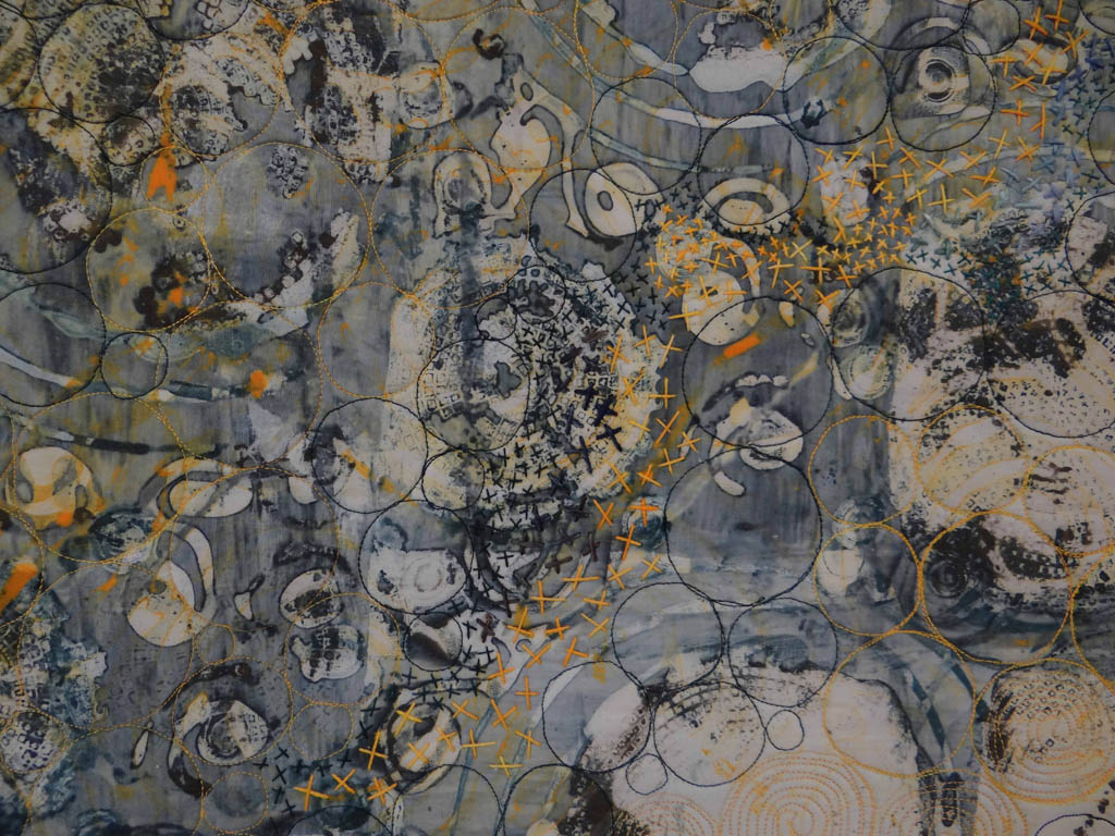
I started sampling ideas for my new series using a selection of dyed fabrics pulled from my stash. Early outcomes did not exactly grab me so I also tried using stencils to take colour out (discharge) and to add colour. Interesting but still not right. I added back colour. And got rather depressed until I decided to change the scale and to add stitch. Bingo!

The sample above is definitely a step in the right direction. However looking at it I realised that the colours of the appliqued strips were not really 'me'. Being dyed fabric, they lacked the texture I usually work with. Pieces from this new series will be shown alongside pieces from my Ruins series in the exhibition I am doing with Helen Conway at Stockport War Memorial Art Gallery in Autumn 2018. So I pulled out my colour diary and compared my little sample with the colour family used in Ruins. The background for the new series uses a colour family made from black and petrol green. In my Ruins series I use petrol green and a colour family made from rust and black. Doh ... it seems so obvious now!

Plan B .....

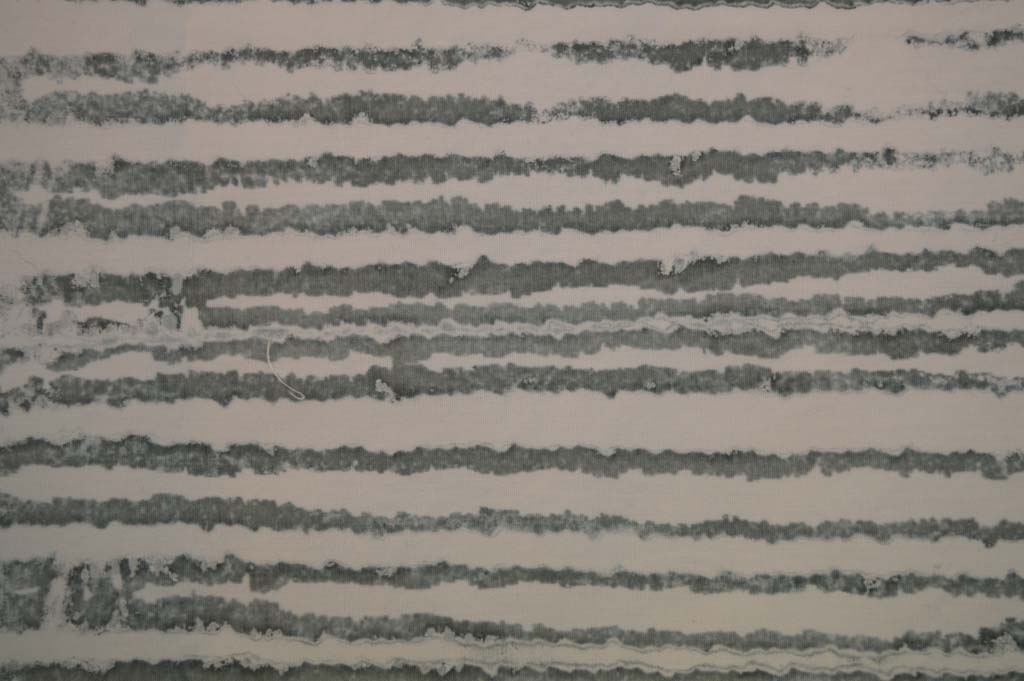
In between wrapping presents last week I did manage to prepare and pull some breakdown screens. I got some really promising marks by using a screen made with torn strips of freezer paper gently ironed onto the screen before rollering on a very thin layer of black thickened dye. I also made a screen using strips of torn masking tape. I wanted the marks to be delicate so pulled through with lots of print paste. And replaced the paste if it got tinted with colour.

However those lovely marks only appeared from the first and sometimes second pull. After that everything went 'blobby' and not at all what I wanted.

I have found before that I get the best marks and the most 'pulls' when I dry breakdown screens outside on warm sunny days. Drying out screens quickly and thoroughly is not easy in the winter. I have tried drying this batch of screens next to and above radiators and I still only get one good pull. Trying to develop a new palette of textiles based on this low success rate could be really frustrating! Luckily I am not working to a deadline so, although Plan B looks to be a good one I am putting it on hold until spring. I wonder if Santa can bring me an early spring?

Failed beginnings

It is a good job that I have a Plan B as my experiments over the last week or so have failed to give me a 'WOW' moment. The results didn't even fall into the 'Ugly Duckling' category of pieces that might fit in with what I'm trying to achieve with some additional process. The experiment has been educational but not in any way that is connected with what I think I'm trying to achieve.

I started with 8 pieces of cotton each 'marked' with a different medium. It turns out that my water resistant acrylic ink didn't put up much of a fight and washed out when put in the soda bath to soak. The soda solution was a beautiful turquoise colour as I poured it down the drain. Luckily (sic) the colour washed out so sucessfully that I can reuse the piece of cloth. The remaining seven, soda soaked and dried pieces were pinned to the bench and a layer of colour added using an open silkscreen.

After batching them I washed and dried the pieces. The original marks were all clearly visible below the layer of colour. The lines I had made with dilute acrylic and with acrylic mixed with Golden Matt Medium looked a little faded and fuzzy but the rest appeared unchanged. I then stripped out the colour using two methods. One half of each piece of cloth was discharged using Formosol mixed with print paste and applied through a screen. The other half was discharged using the cheapest bleach I could find (40p for 2 litres - bargain!) and a fan brush.

The Formosol discharged to a fairly consistent colour irrespective of the original colour. The bleach gave a bit more variation and also some different colours. Neither method affected the original marks. Hmm ... I had been hoping for some really interesting chemistry to happen that maybe striped back or somehow changed the first layer of marks. Instead discharging added colours to the fabric pieces that created a palette that reminded me of street lights glowing in the dark. Which has got me thinking about something else ... maybe the beginning of something else? So the pieces will be hung on a small design wall to contemplate whilst I move on to Plan B!

Happy with the colours, now time to get printing

New 24 piece colour family 
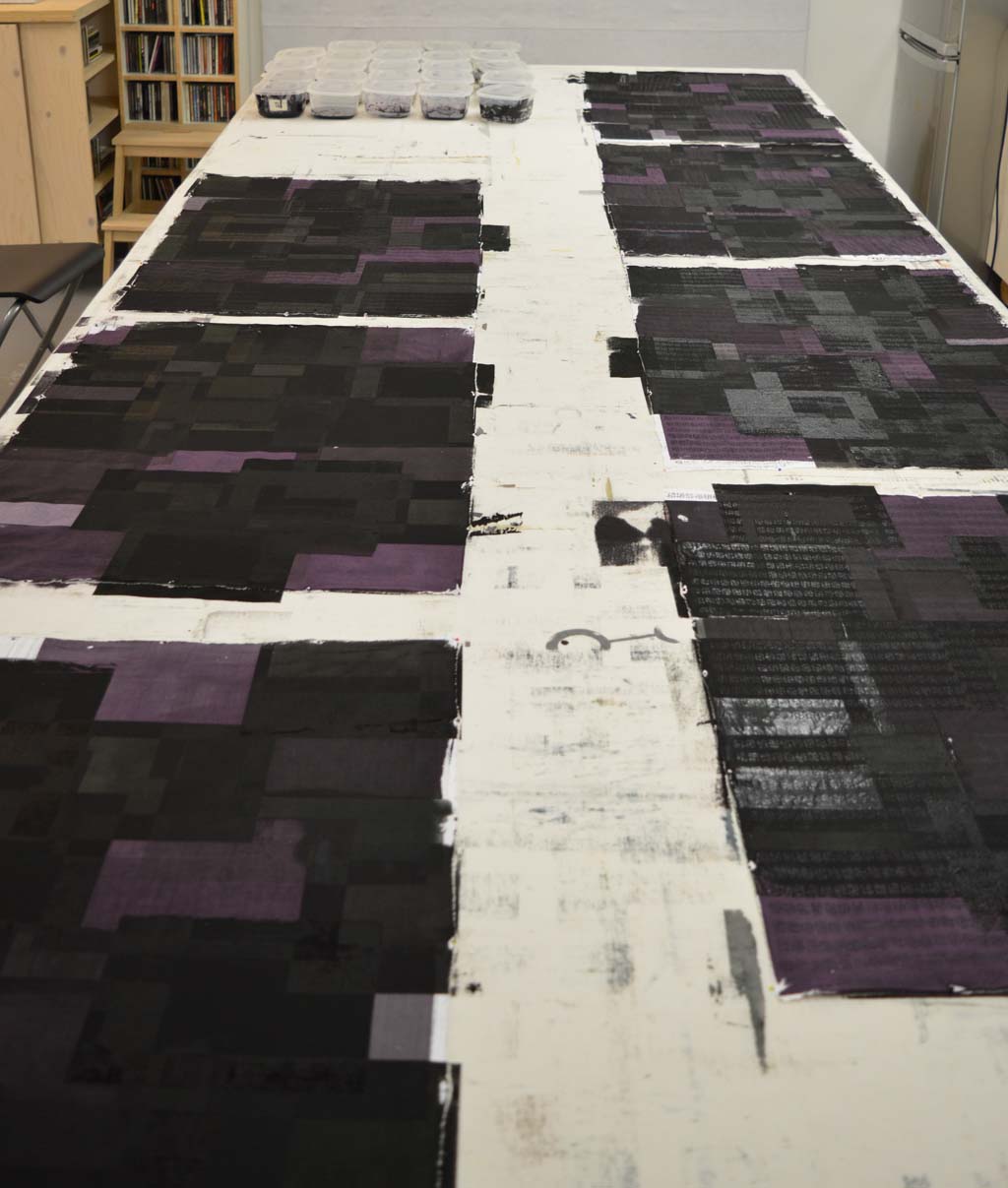
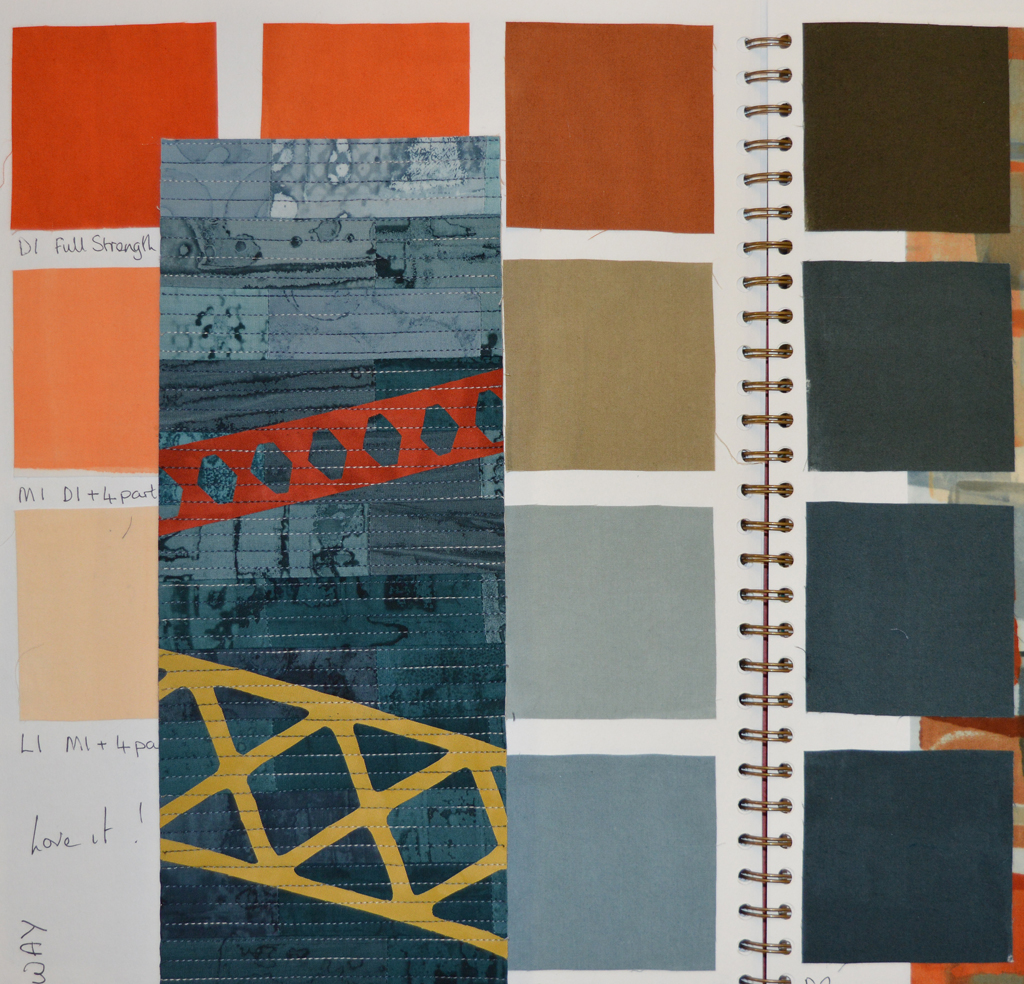
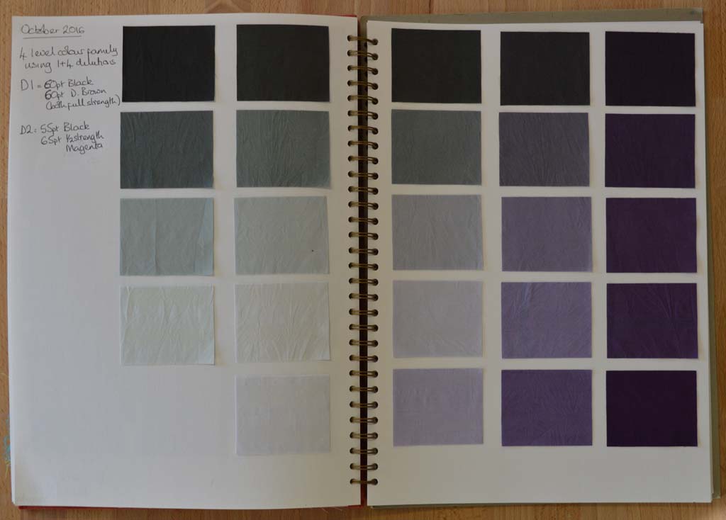
After multiple attempts I am now happy with my new colour family. I am calling it 'traces' as I'm hoping to use it to create a new body of work based on iconic industrial buildings that no longer exist. I spent my childhood summers staying with my grandparents in a small village north of Nottingham. The area was criss-crossed with coal seams and every journey took us past pit heads. These buildings don't exist anymore but I bet most people my age who spent time in the north of England know exactly what I am thinking off.

I used magenta dye as one of the starting colours as an ironic reference to the way we tend to look at the past through 'rose tinted glasses'. Although many people mourned the loss of community when the coal industry declined I don't think anybody could remember working conditions in the pits or the polution in the surrounding areas through rose tinted glasses hence I have blended the magenta with black to the point where the colour just tips over from pink to purple. I particularly like the paler colours in the family.

Now that the colour family is fixed I've started work on creating the palette of fabrics. This could take several months as my ideas tend to evolve gradually as I work at the bench. However the way I used breakdown printing in my Still / Storm series gave results that were similar to what I have in mind for this new series. So this is where I'm starting.

Fragile lines created by breakdown printing